🔥 CYBER MONDAY 24H: 60% off all prices on the site! Only until midnight. Use code CYBERMONDAY25 👉🏼


Milan, Metropolitan City of Milan, Italy
Commercial - Restaurant
POKE HOUSE — EAT WHAT GIVES YOU JOY
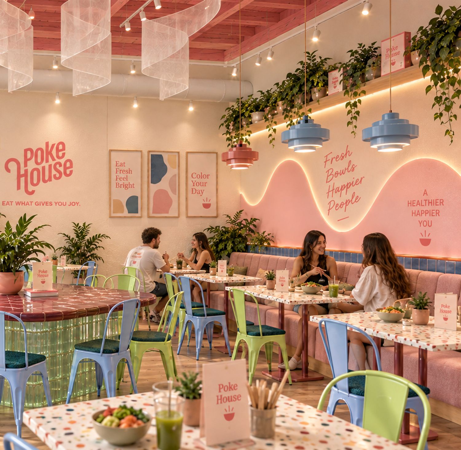
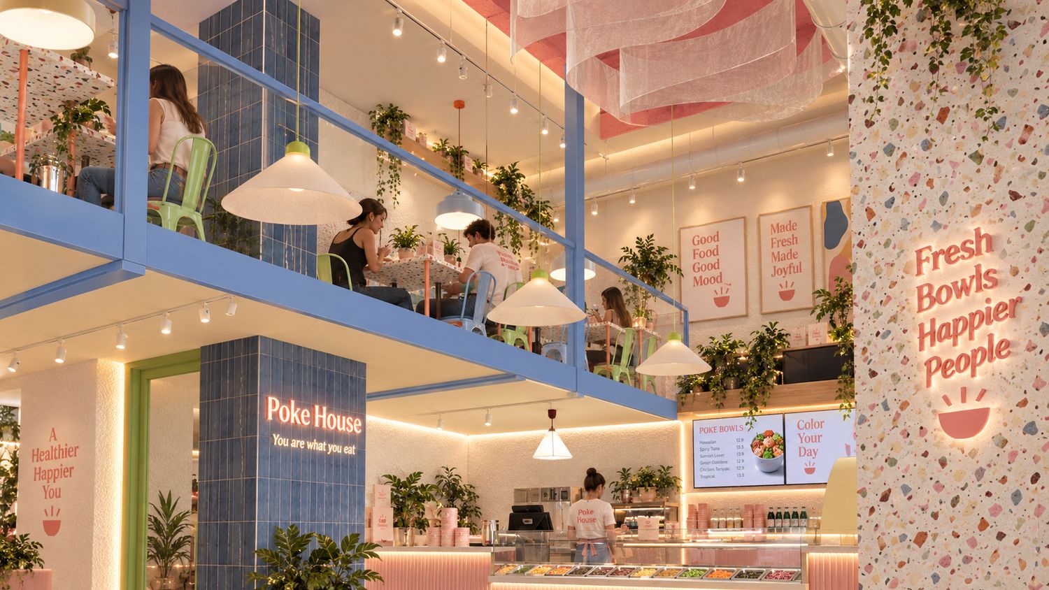
The project translates Poke House’s renewed identity into a vibrant, warm and highly recognizable spatial experience, designed around the idea that eating well should feel joyful, intuitive and social. Rather than creating a conventional fast casual interior, the concept treats the restaurant as a complete brand environment where color, material, movement, food and communication work together as one coherent experience.
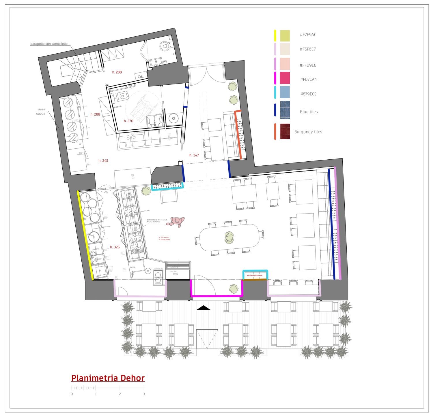
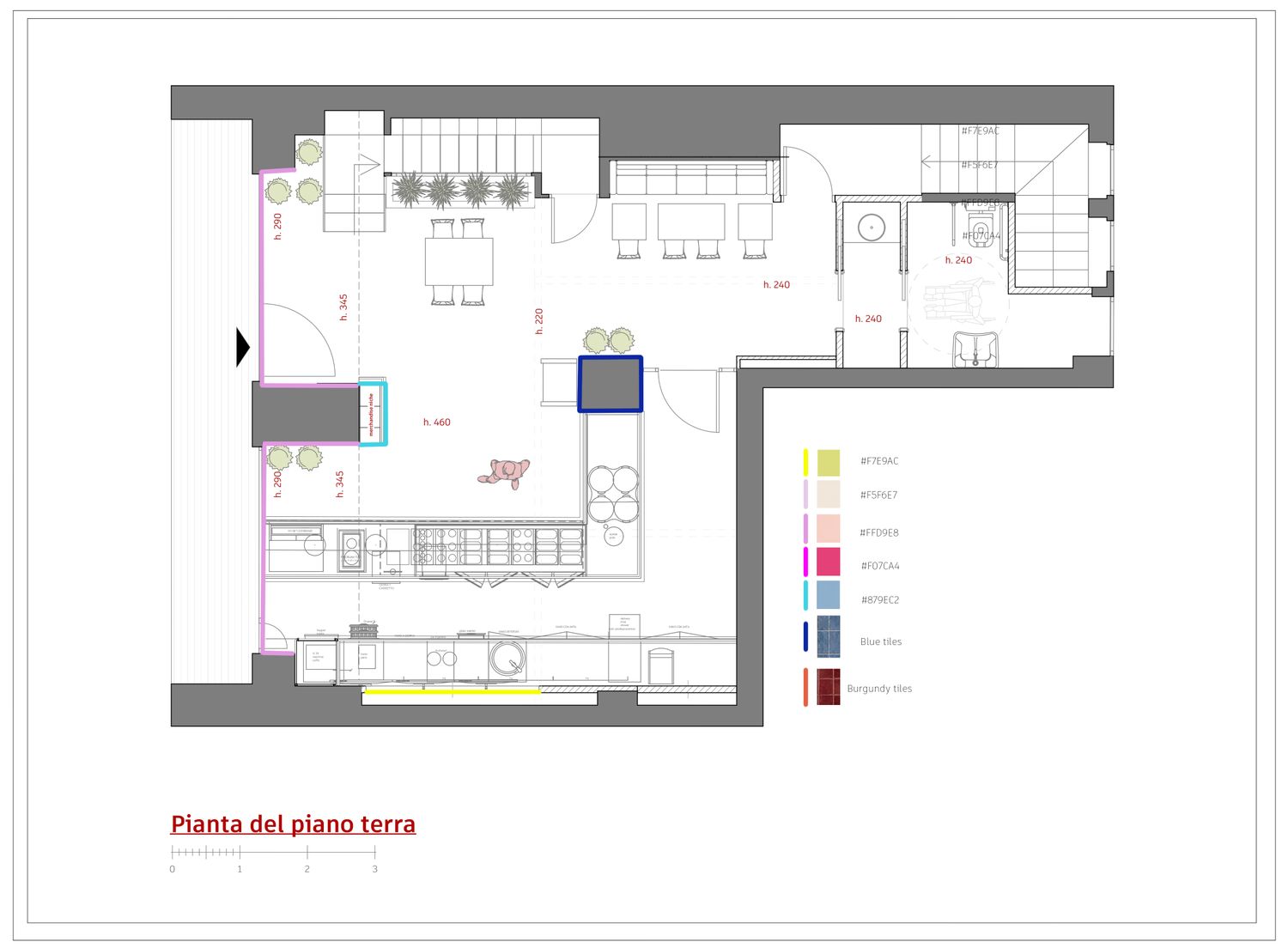
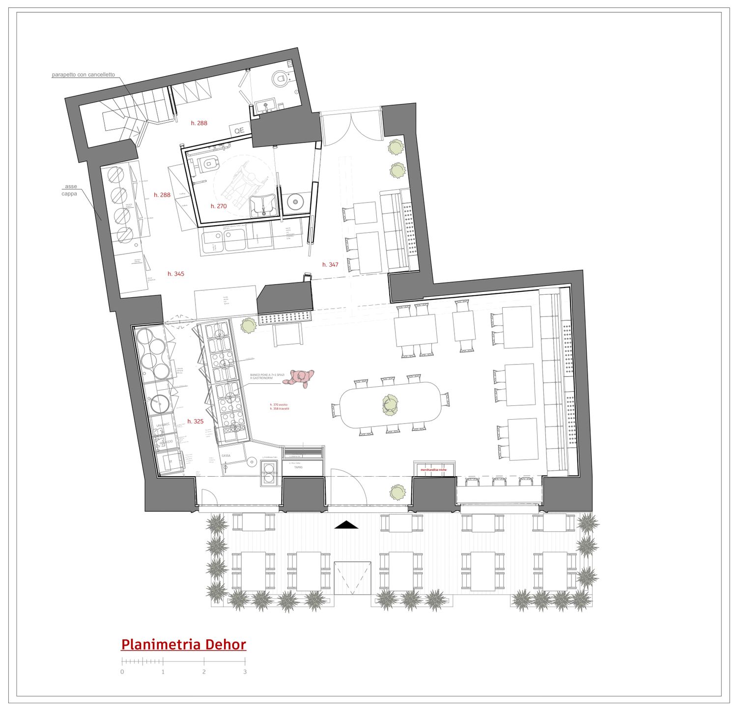
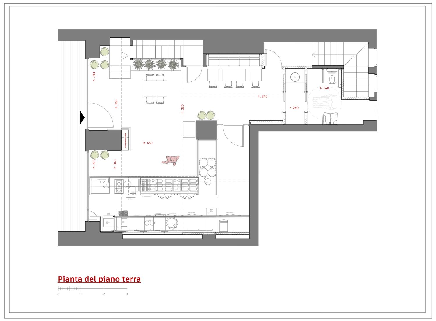
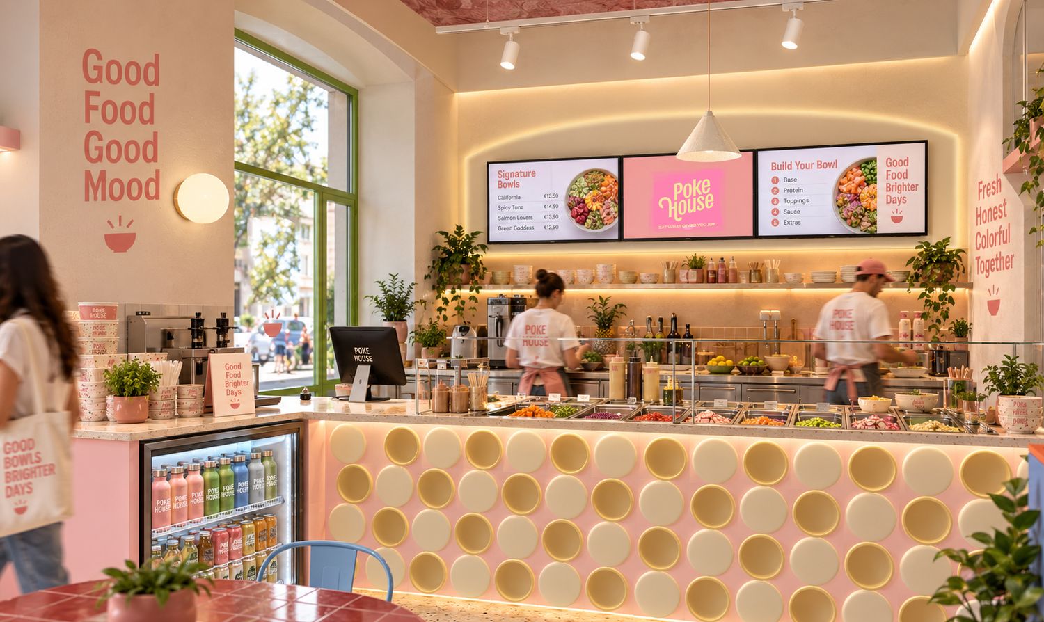
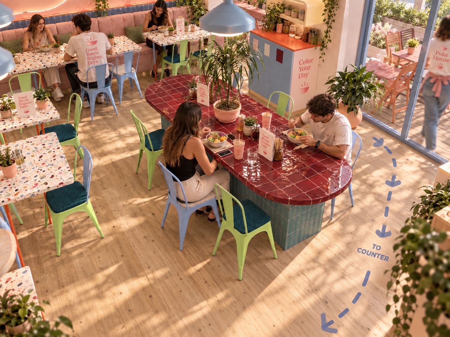
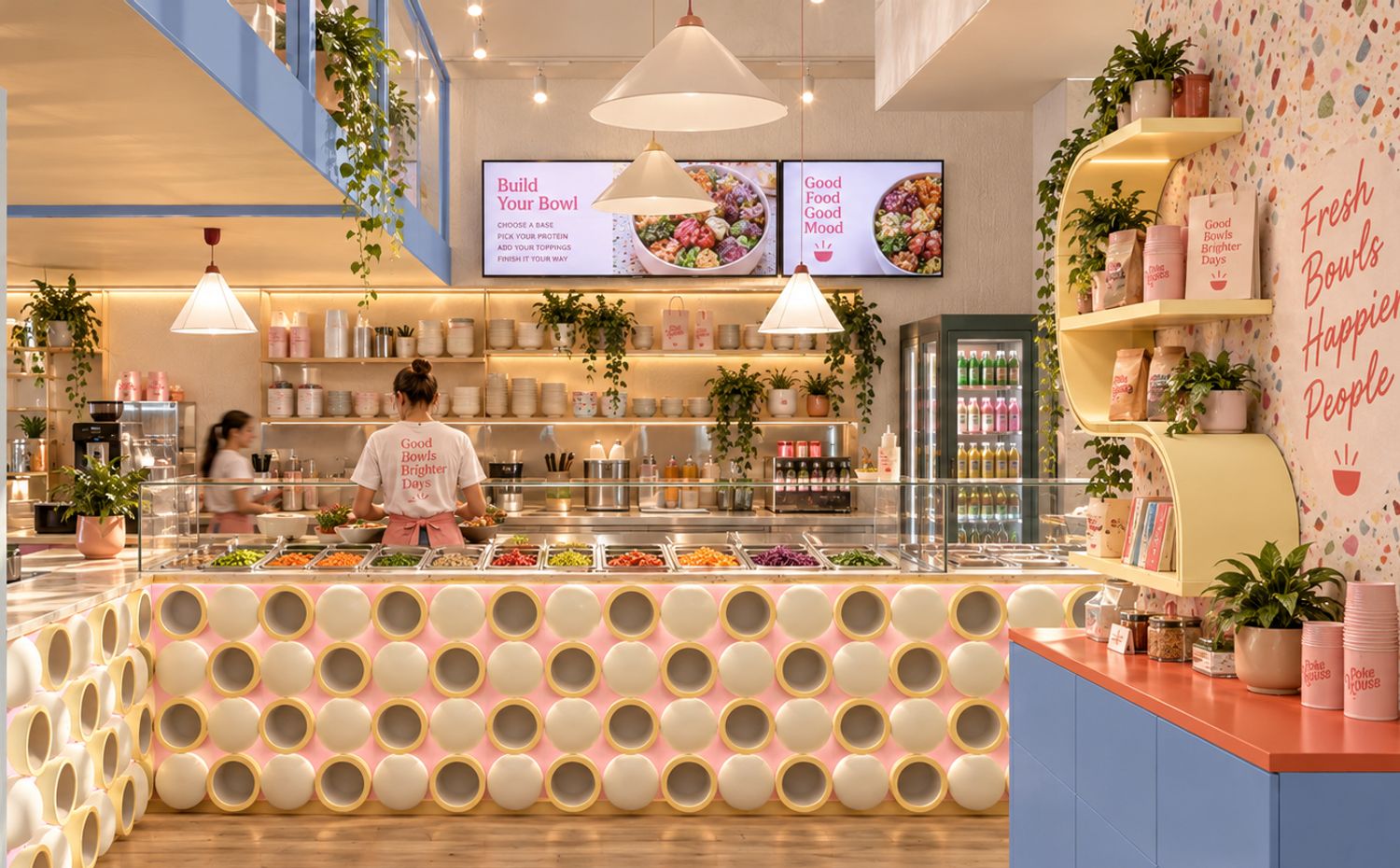
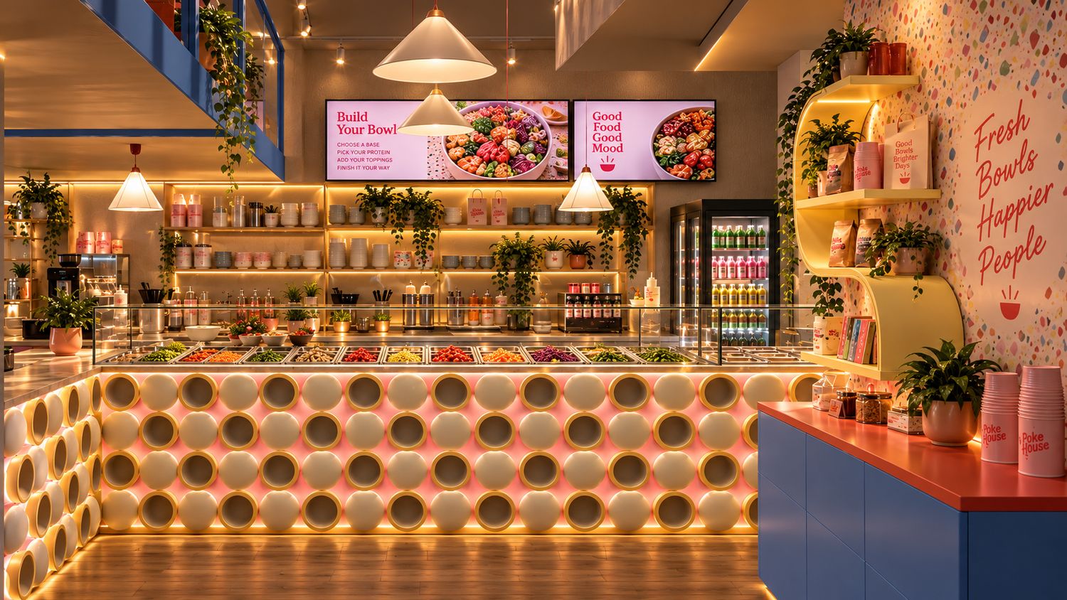
The existing operational counter layout is fully respected and becomes the visual heart of the project. Its front is reinterpreted through a playful composition of concave and convex circular ceramic elements, creating depth, rhythm and a memorable tactile identity while keeping the food display visually dominant. The customer journey is made immediately understandable through a clear entrance sequence and subtle blue floor wayfinding that guides guests naturally toward ordering, payment and seating.
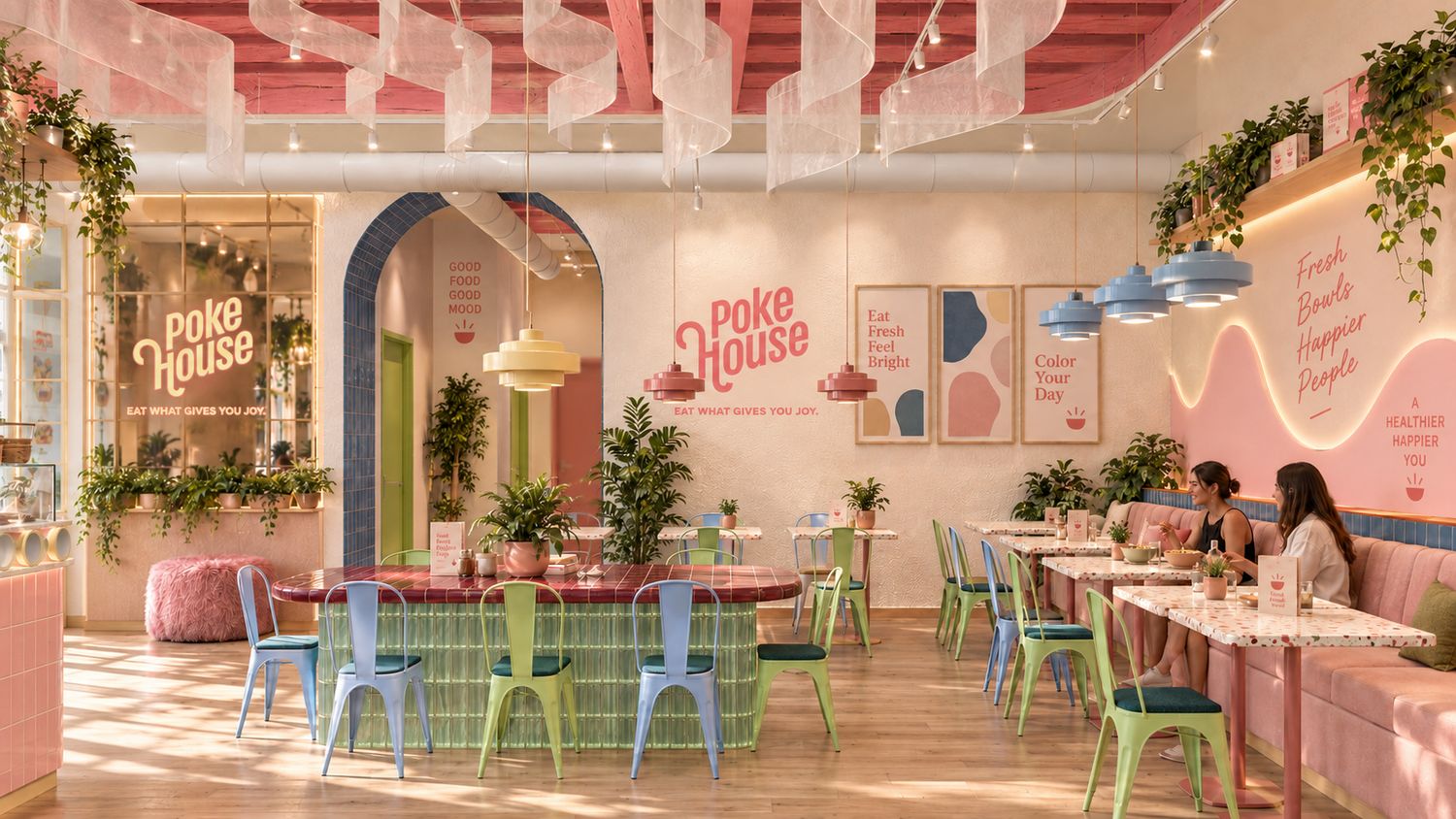
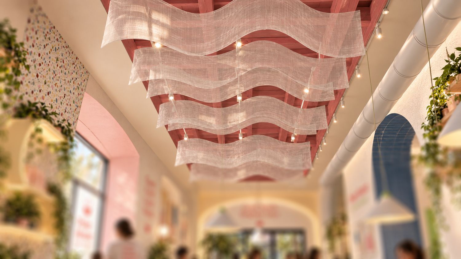
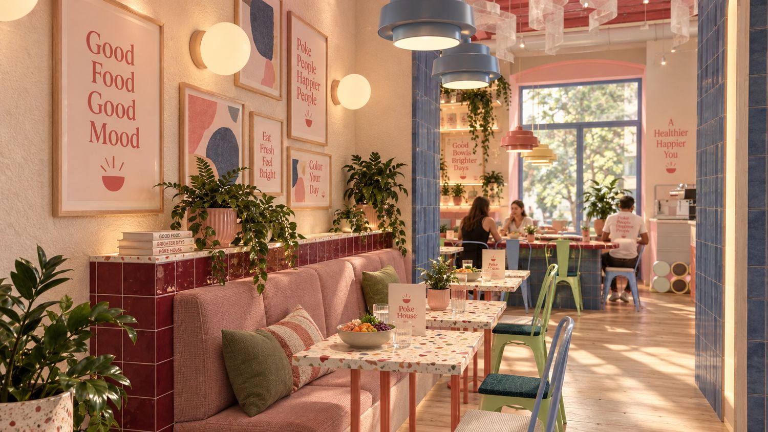
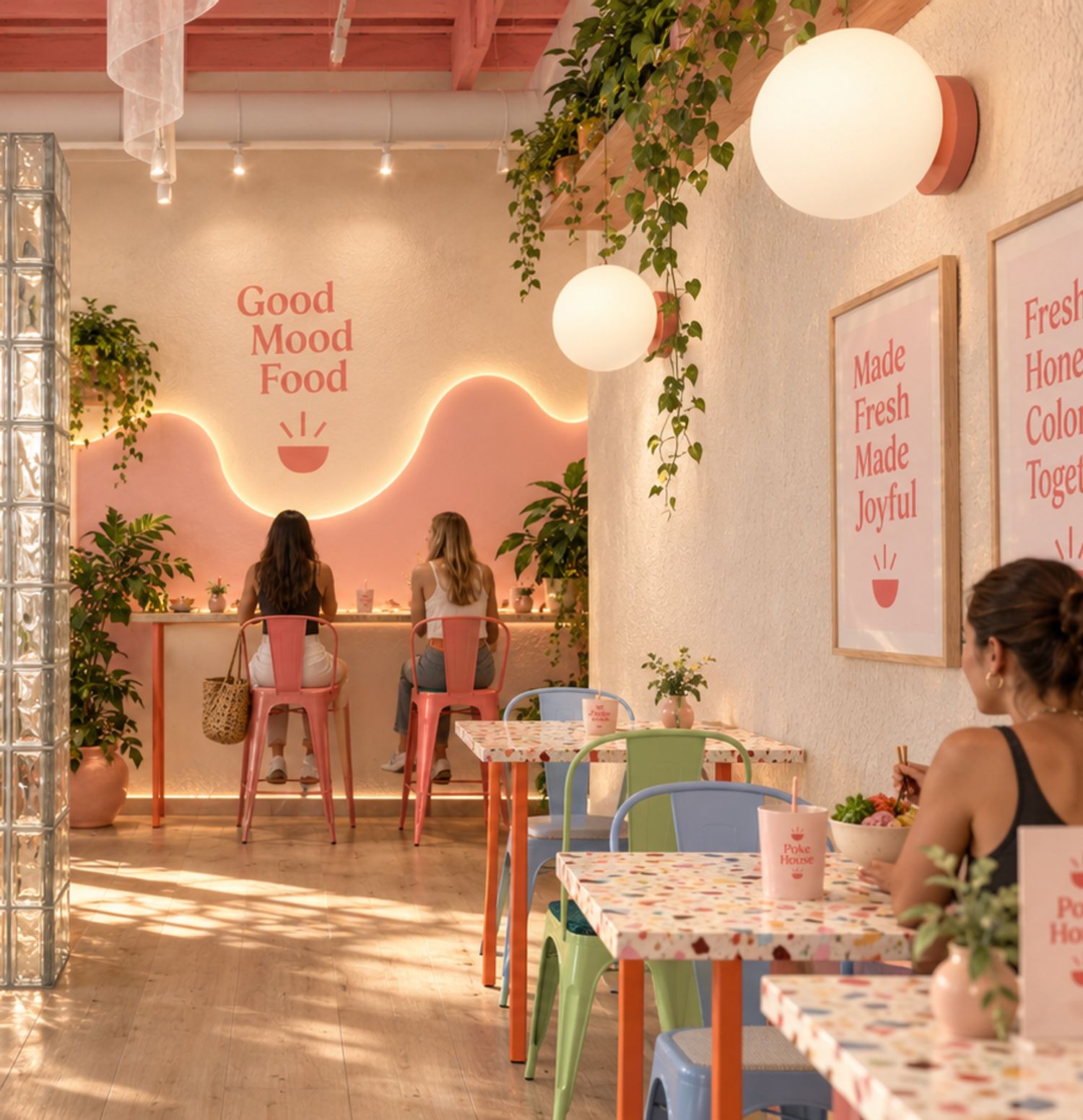
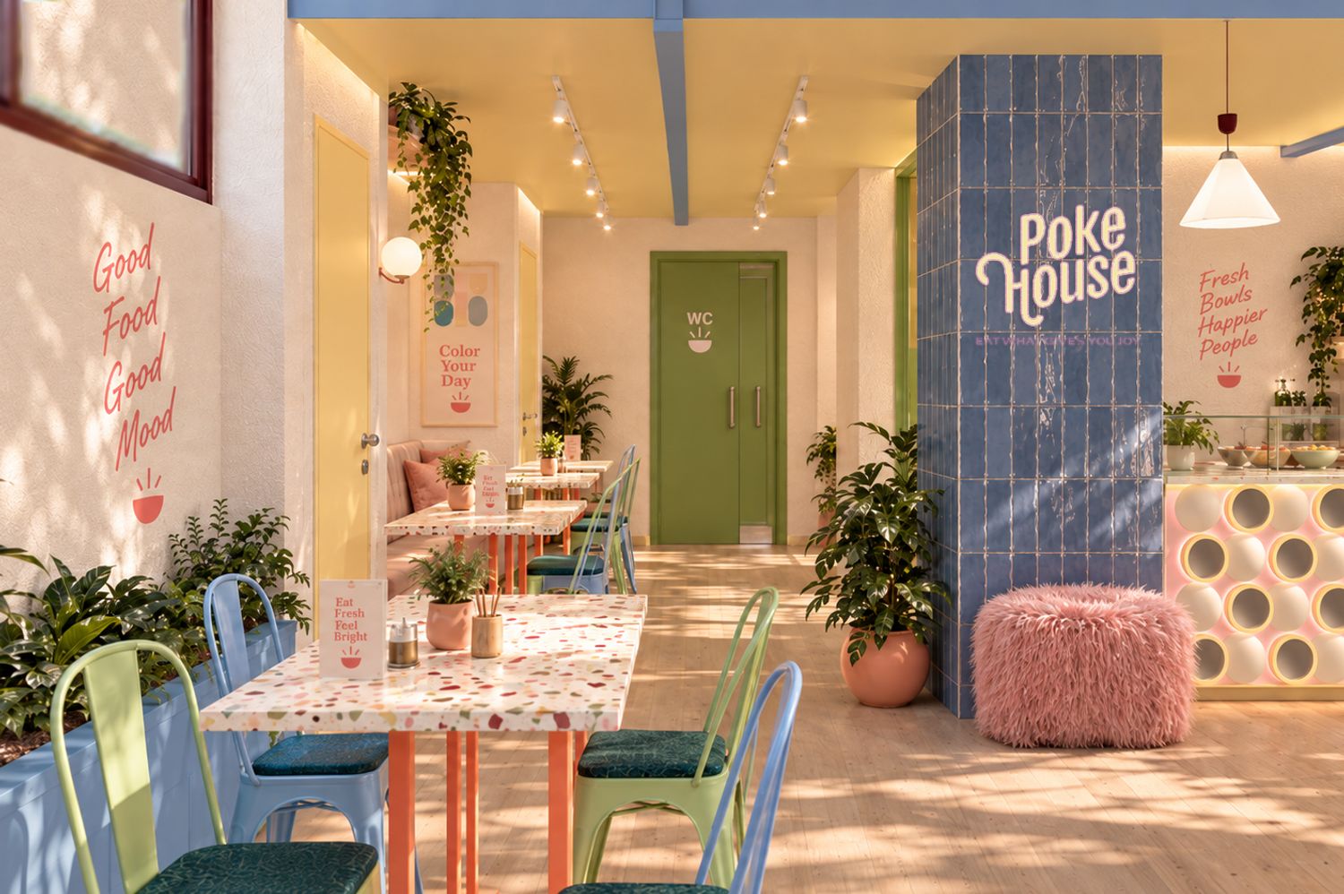
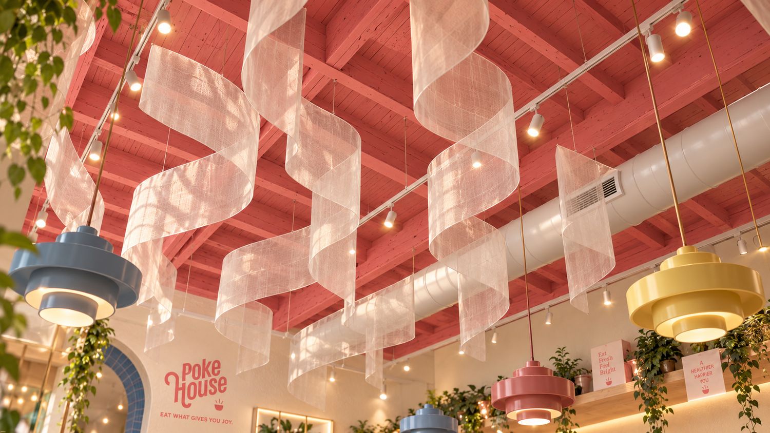
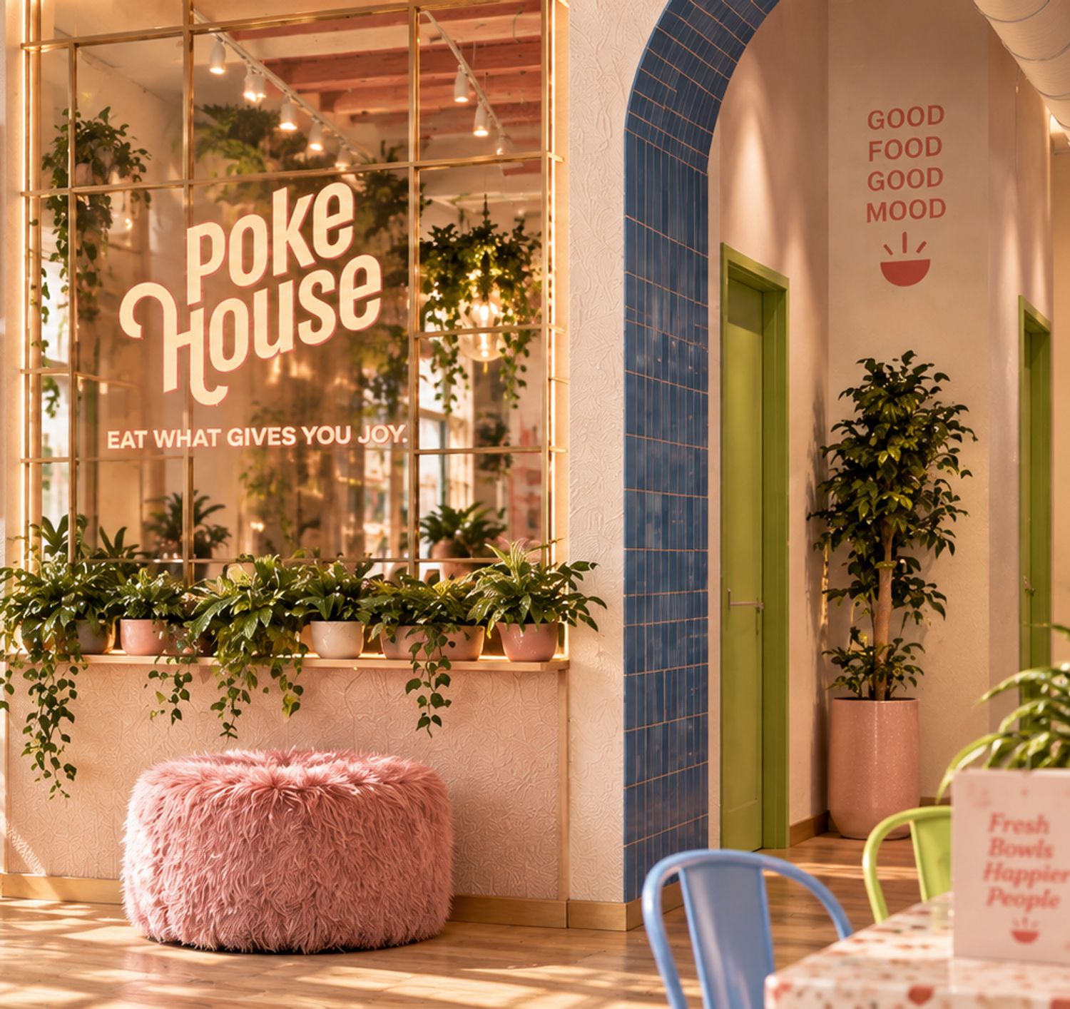
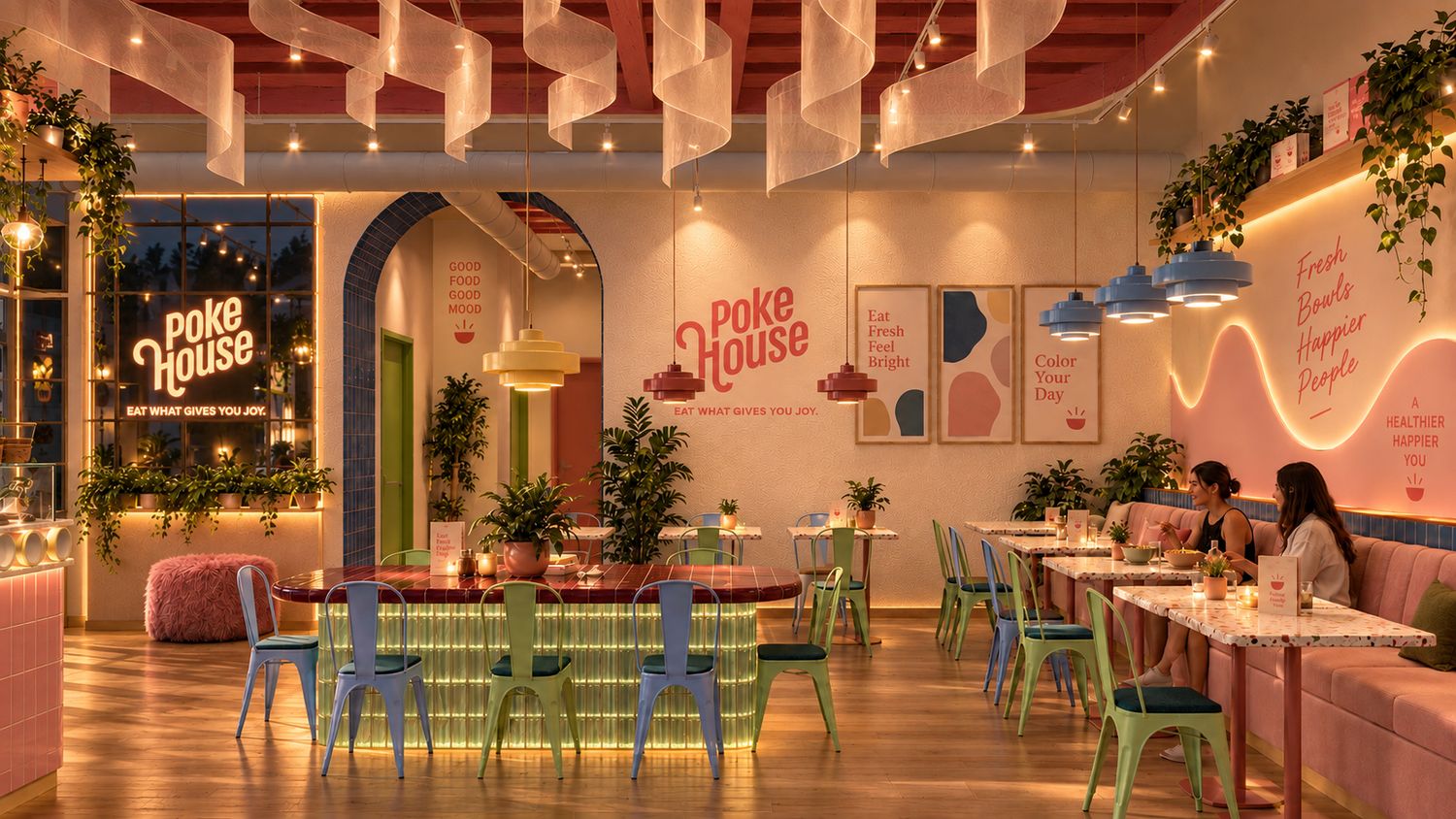
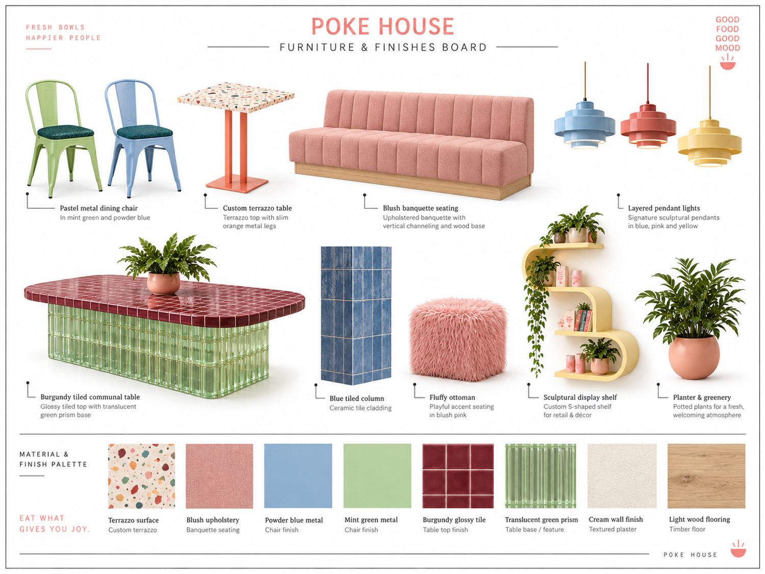
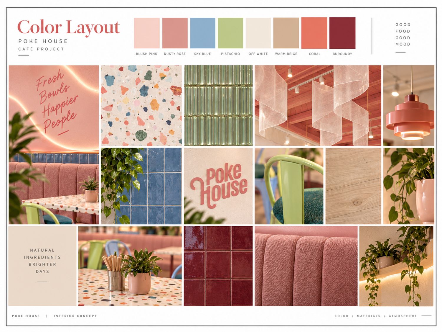
The interior develops around a soft, rounded design language. Pink painted timber beams create a strong architectural ceiling, combined with suspended translucent fabric elements that introduce movement, softness and visual lightness. Terrazzo surfaces, glossy colored tiles, translucent green glass prisms, textured plaster, warm timber flooring and upholstered seating create a layered material palette based on the Poke House colors. Burgundy, Pink Mochi, Butter Yellow, Olive Green and Icy Water are distributed throughout the space in a controlled way, giving each zone its own character while maintaining one consistent identity.
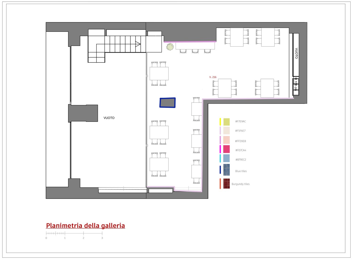
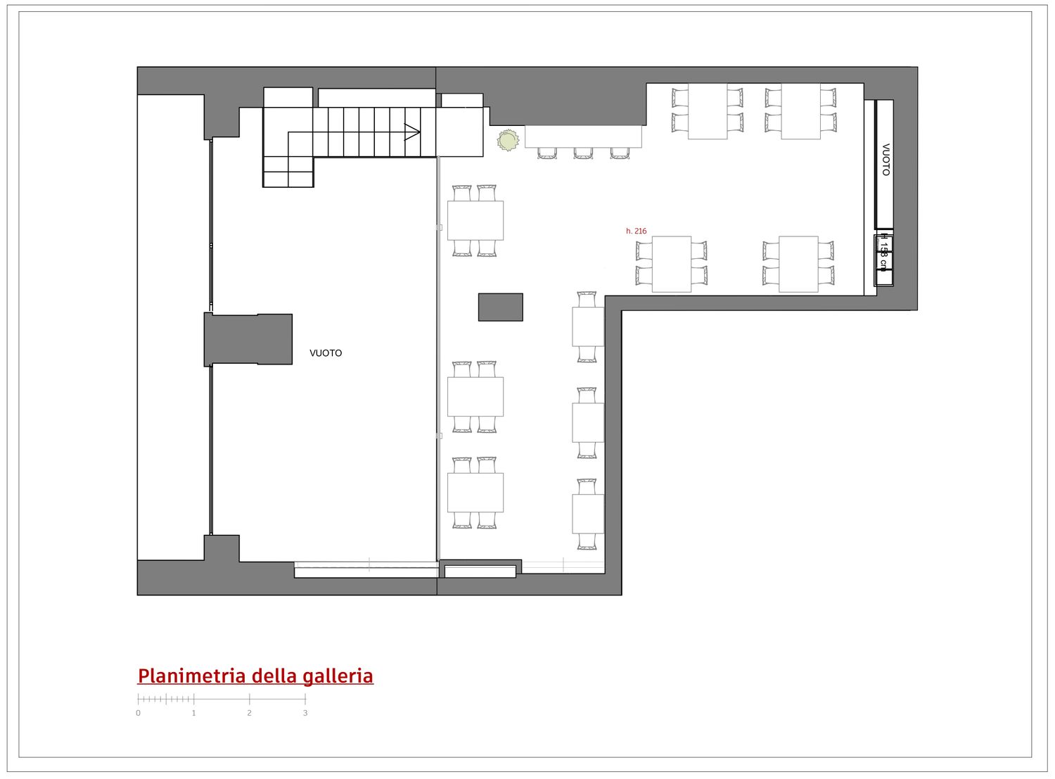
Different seating typologies support different ways of using the café: small tables for two, banquette seating, a large communal table and more informal seating areas. The central communal table becomes a social focal point, while the dedicated Social Networks Spot provides a recognizable photo moment integrated into the space rather than added as decoration.
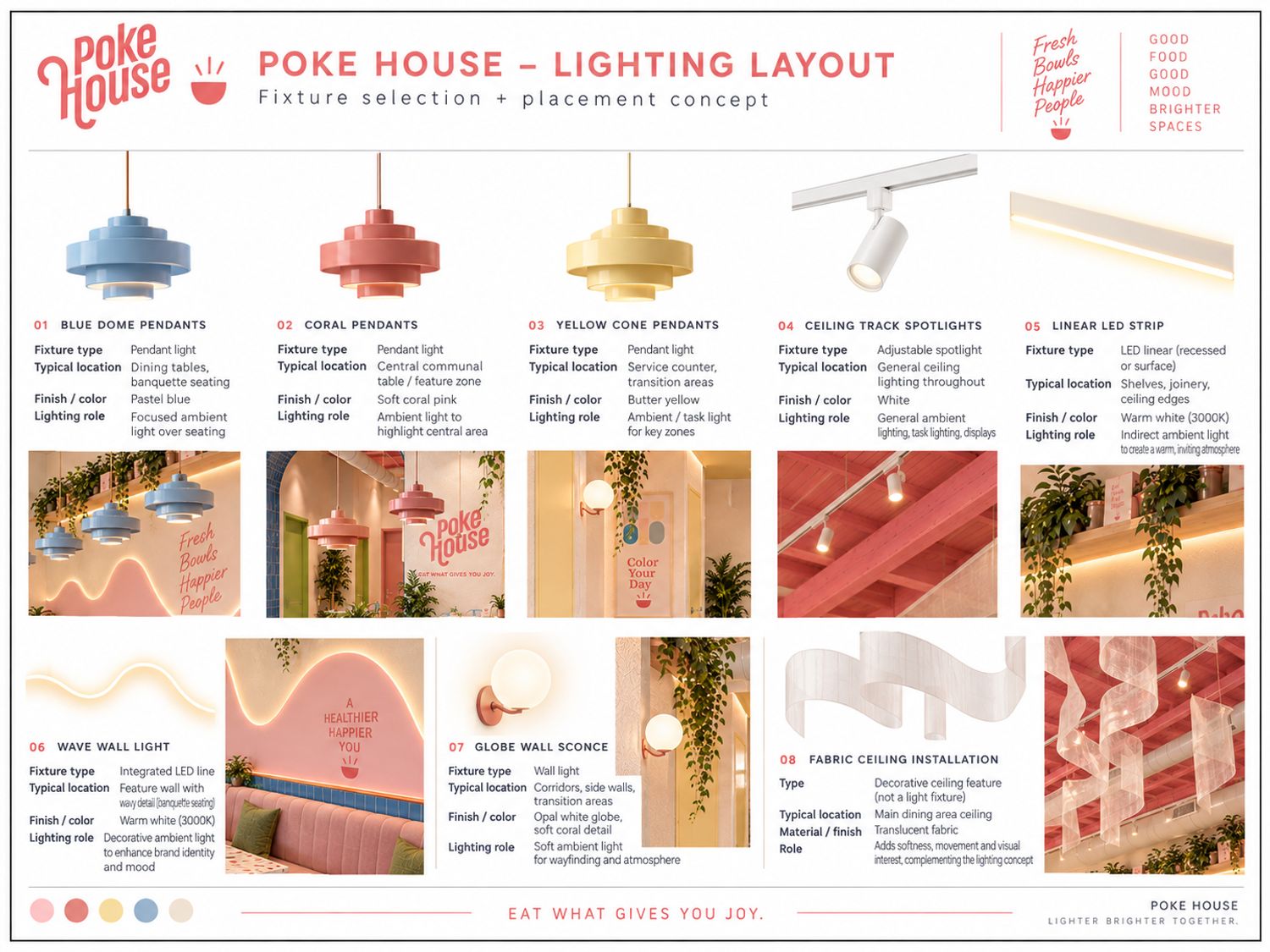
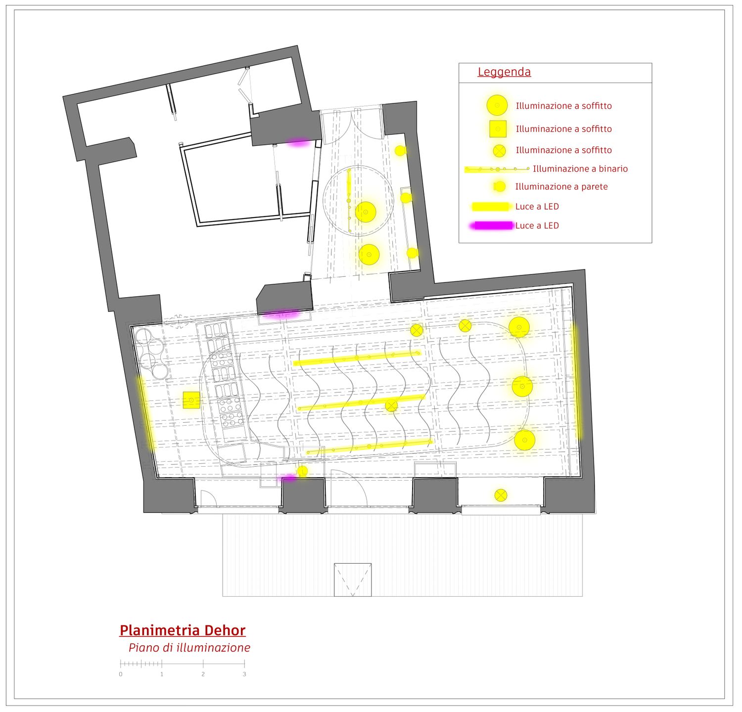
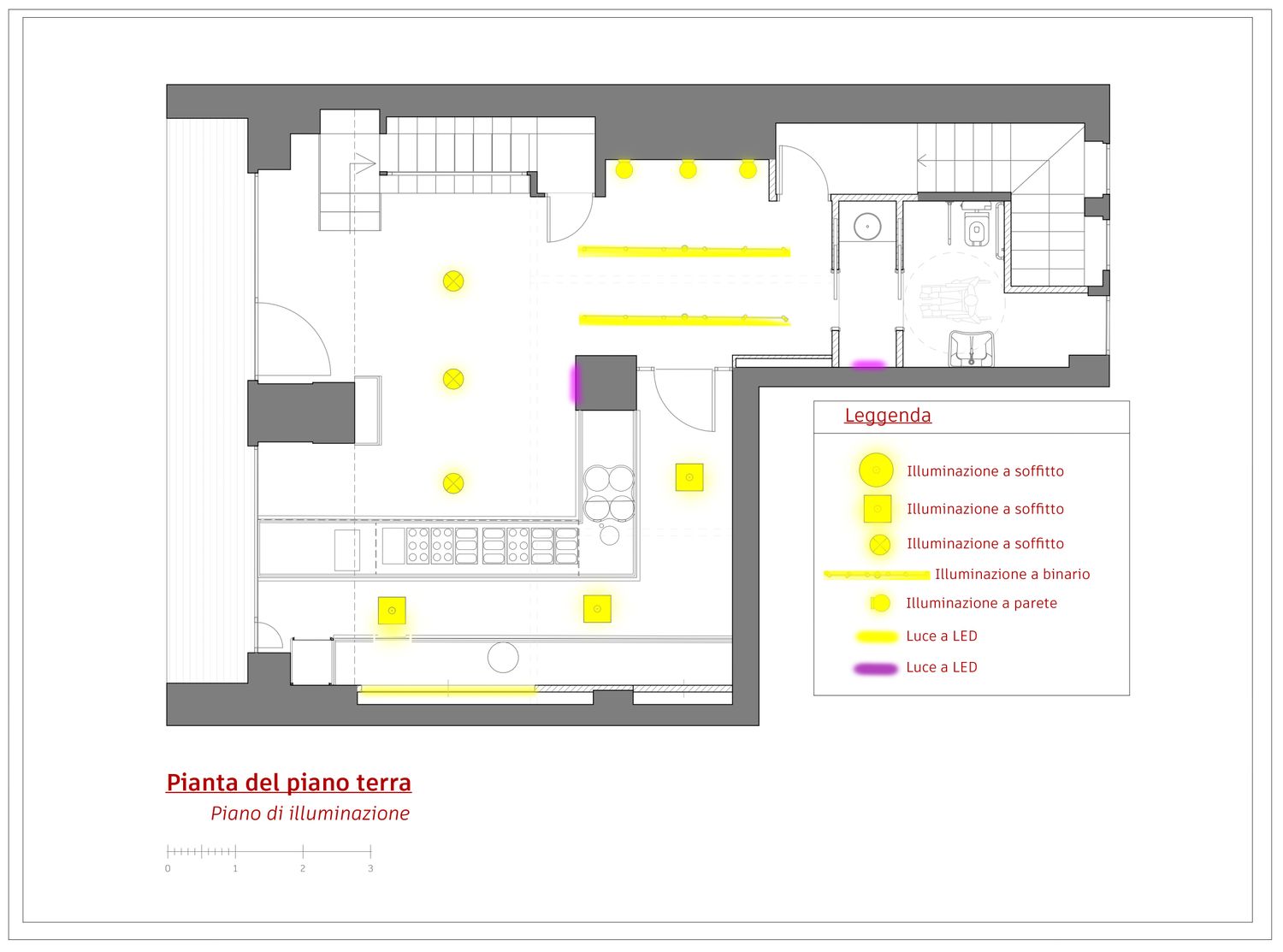
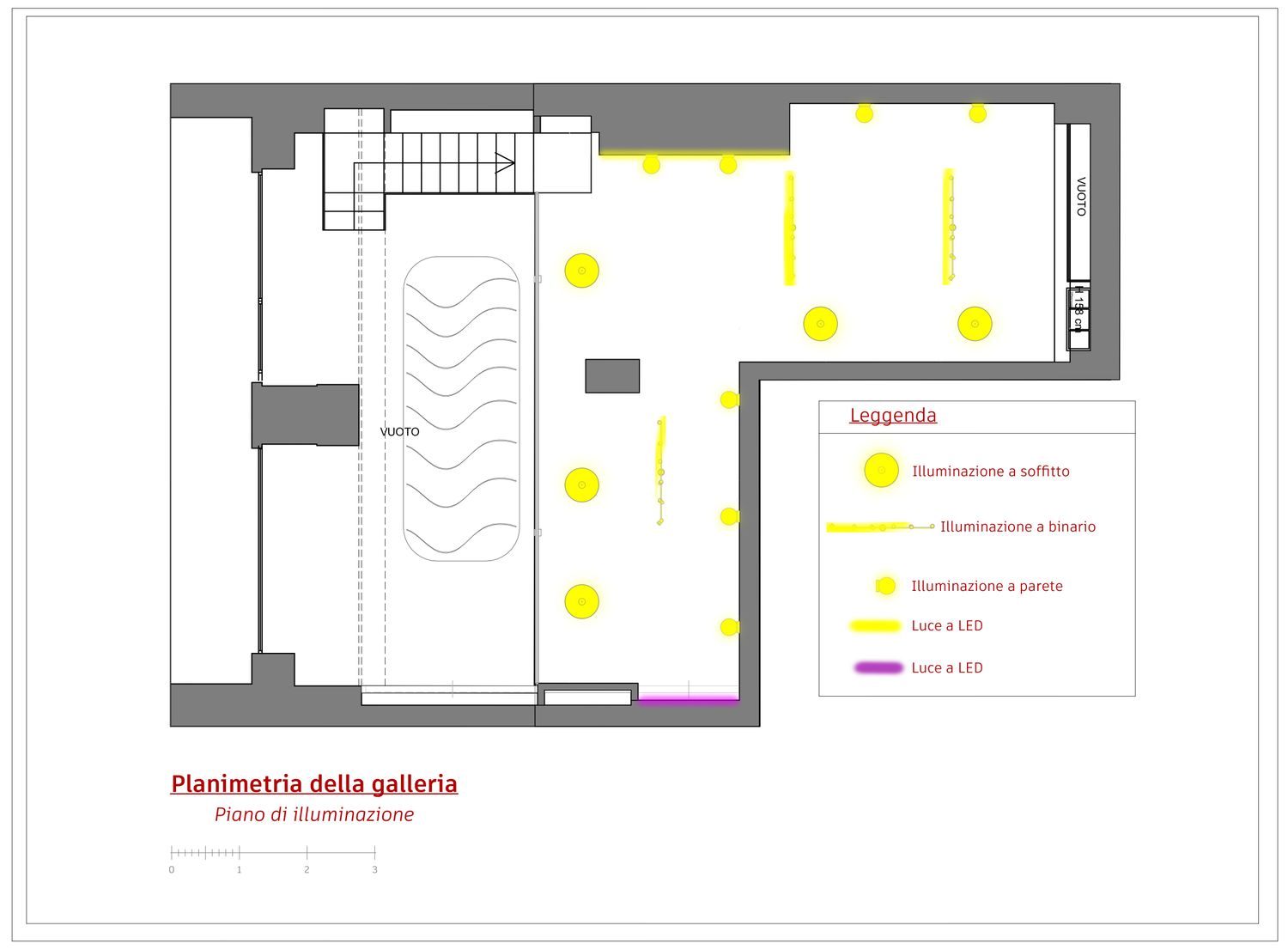
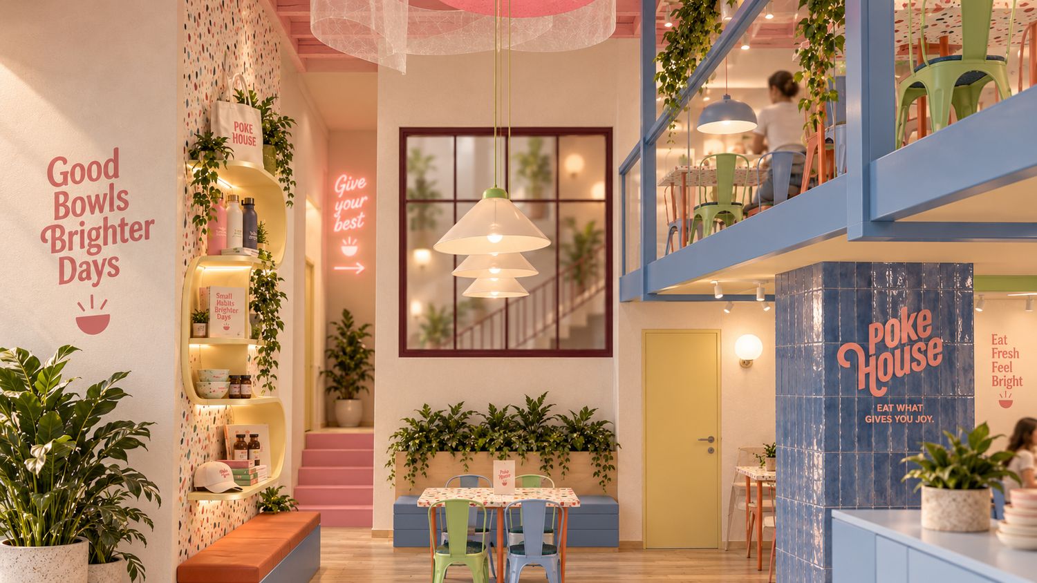
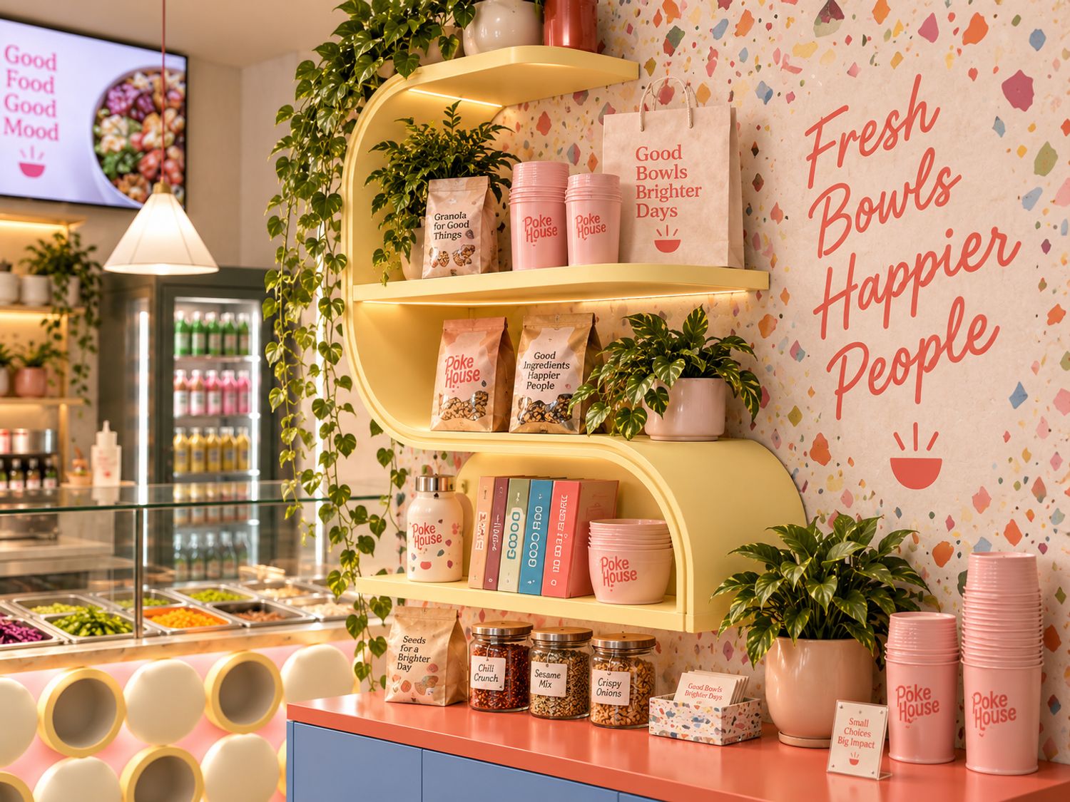
The merchandise corner is positioned as a natural extension of the customer experience, with an S shaped sculptural shelf displaying branded bowls, bottles, packaging and accessories. Lighting combines colorful pendant fixtures, track spotlights, integrated LED lines and illuminated wall graphics to create both functional clarity and a warm evening atmosphere.
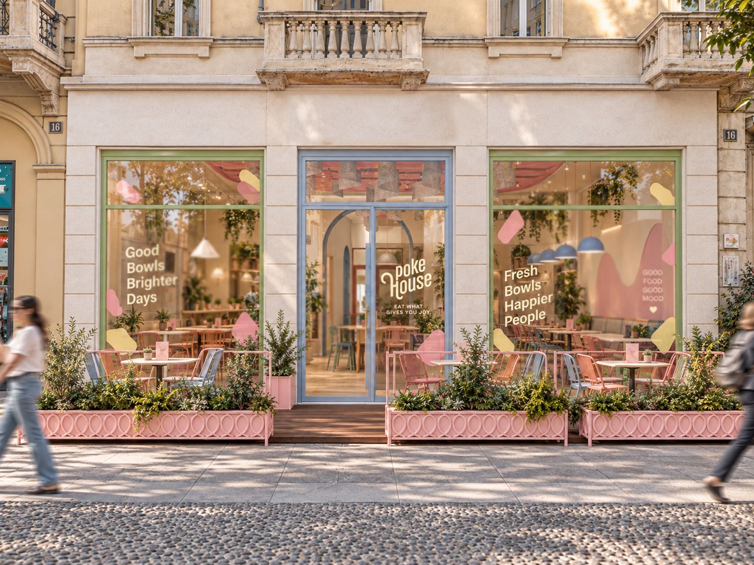
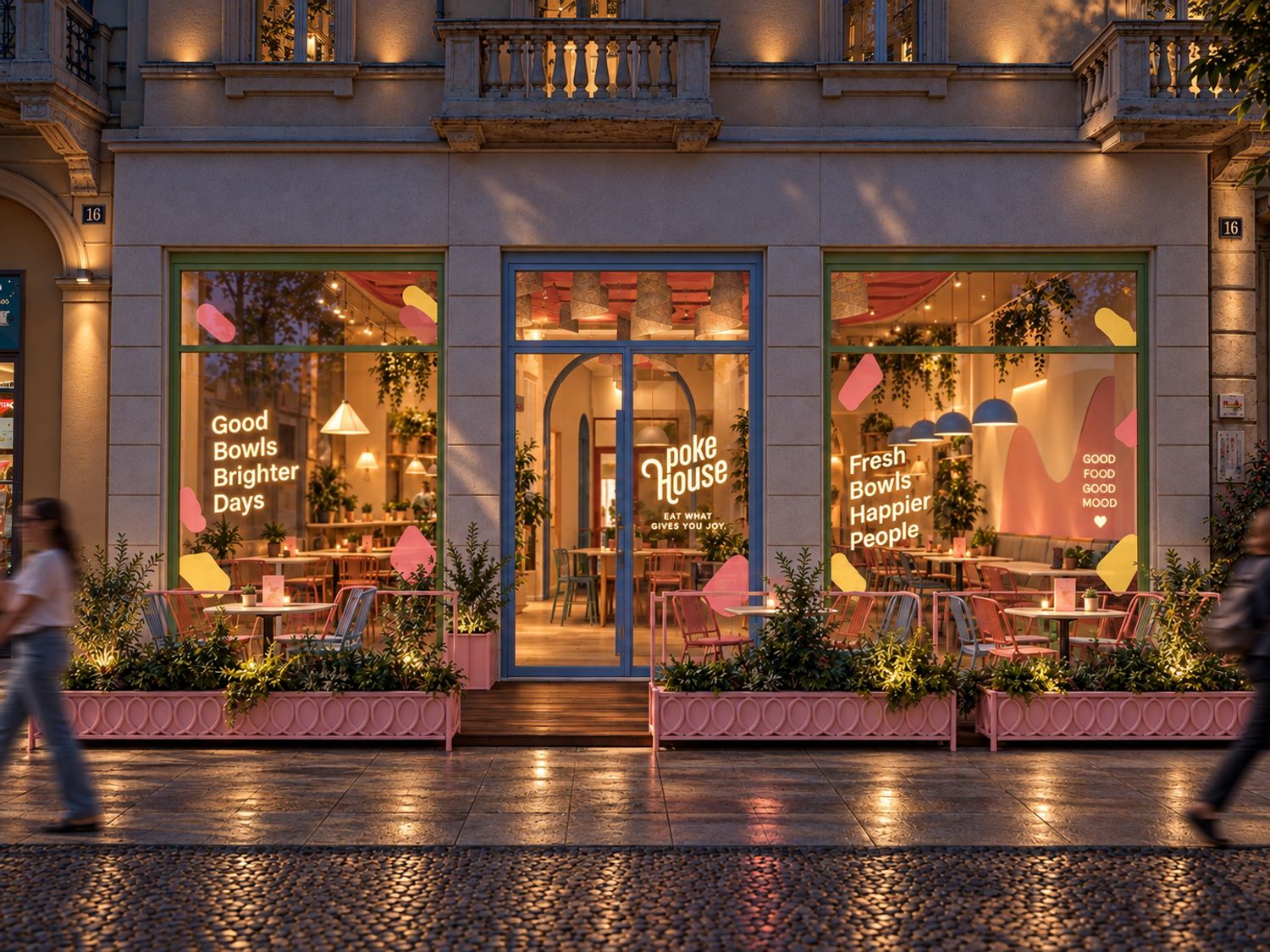
The storefront continues the same language through colored frames, semi-transparent graphic applications and branded messages, allowing the interior to remain visible and inviting from the street. The result is a flexible, memorable and highly shareable Poke House concept: playful but controlled, expressive but functional, and unmistakably connected to the brand’s new message — Eat What Gives You Joy.