
Milan, Metropolitan City of Milan, Italy
Residential - Loft
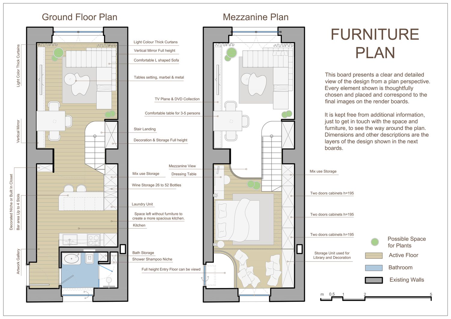
Dear client, it was a delight working with this projects, compact space yet rich in possibilities. I have divided the project description into sections to better understand the design and its elements.
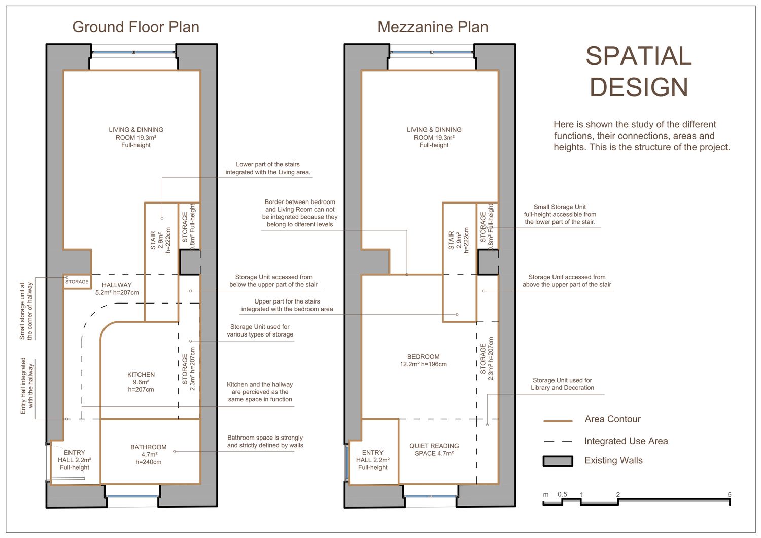
SPATIAL DESIGN
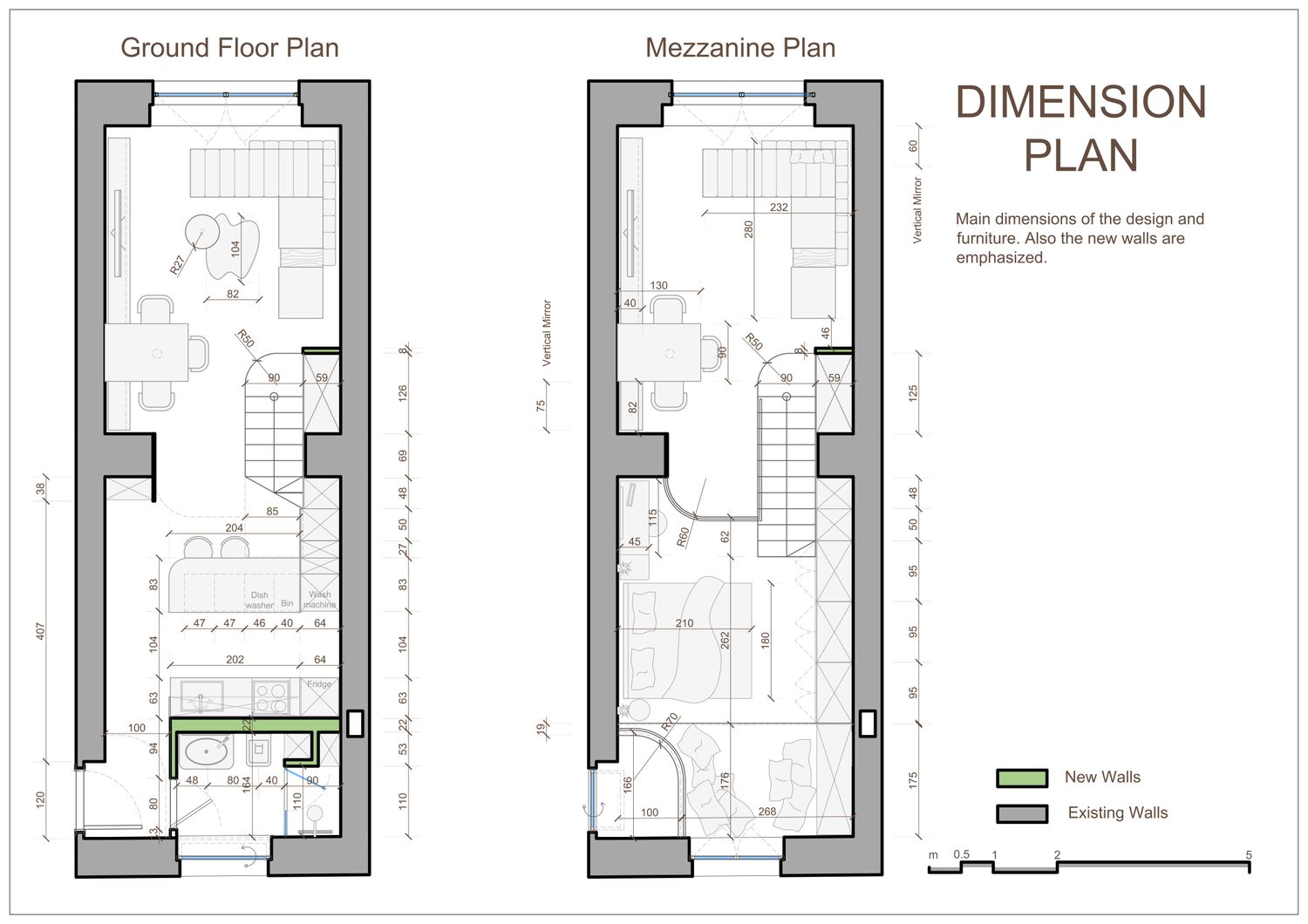
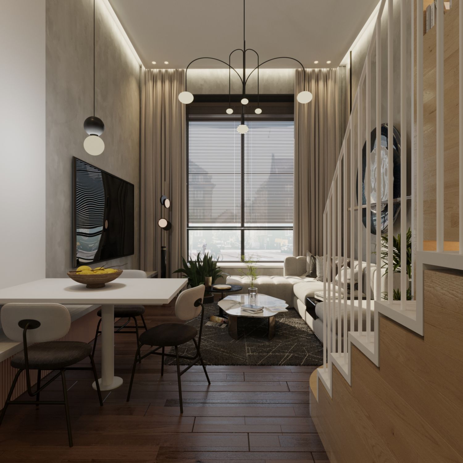
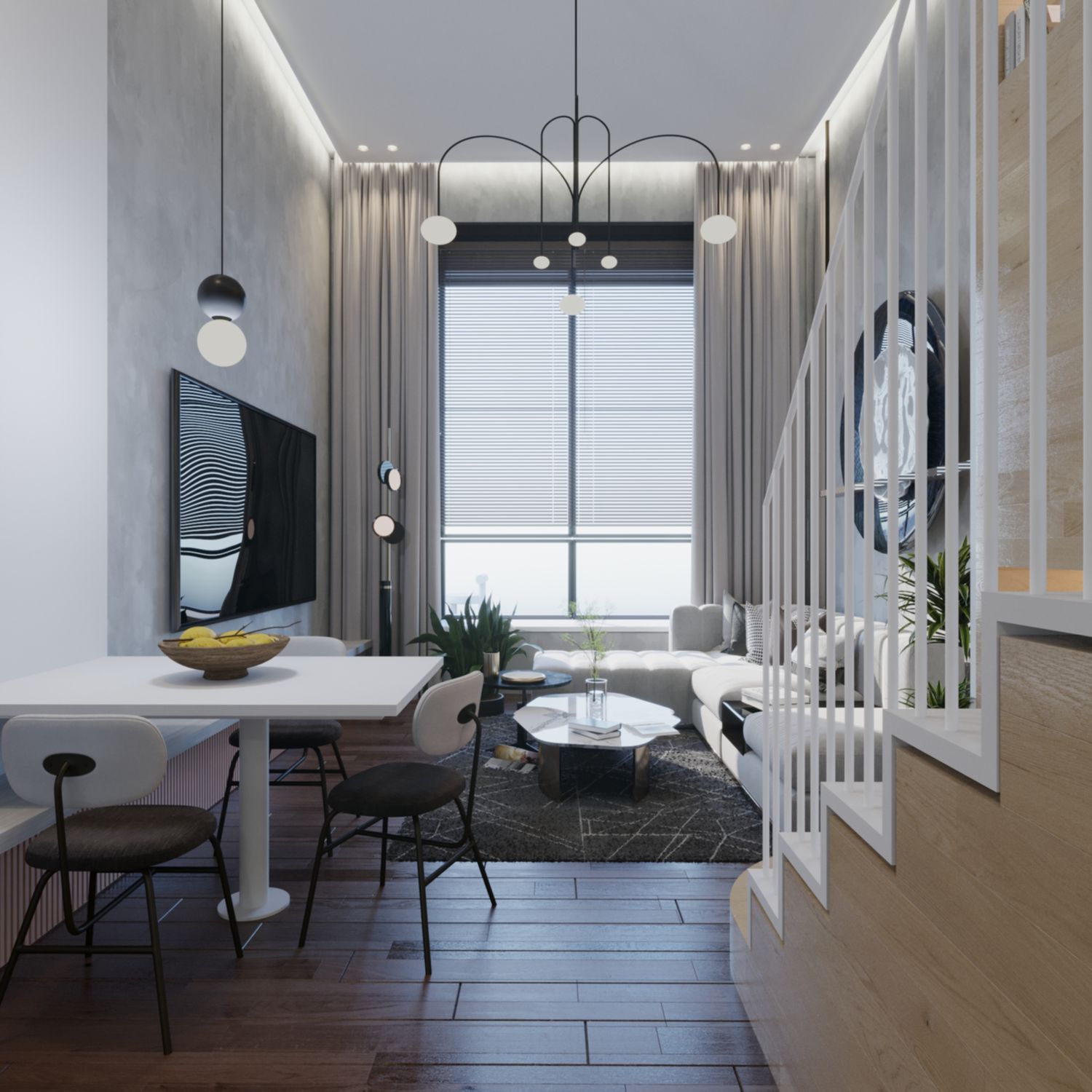
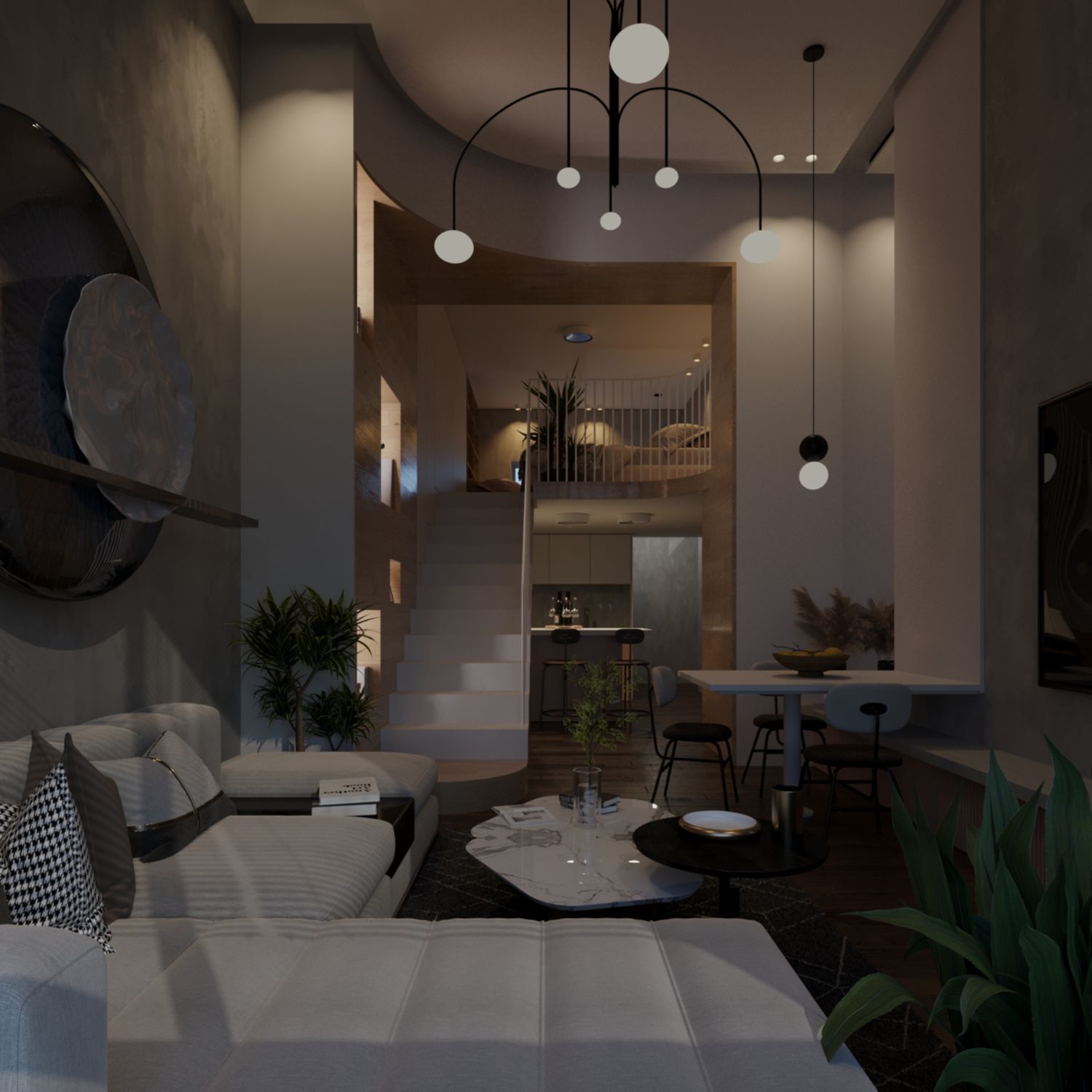
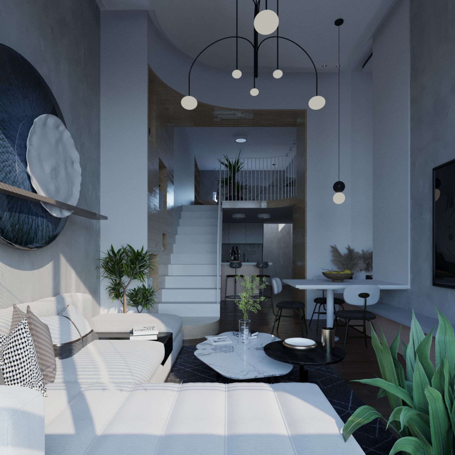
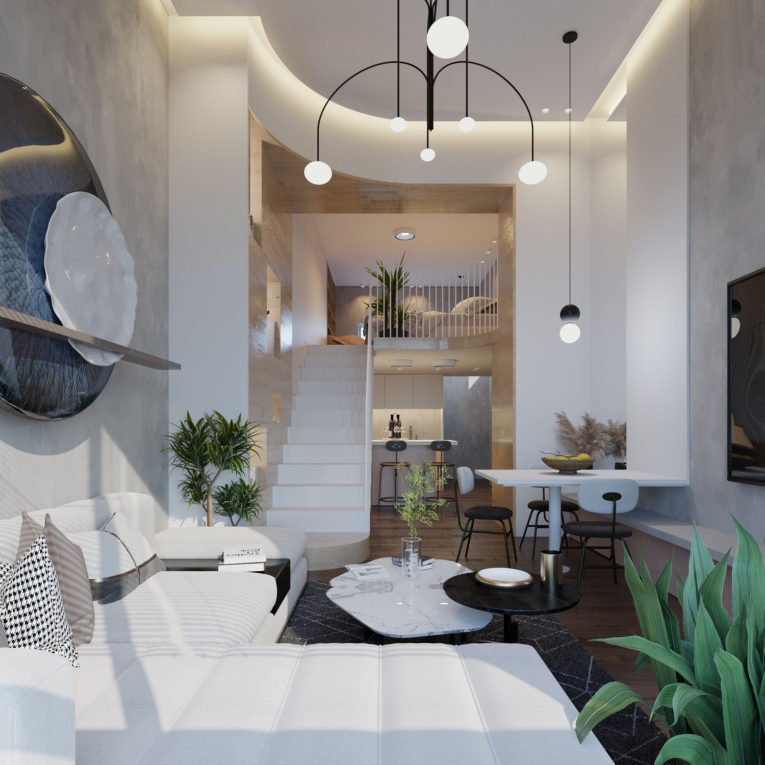
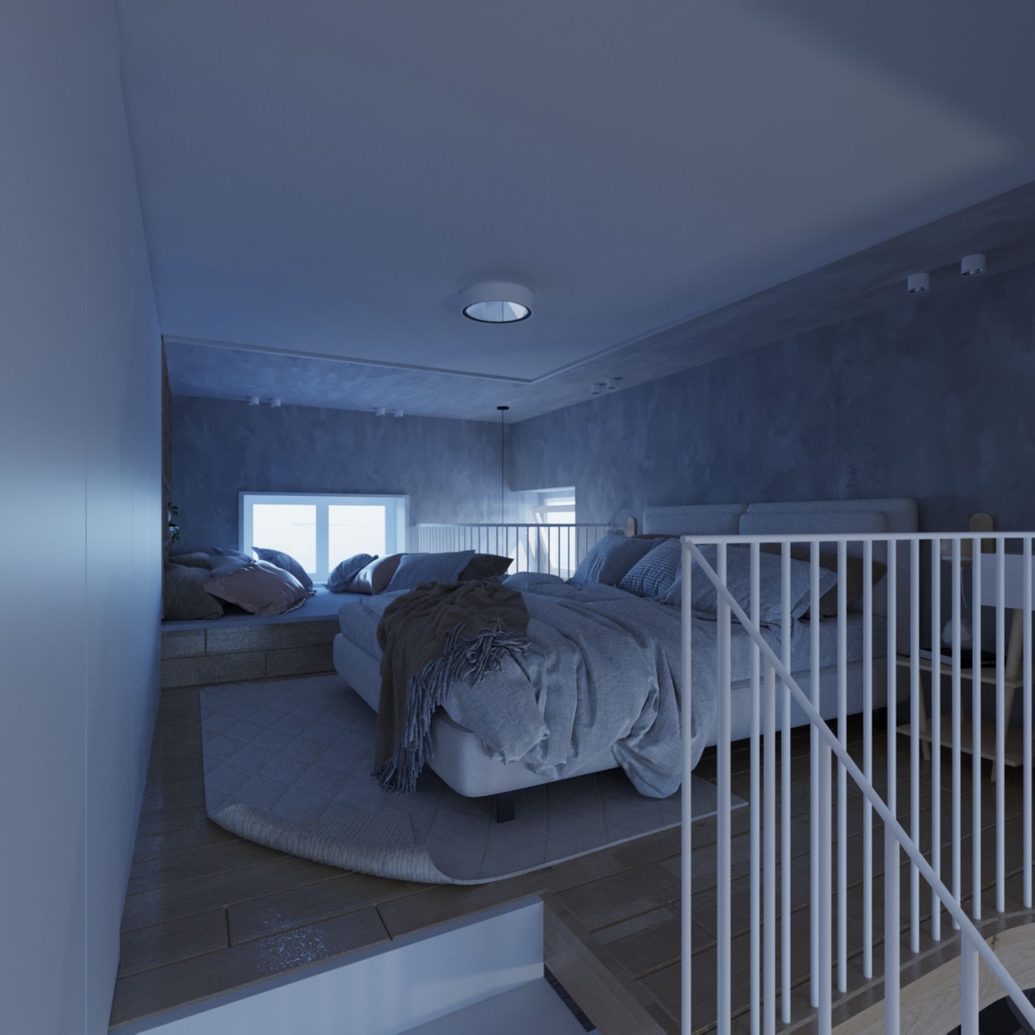
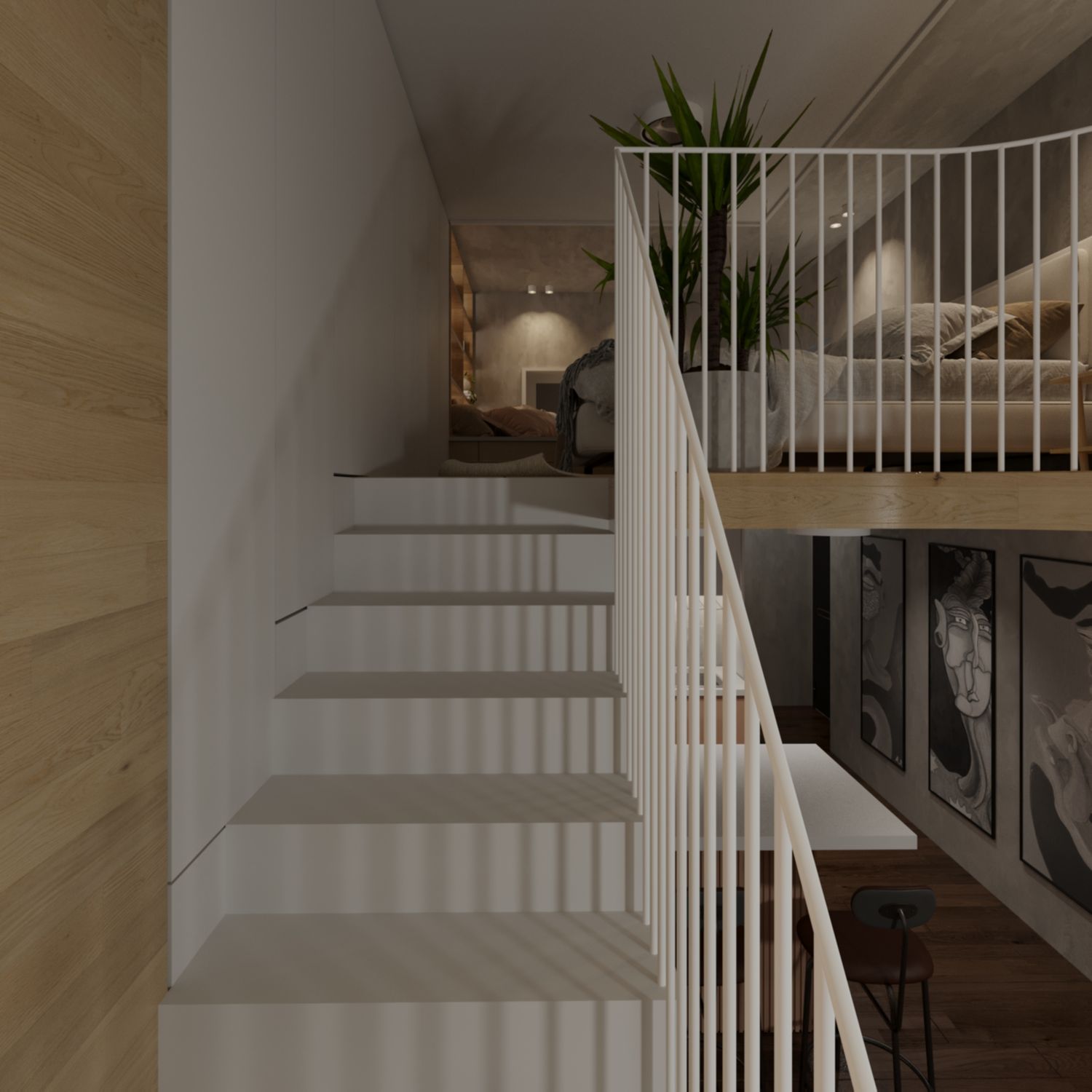
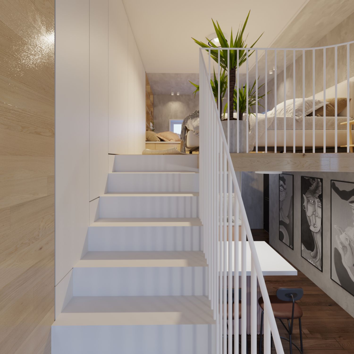
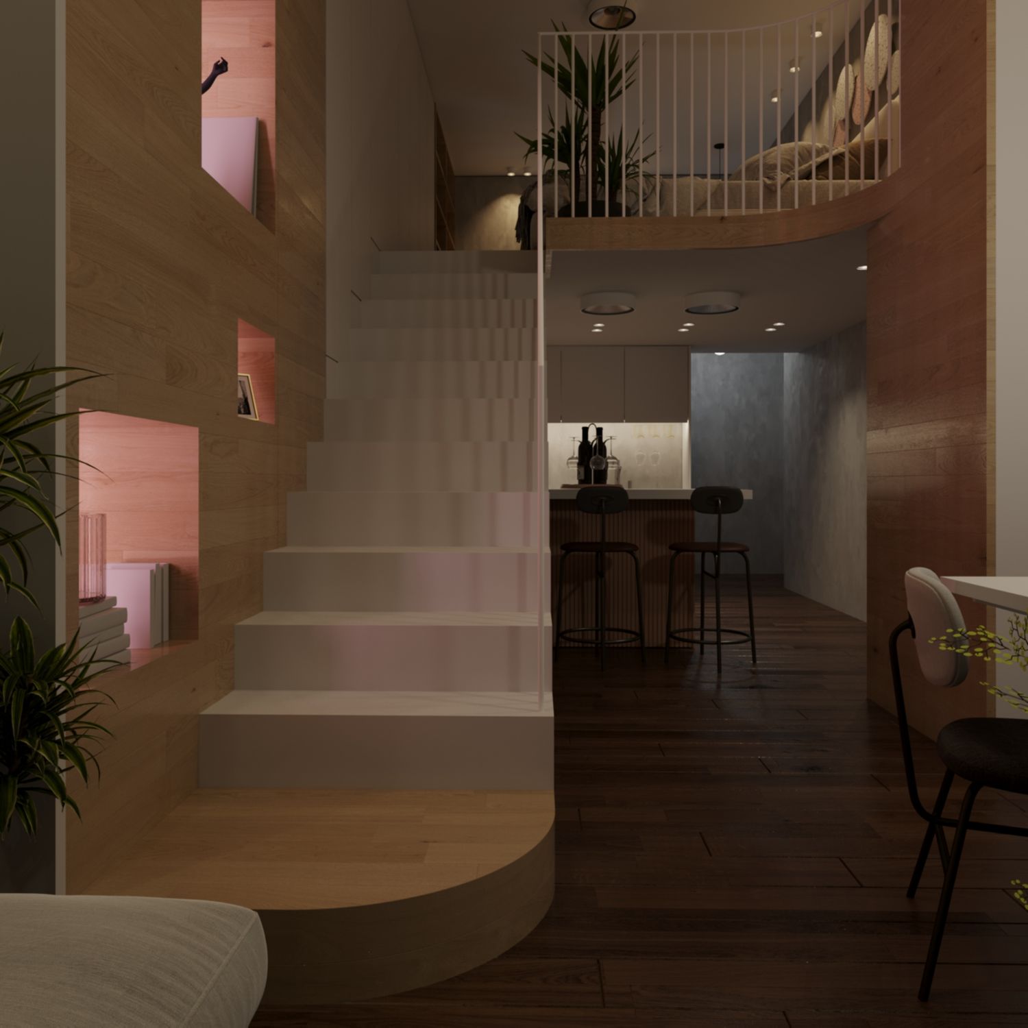
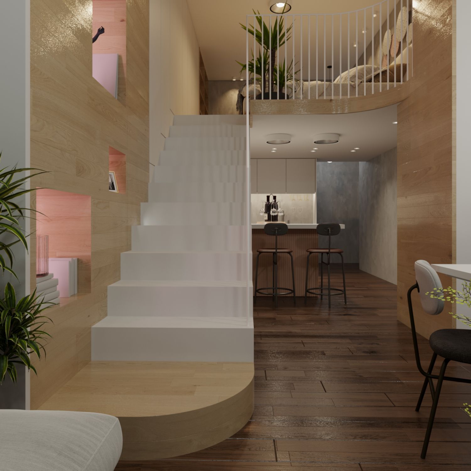
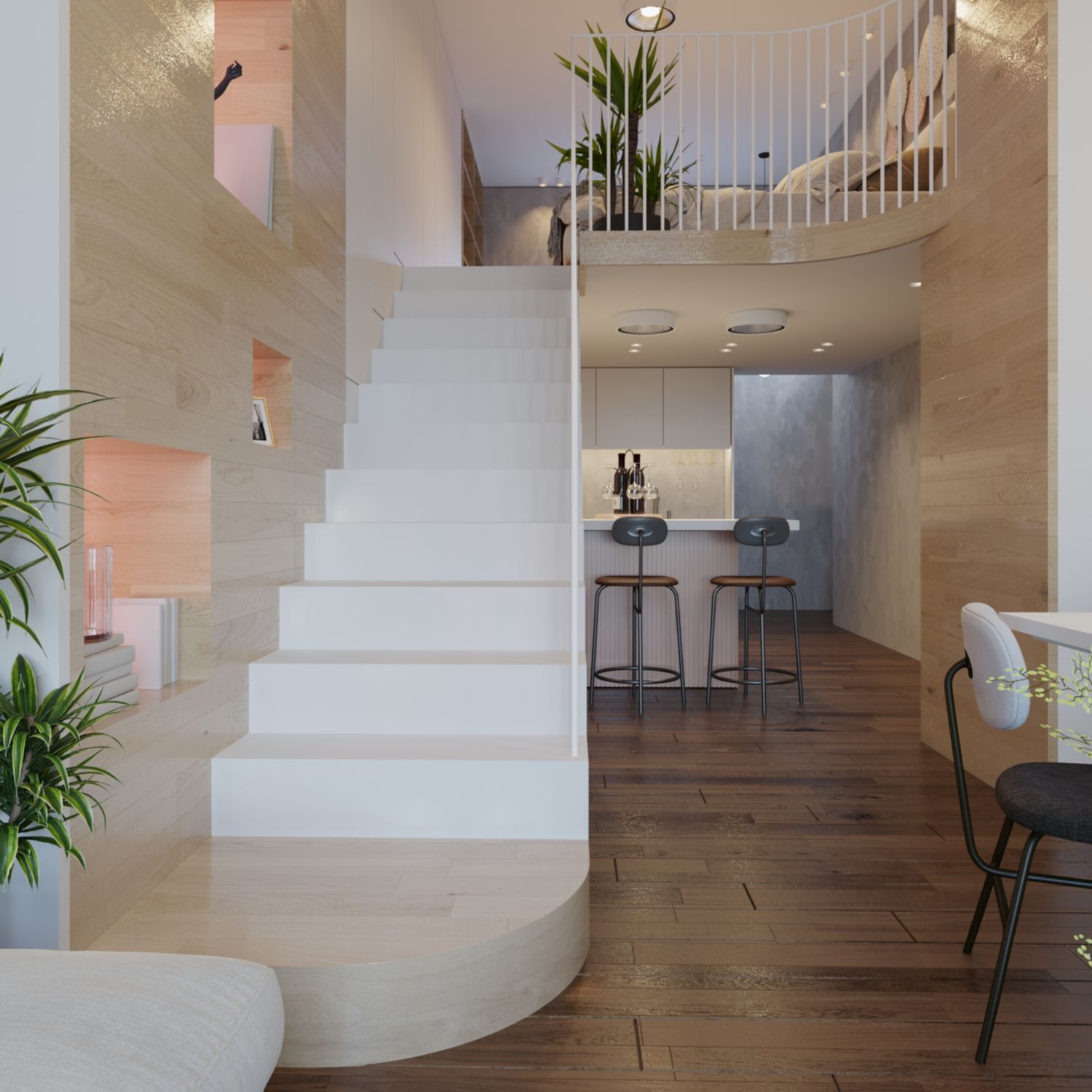
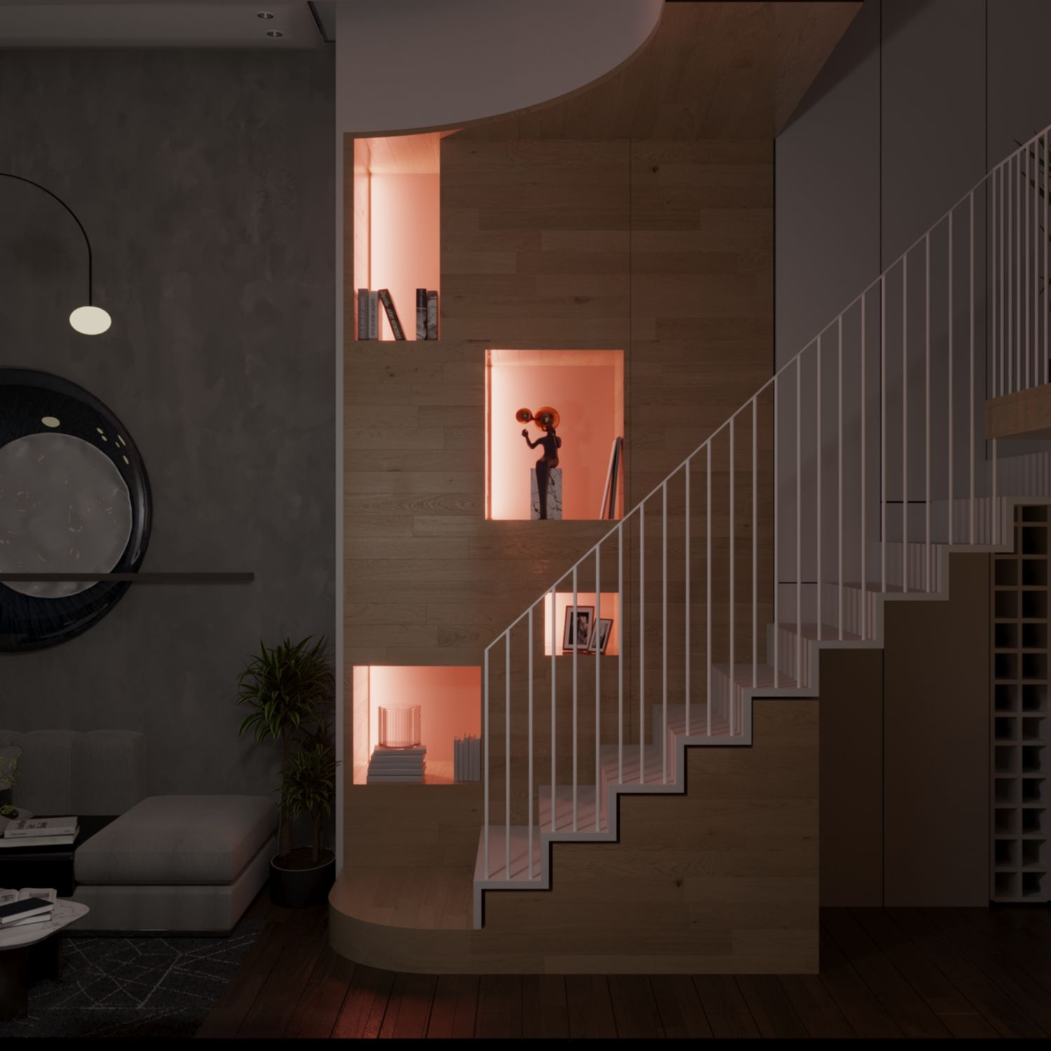
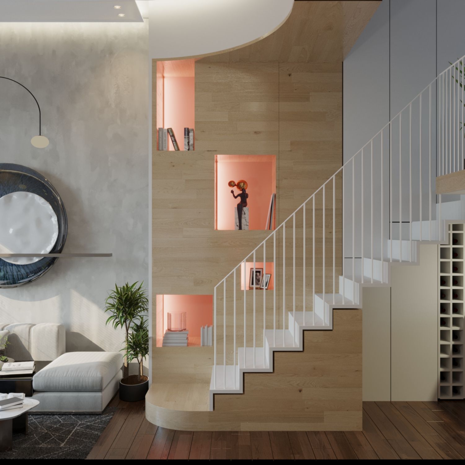
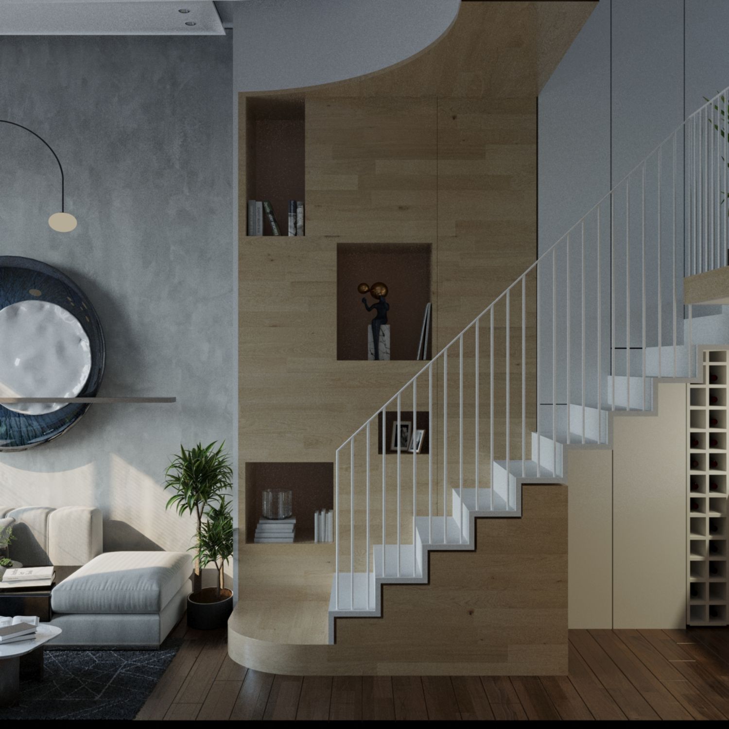
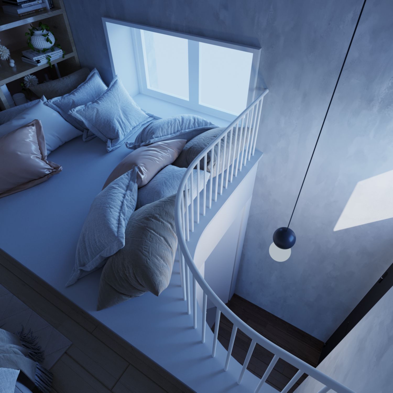
First comes the study of space. This proposal makes use of the space available very efficiently without wasting a single bit. The existing structural columns naturally divide the area into two main portions. Step one it the placement of the stair, located between the two portions for four reasons, 1) to share the spatial load 2) to link these two areas 3) to make efficient use from above of the lower part of the stair from one portion and from below for the upper part from the other portion and 4) to merge the space it slices with the adjacent areas to create a feeling of expansion of each section. Always keeping in mind the mandated height of the stair overhead dimension more than 210cm. Next to the right is created a long unit of storage which servers both levels, the ground floor and the mezzanine and it integrates with the various adjacent functions for example it becomes kitchen storage and fridge near to the kitchen, storage along the stairs and clothes cabinets at the mezzanine level. It fulfills all of the apartment needs for storage. So naturally comes the placement of the bathroom, kitchen, Living & Dining Room, Bedroom and a Reading niche over the bathroom. The Entry Hall together with the Living Room use the full height of the space, to create the feeling of spaciousness.
Since all of the plan is an open plan (except for the bathroom), in the spatial plan are shown with dashed lines the integration and perceived area of adjacent functions into each other.
NATURAL LIGHT STUDY
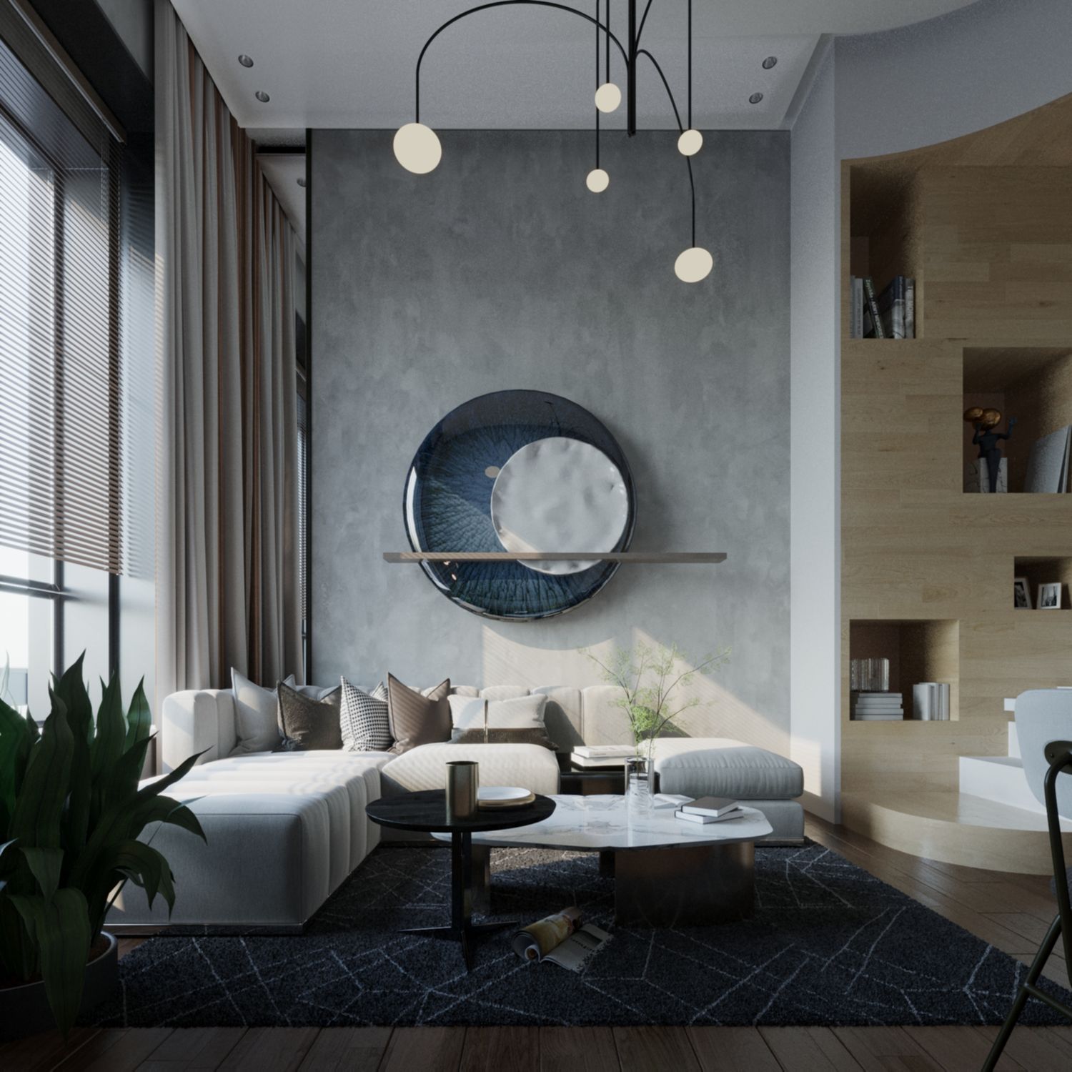
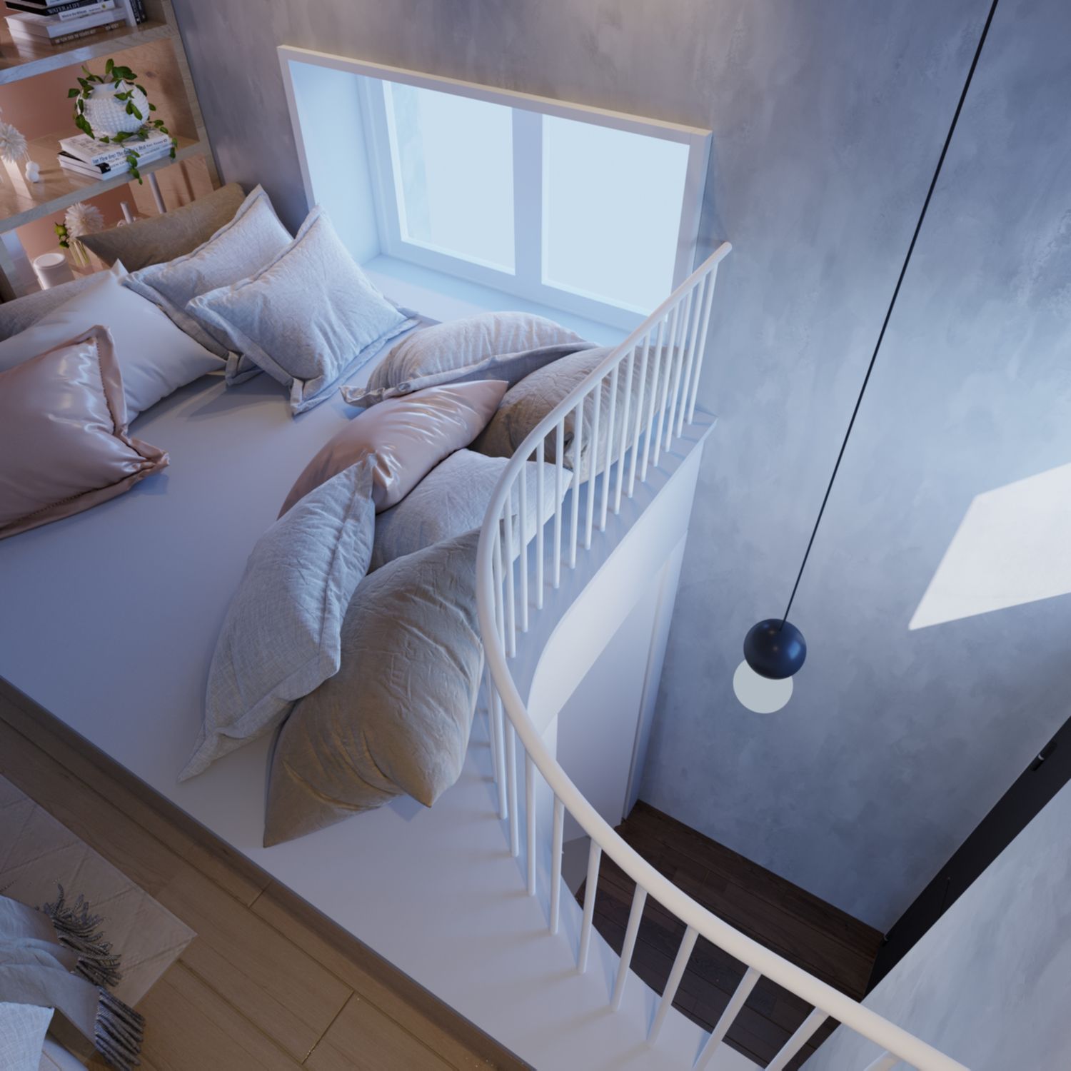
There are three natural light sources in the apartment. The high front window, the back window and the overhead window at the entry. To maximize the quantity of diffuse lightning in space I try to maintain the most possible area of natural light transmitting surfaces. The proposed interventions for each window are discussed below at the section the are part of. Some of the renders focus on the natural light study undergone in this project.
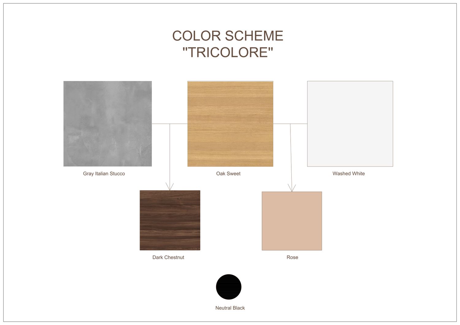
COLOR SCHEME
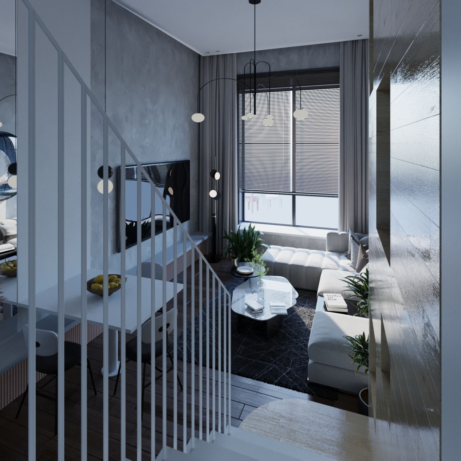
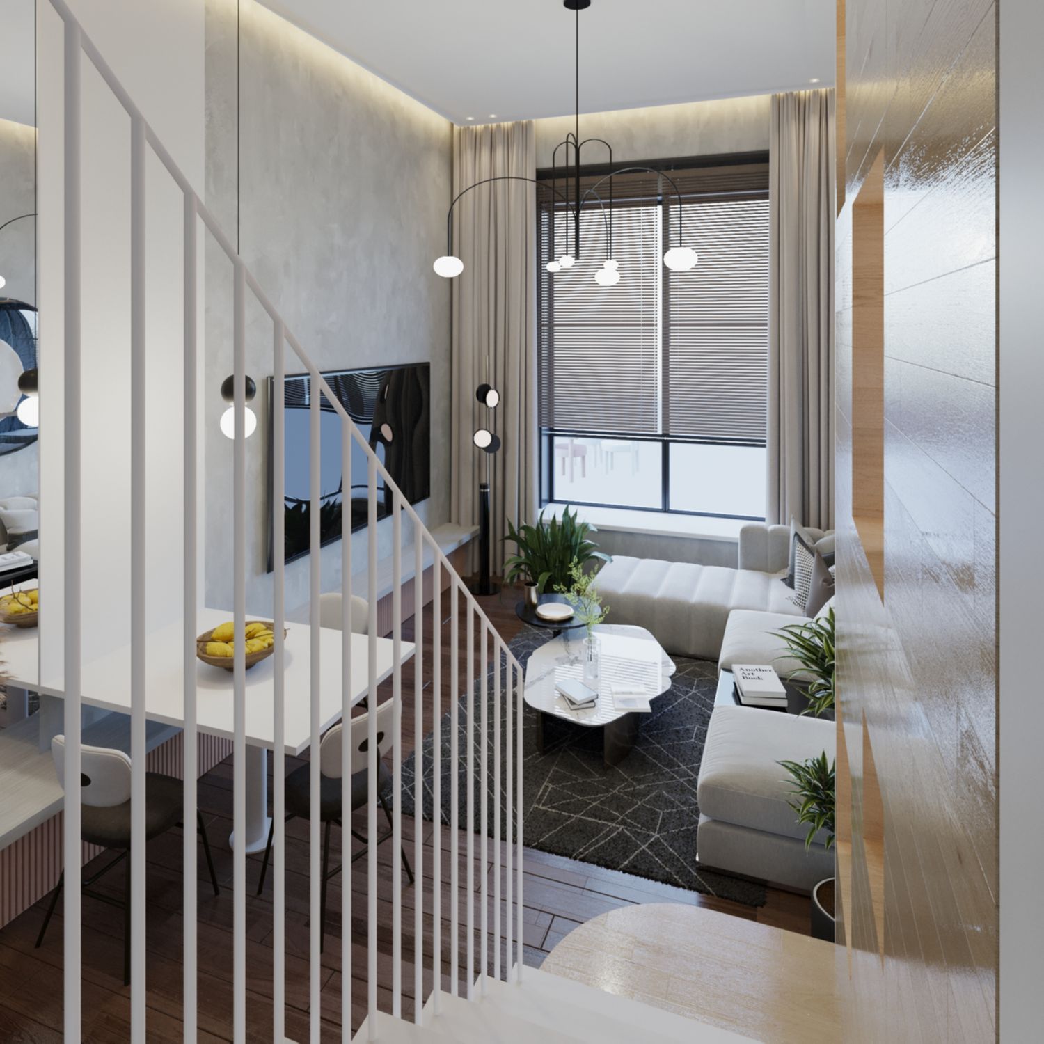
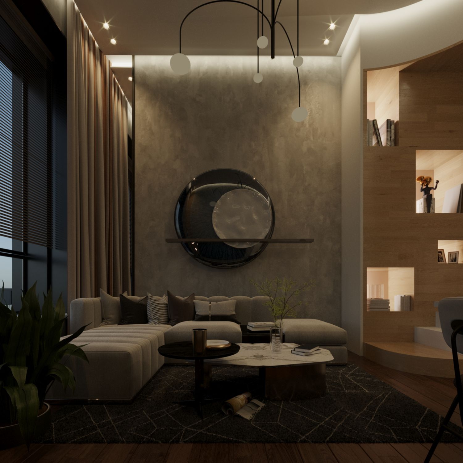
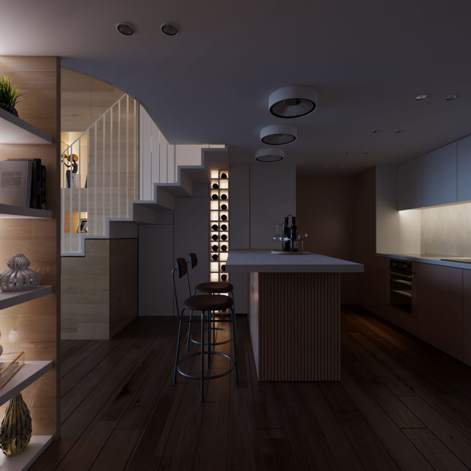
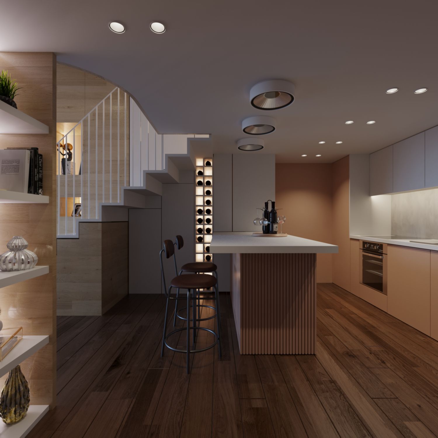
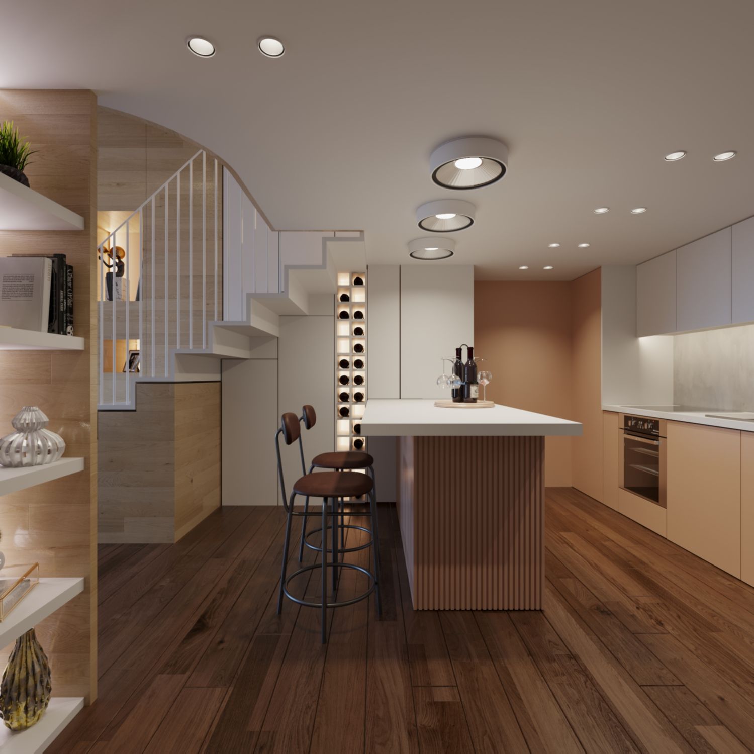
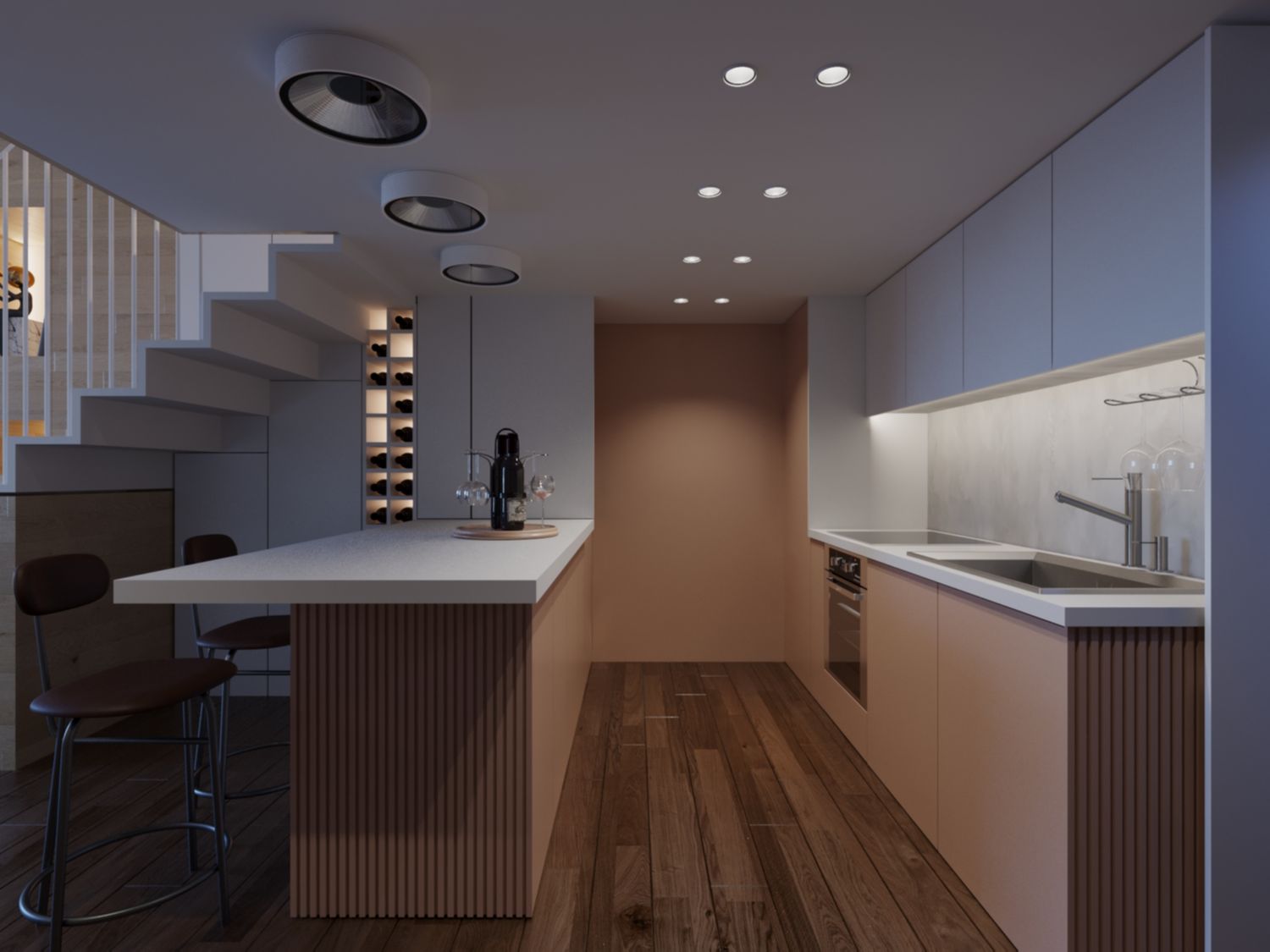
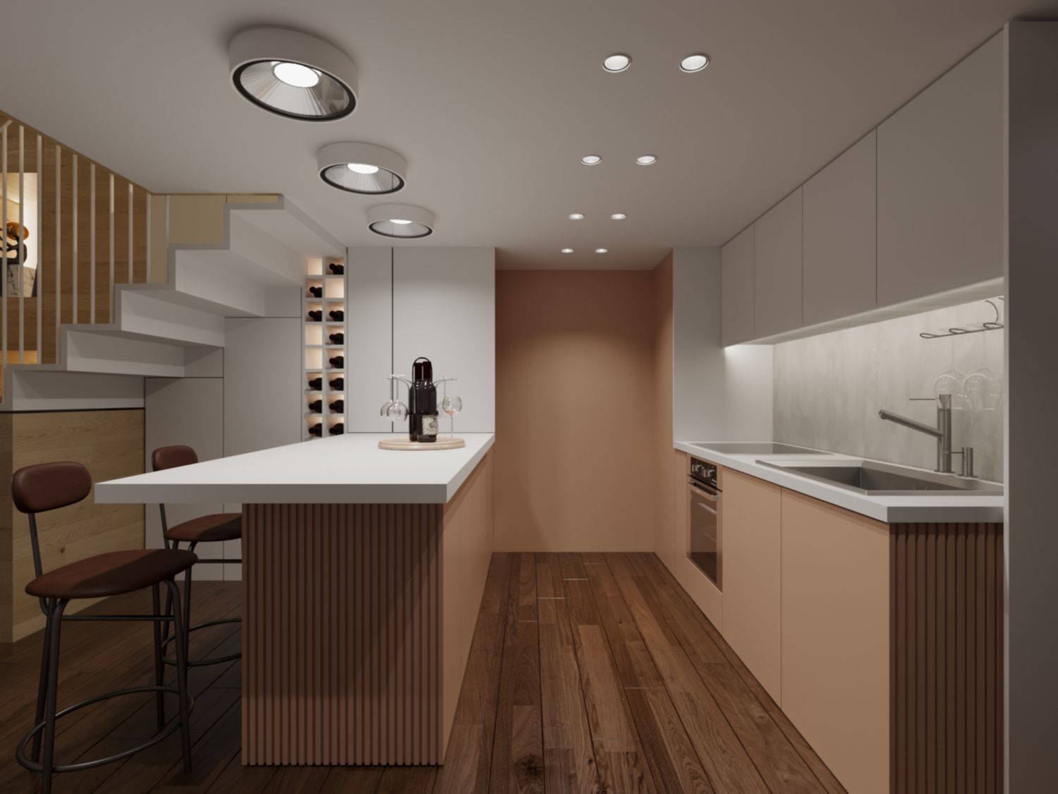
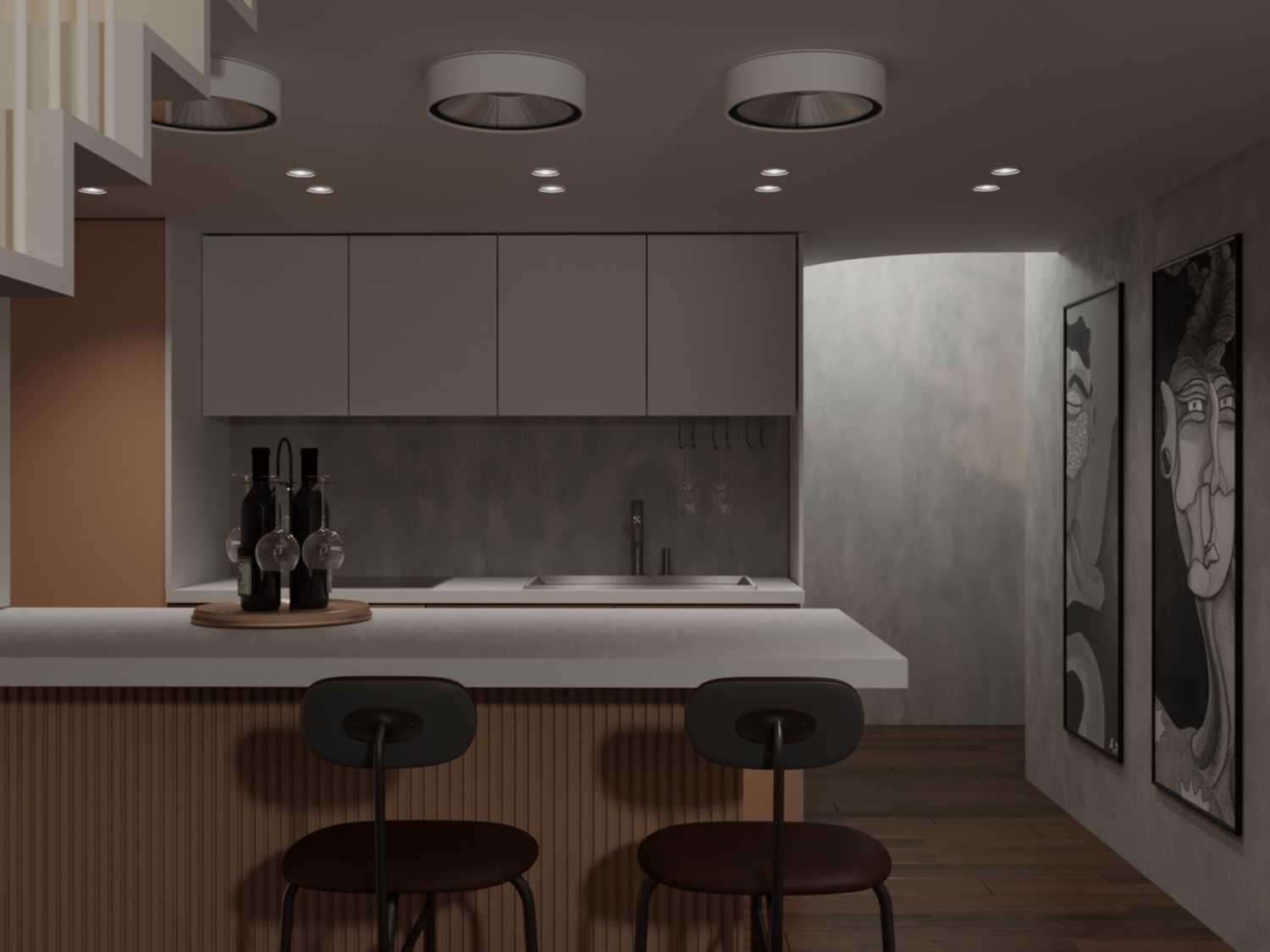
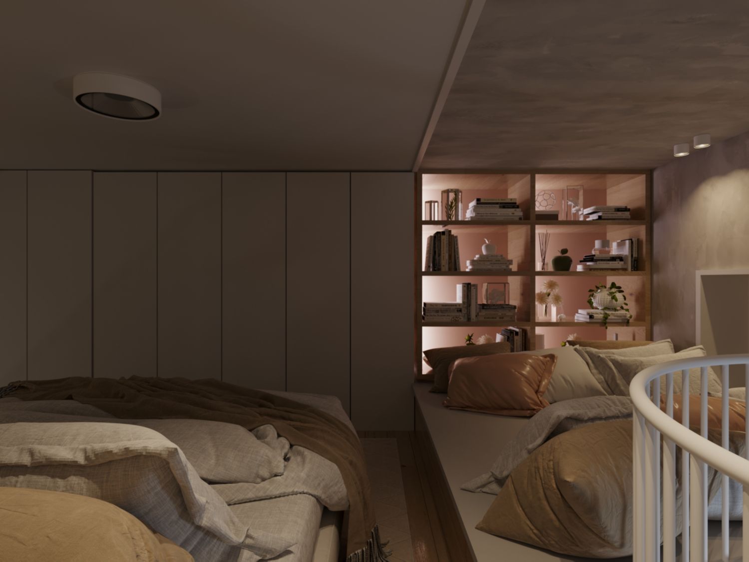
I have been greatly inspired by the name of your project “Tricolore”. So I created a pallet of 3 base materials, Gray Italian Stucco / Oak Sweet / Washed White. By intersecting with the Sweet Oak, we get two more colors pertaining the same scheme, Rose and Darkened Chestnut. Also a touch of Neutral Black (un pizzico) to balance the design. White is dominant, gray as background, oak for emphasizing, rose for special details and Darkened Chestnut for the ground floor (since all the other colors will be bright the pallet needs an equilibrium), while black emphasizes.
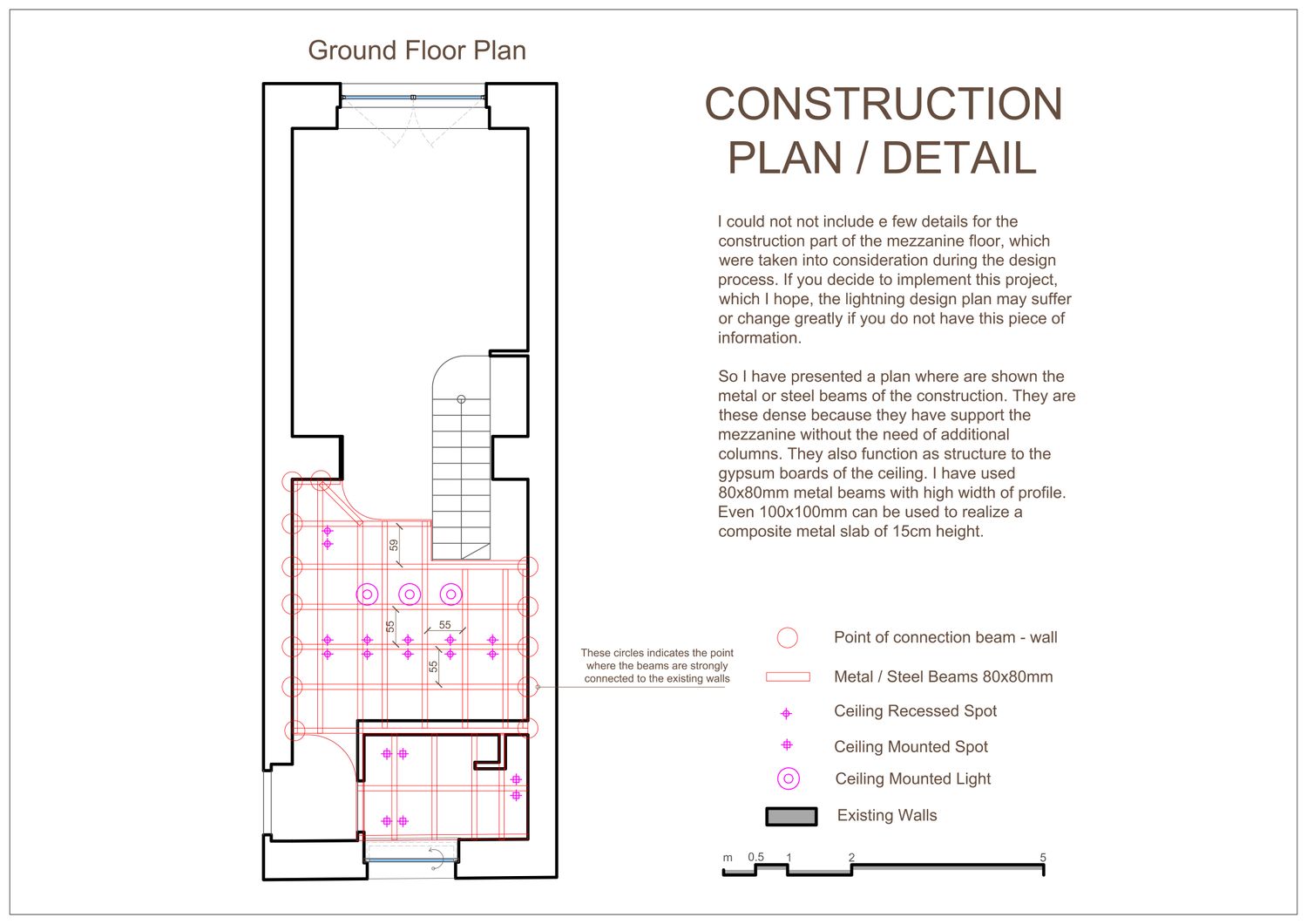
CONSTRUCTION
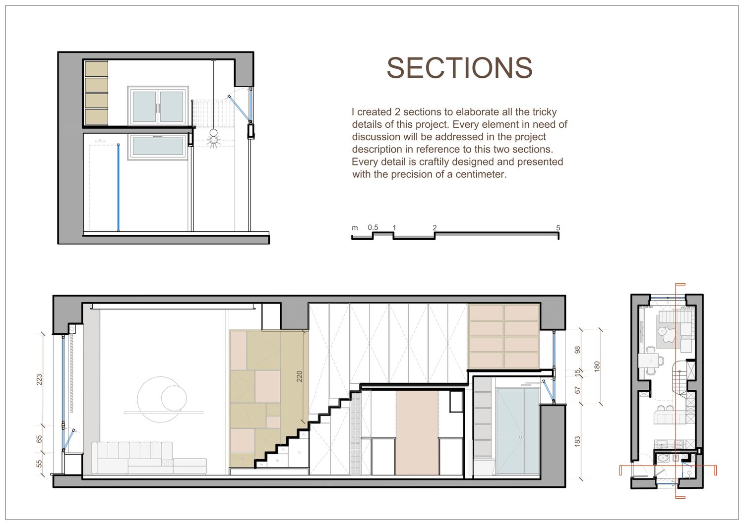
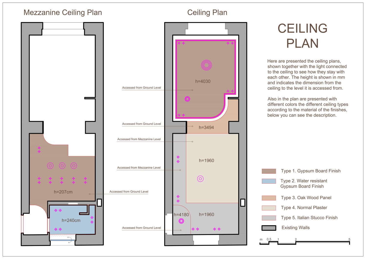
The dimensions of the 90cm wide stairs are 12 steps with 18.5cm height and 25cm depth. It produces a mezzanine at the level 222cm with a lower level height of 207cm and the upper level of the mezzanine 196cm using a 15cm composite metal slab. If up to 10cm can be profited from the floor, the stair can be modified to 19x25cm, so that you can automatically profit 6cm below and 4cm above.
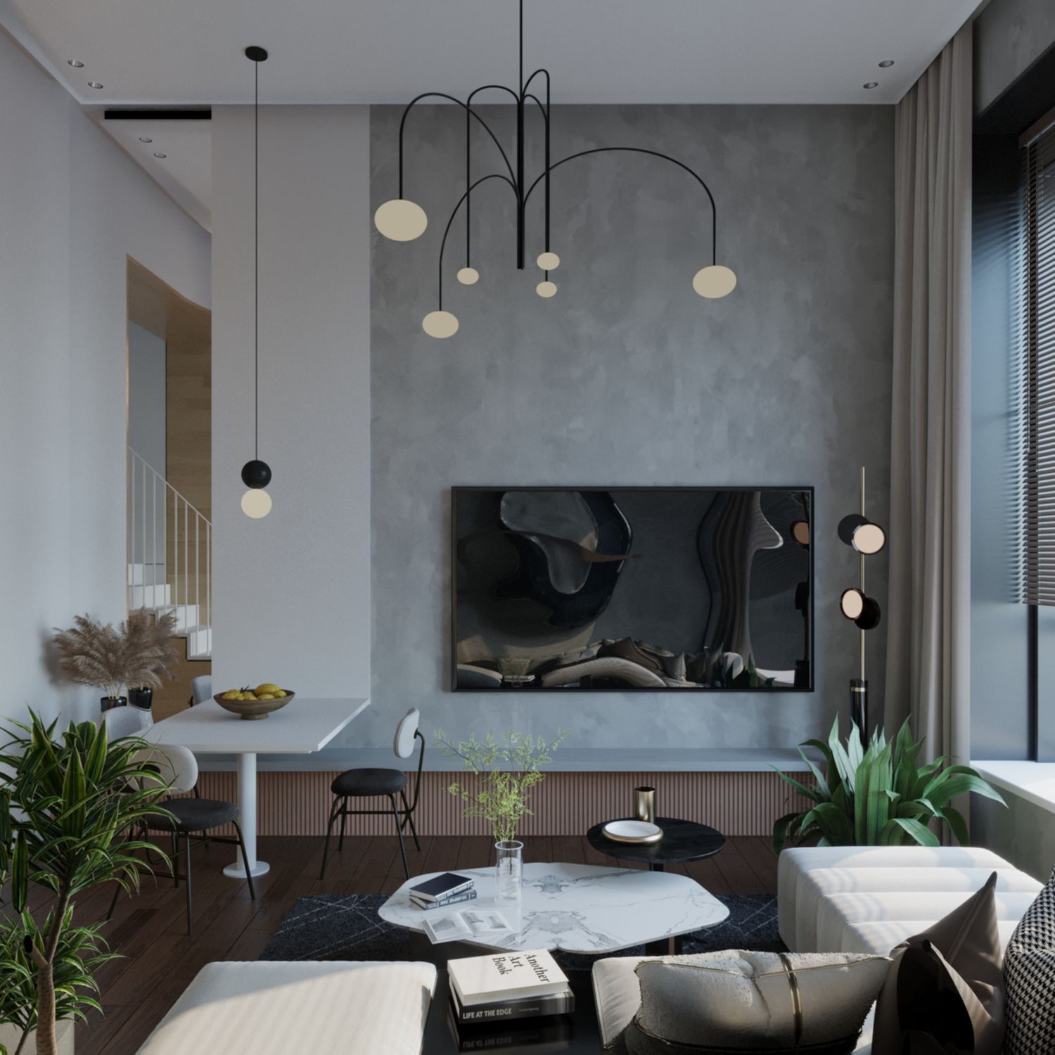
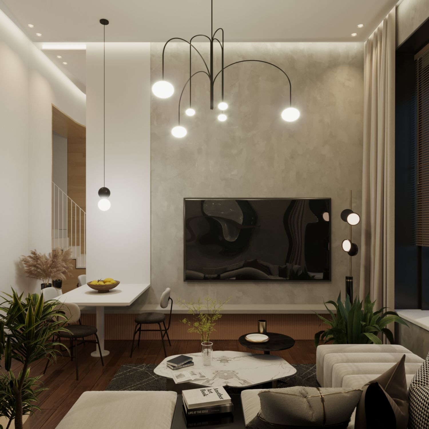
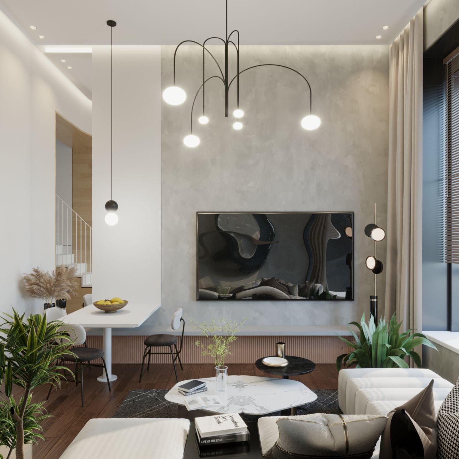
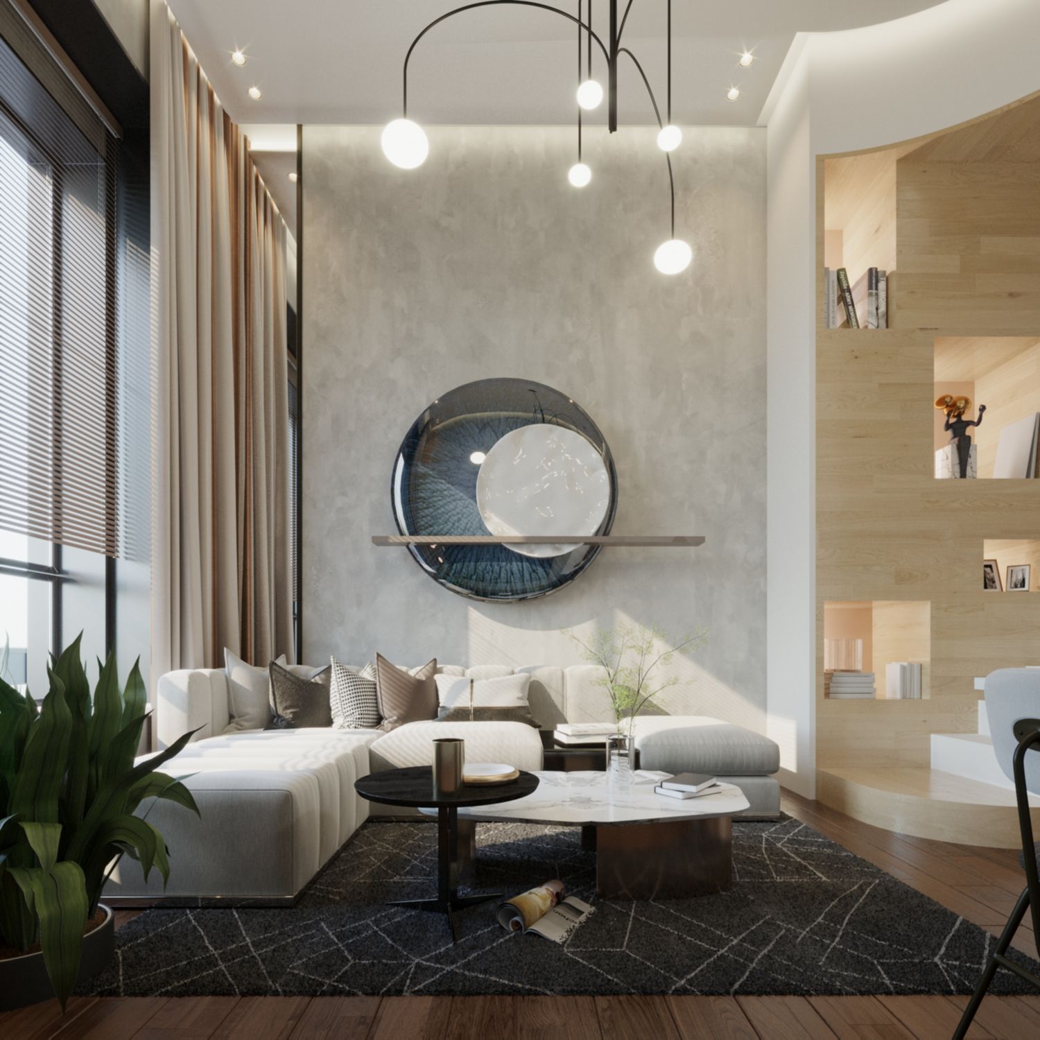
LIVING ROOM & DINNING
Spacious, with a contemporary style, the play of oak and gray, white and a few selected colors makes the ambient both luxurious and cheerful. It can function properly with a variety options as the main decorating piece. I have just shown an example of a basso-relievo frame sculpture.
The stair integrates beautifully with this area and expands it. Its design is minimal in harmony by contrast to the other part of the living room. Every bit of space is unused space is turned into storage, so for the drawers below the lower half of the stair. Playful yet stylish. Did not choose to use glass for the handrail to create a more unified design in overall, by creating a stripped barrier of white bars which maintains visibility yet creates separation and intimacy. It is balanced by the thin stair design of only 2.5 -3m cm thick made of two sheets of steel welded together at a fixed distance to morph into a double layered structure. This low section gives us even more usability below the staircase.
I propose the main window viewed from the living area to be composed of three parts. The lower part fixed of 55cm, part of the window frame from the outside and a brick wall from the inside, as to feel solid and look part of the wall. This height can be used with a couple of pillows to turn it to a sitting niche. The second part I propose a low 65cm window with frosted glass with vertical opening. This serves to ventilate and bring in more light than a normal window would. The high remaining part of 223cm, I propose to remain fixed and not openable, mainly for safety reasons. You may still have the option to partially open it, depending on your preferences. From inside motorized blinds can be put to easily open up or arrange any kind of transparency needed.
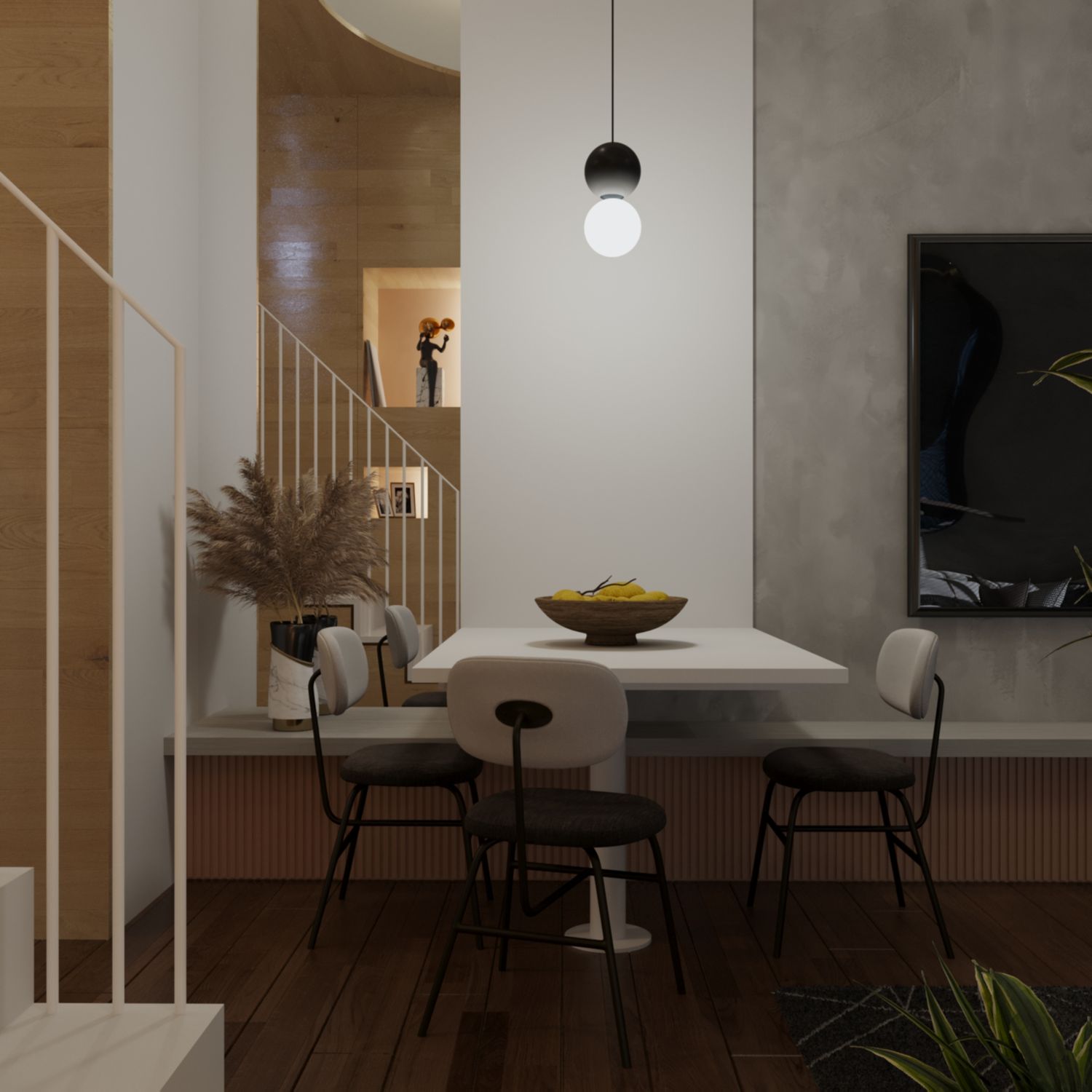
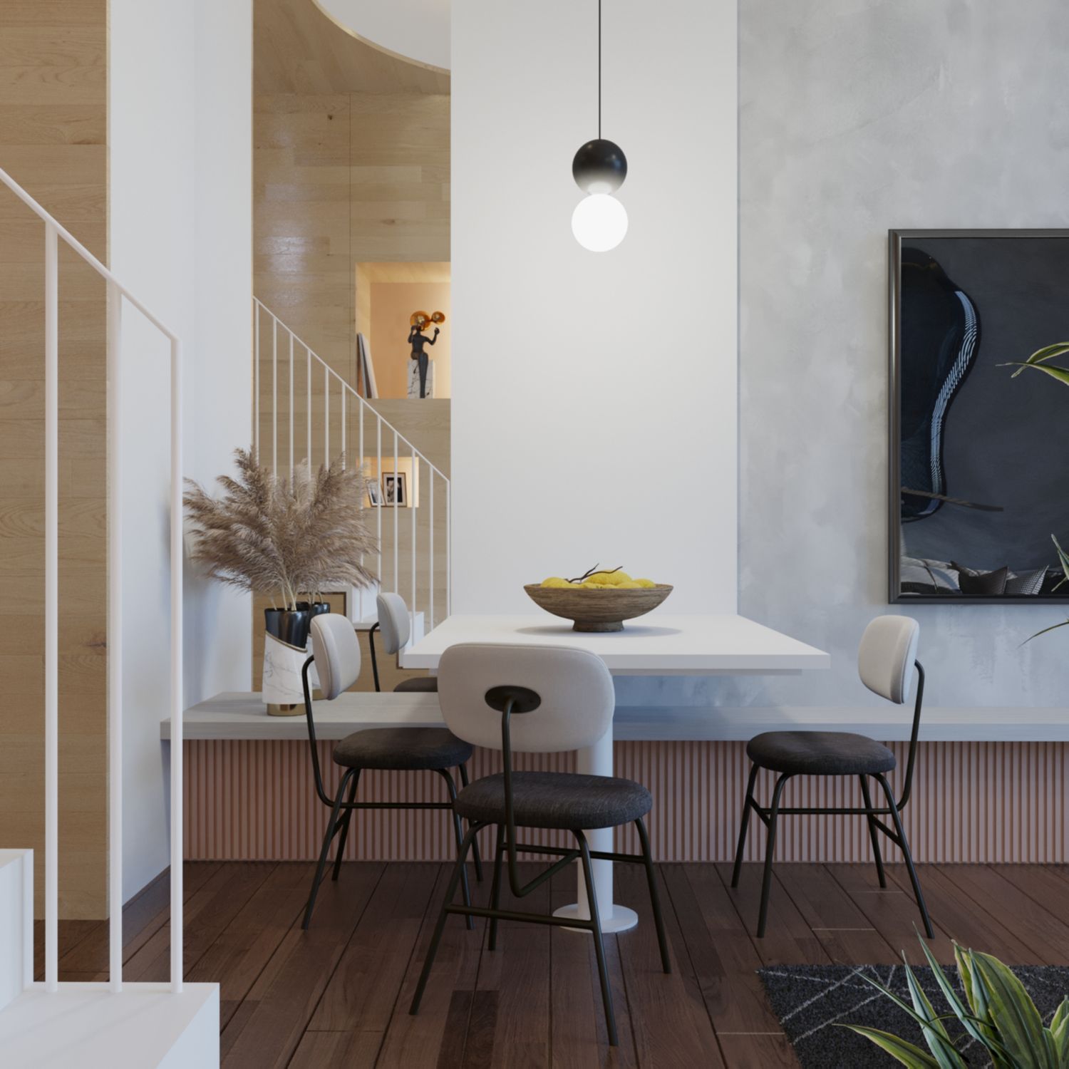
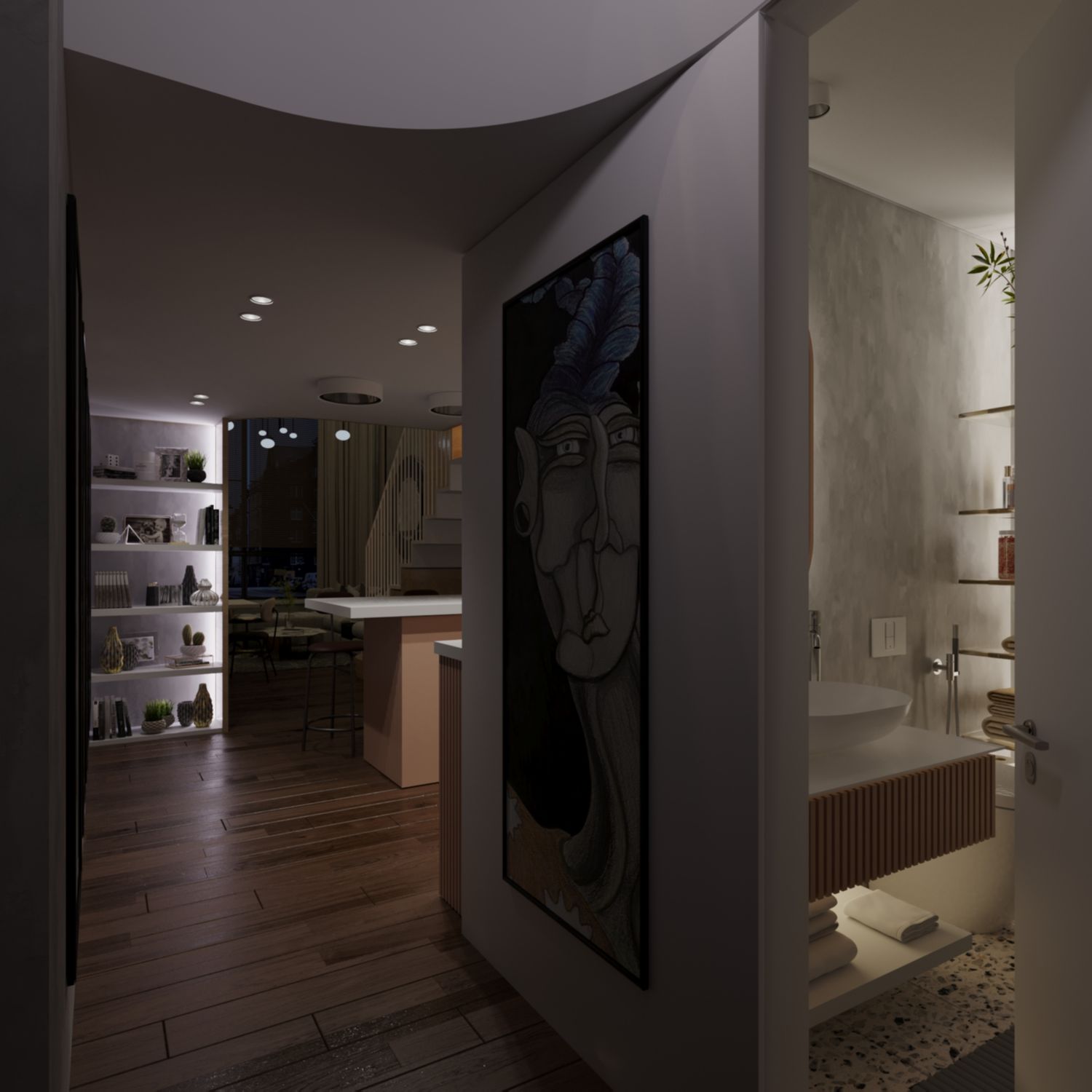
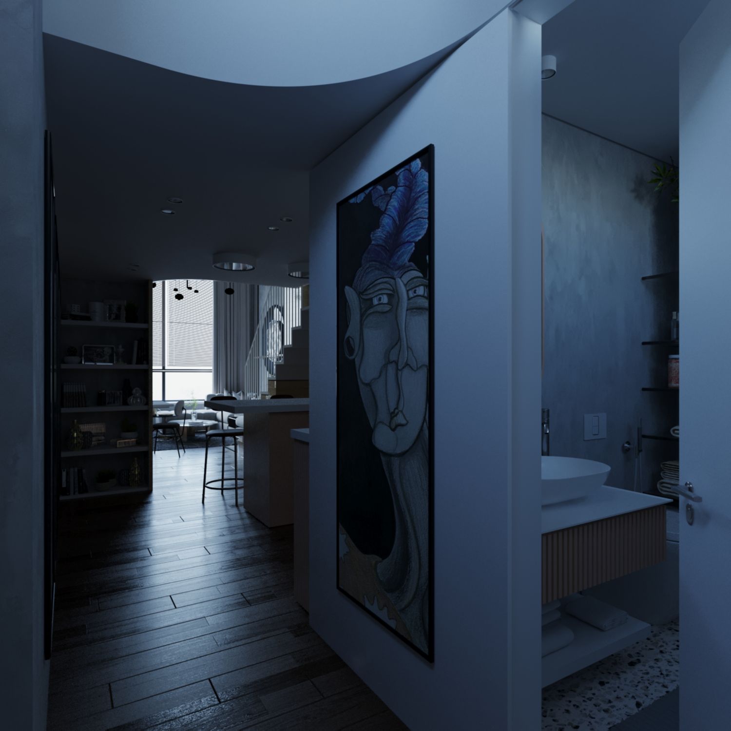
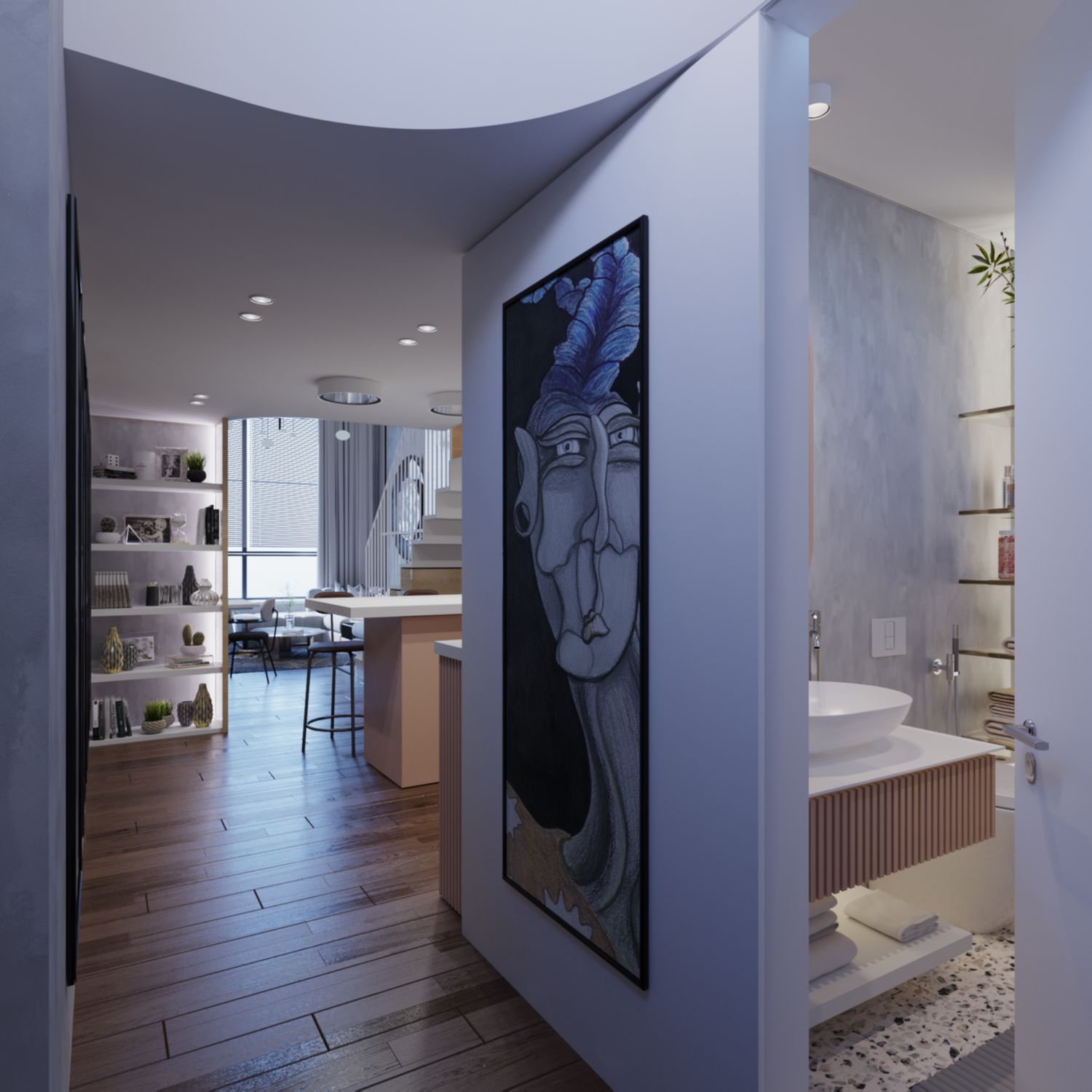
THE ENTRY HALL
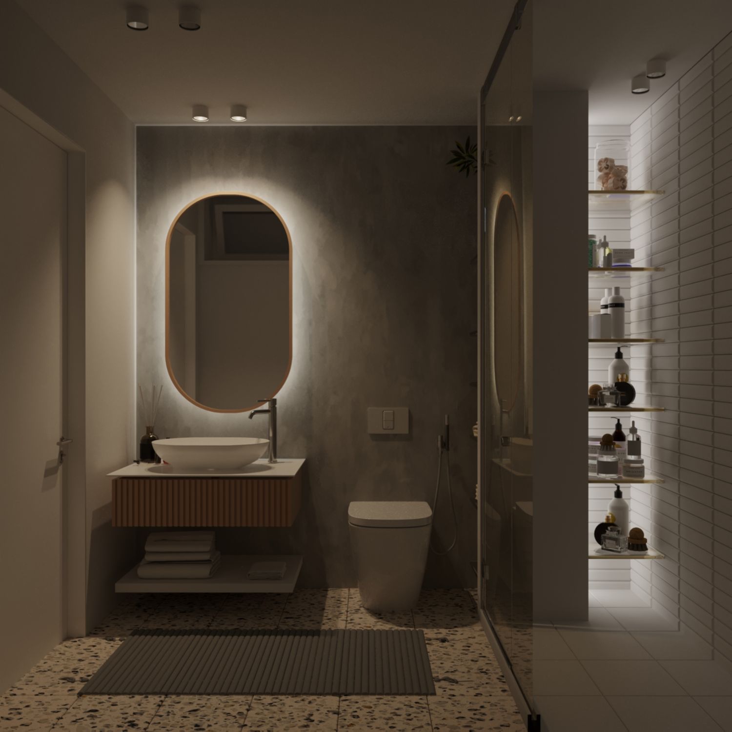
After you open the main door, you are faced with a white wall and the bathroom door, together with a piece of artwork designed to orient you down the hallway. You can see a part of the reading niche upstairs and the high pendant hanging above. The bathroom door is meant to be filo-muro (from the catalog GAROFOLI for example) without borders to enhance the curation of detail and to maintain a classy feel.
THE HALLWAY
The hallway is long, free of functions but well illuminated. Perfect place for artwork. I imagine a few long vertical abstract frames. From the test I did with the current furniture colors it suited black and white images. Except the entry hall artwork which could work better with a bit of saturated colors. Examples are shown in the render boards.
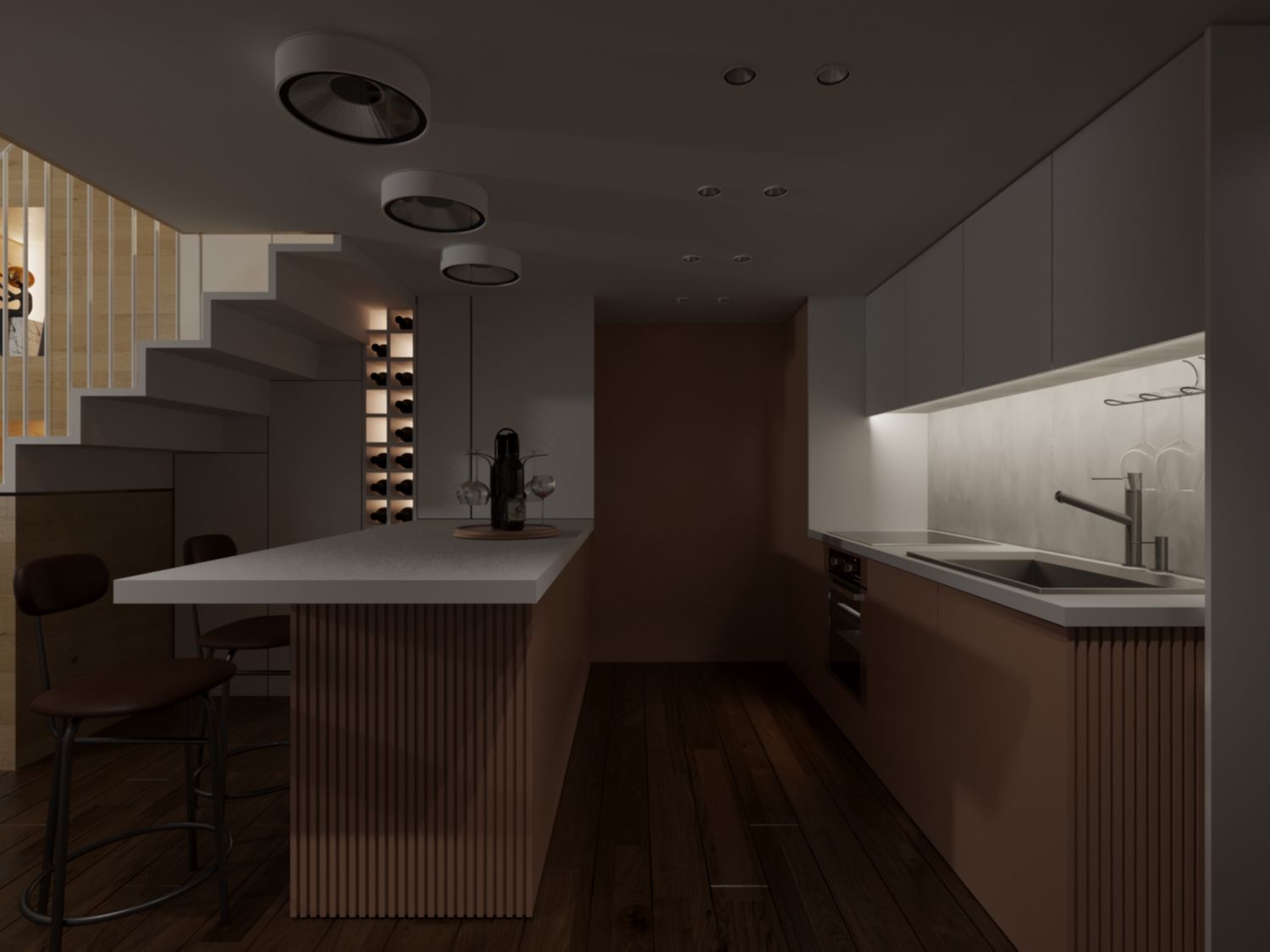
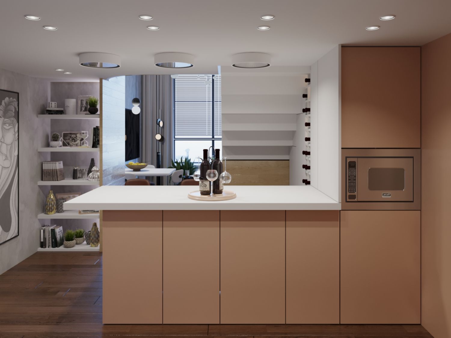
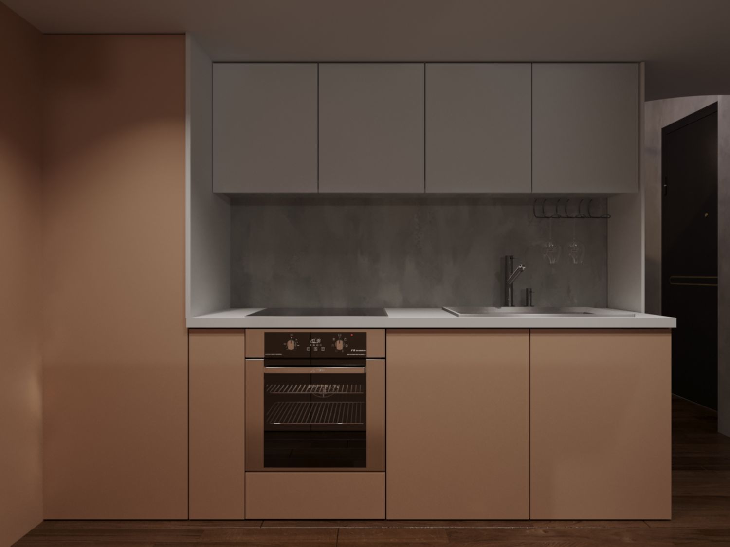
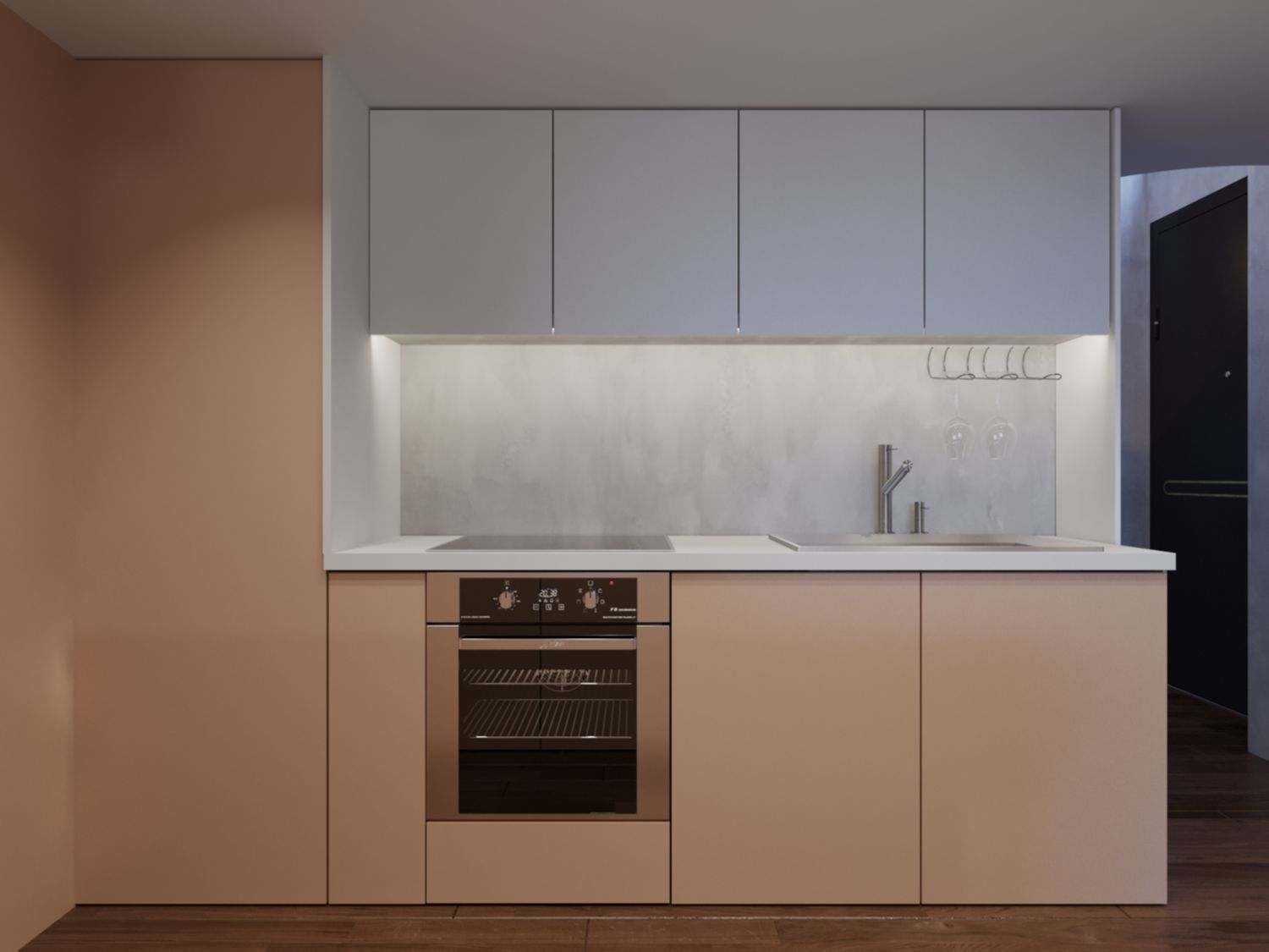
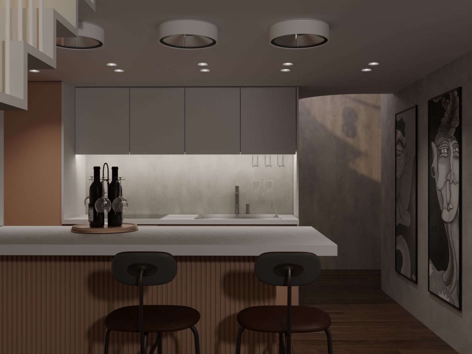
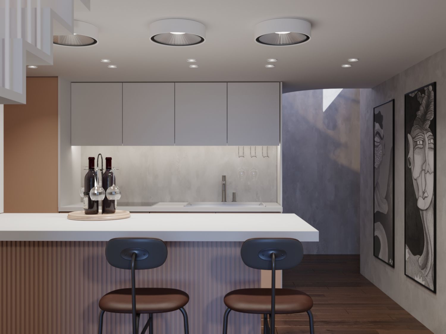
KITCHEN
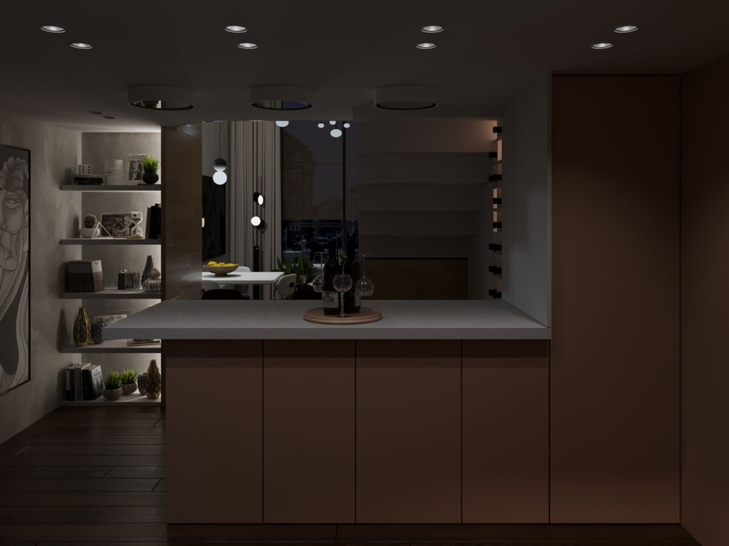
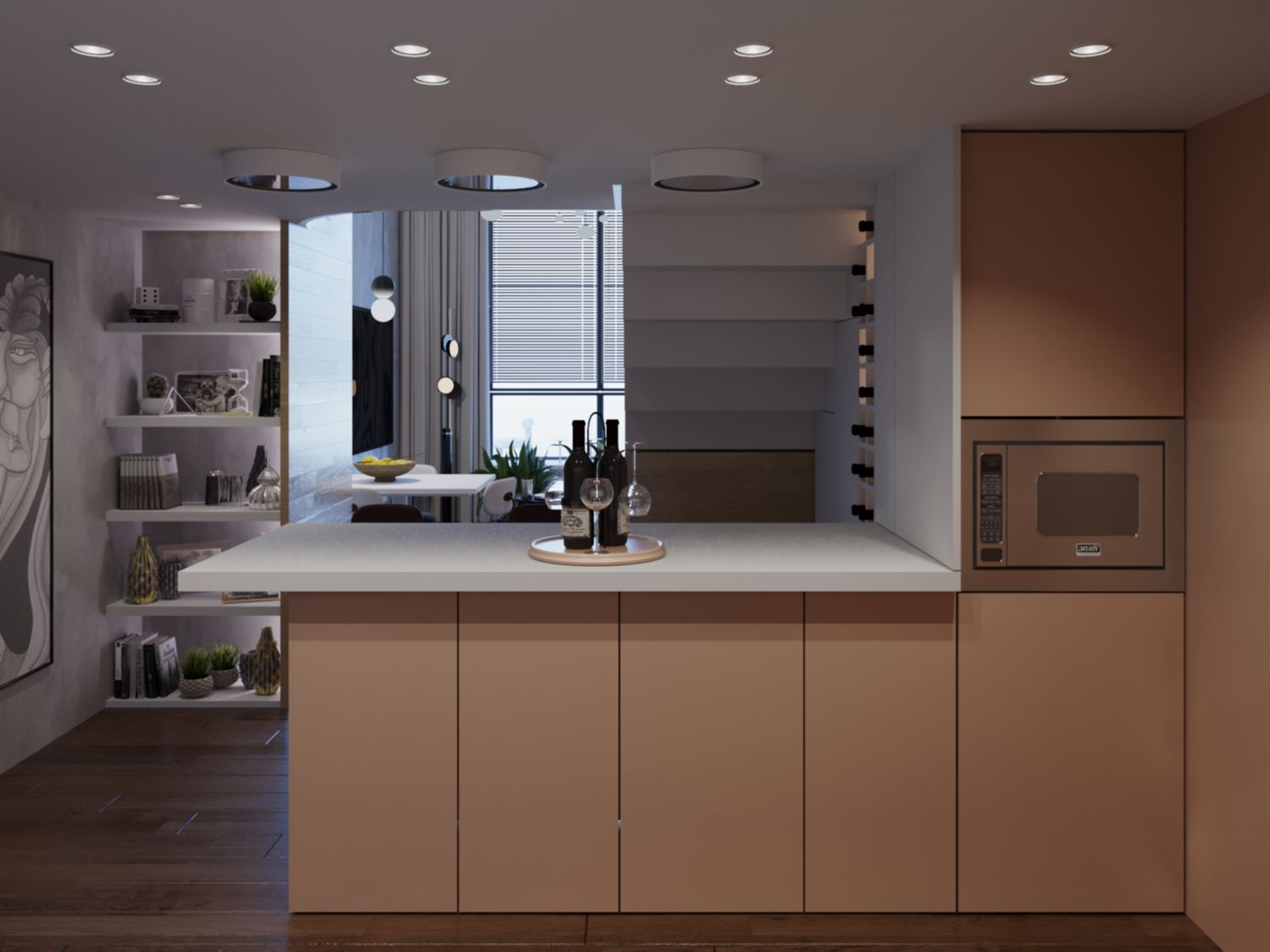
The kitchen is large, fully equipped and with bar module attached to it. I have made it so that gets can come over, hang around and have cocktails and drinks. Not a bad way to impress potential renters. The perfect place for the laundry, in the niche out of view created in the kitchen. The washing machine is at the lower level of the niche with baskets and detergents above, completely recessed in the furniture. Width up to 83cm and the back connections part can be accessed separately from below the bar without needing to move the machine from place at all. The wine holder box can hold two rows of bottles in two columns of 13 bottles so it can hold up to 52 bottles. All lit up by LED light to look cool. Every detail is clearly shown in the renders.
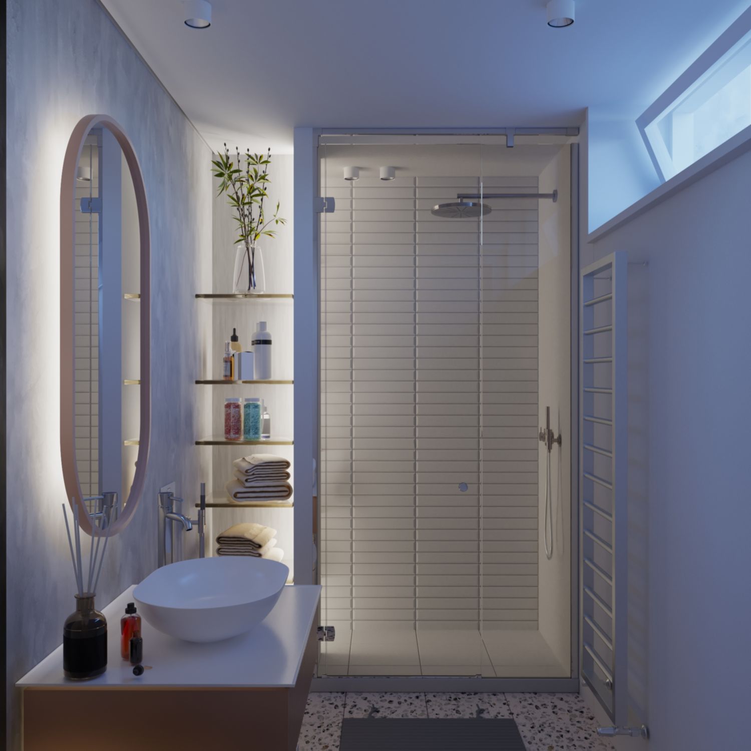
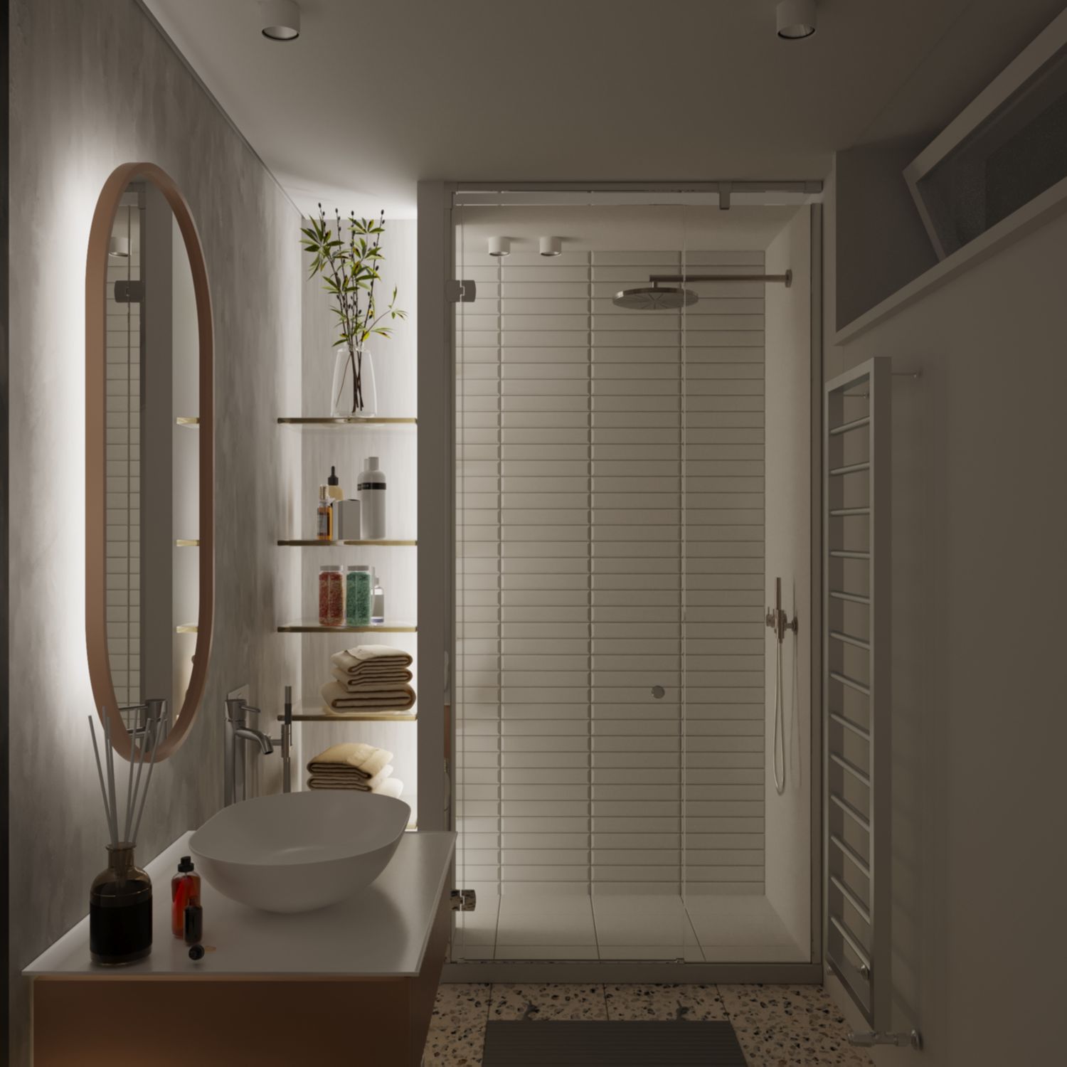
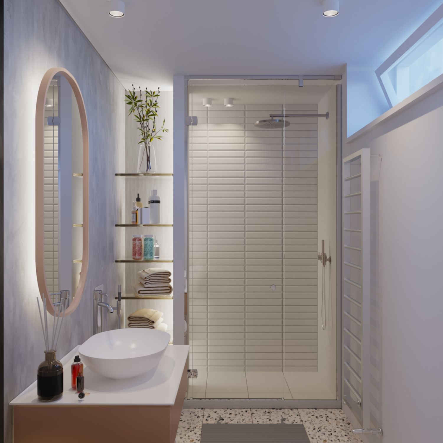
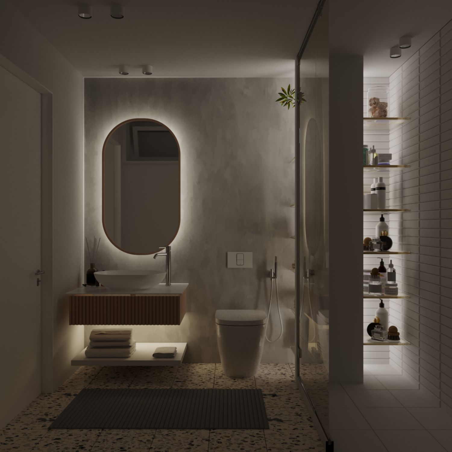
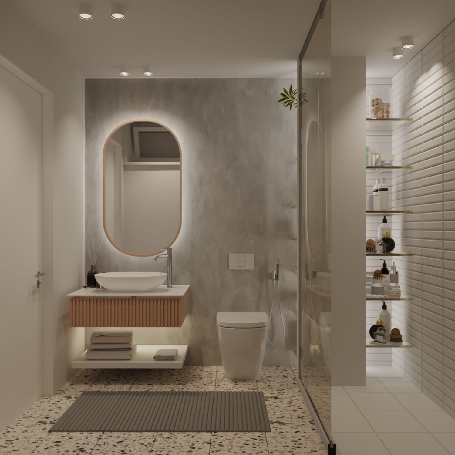
BATHROOM
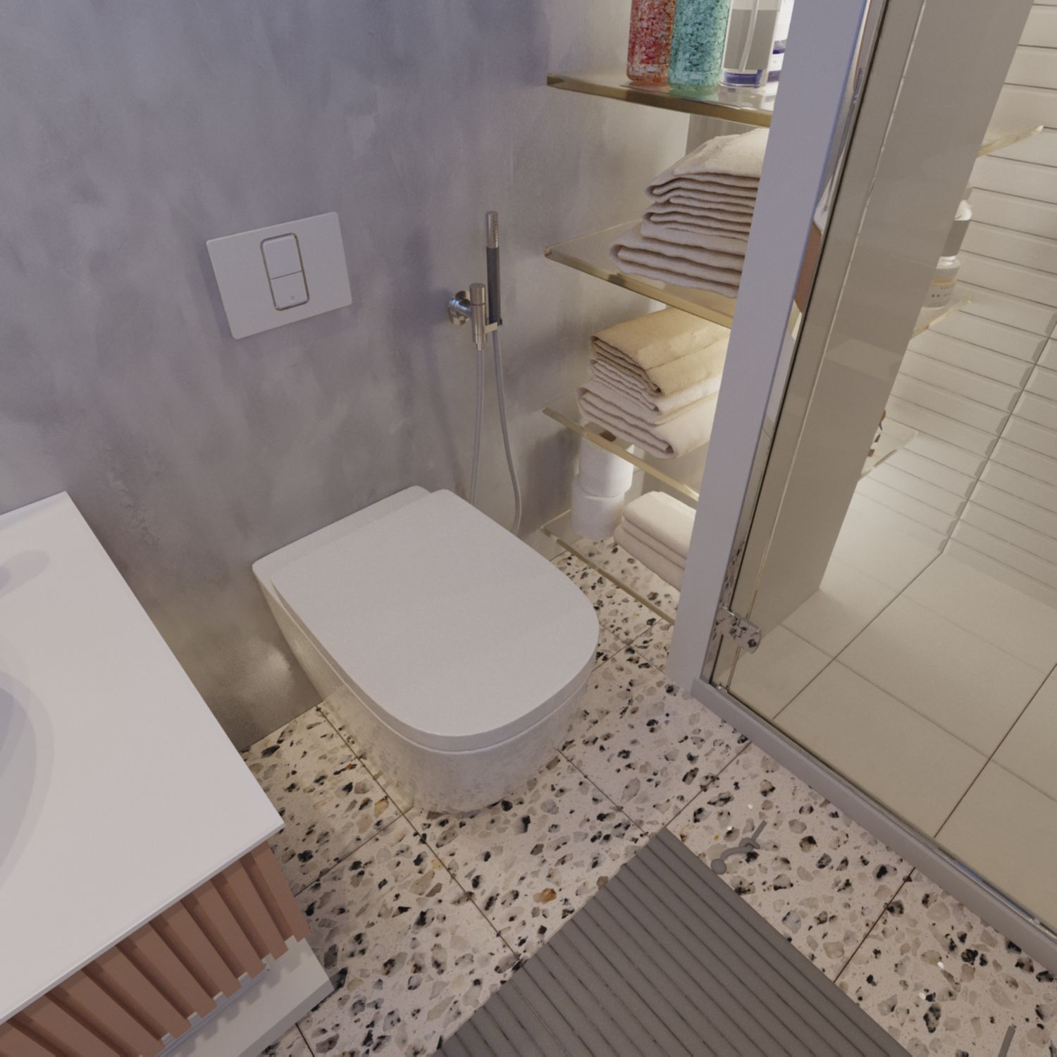
Very comfortable and elegant. Not a single bit of space wasted and if functions beautifully. Given the limited space of the bathroom mandated by the mezzanine conditions, the need for a bidet is replaced by a WC-Bidet used in the project together with a washing kit shown in the renders.
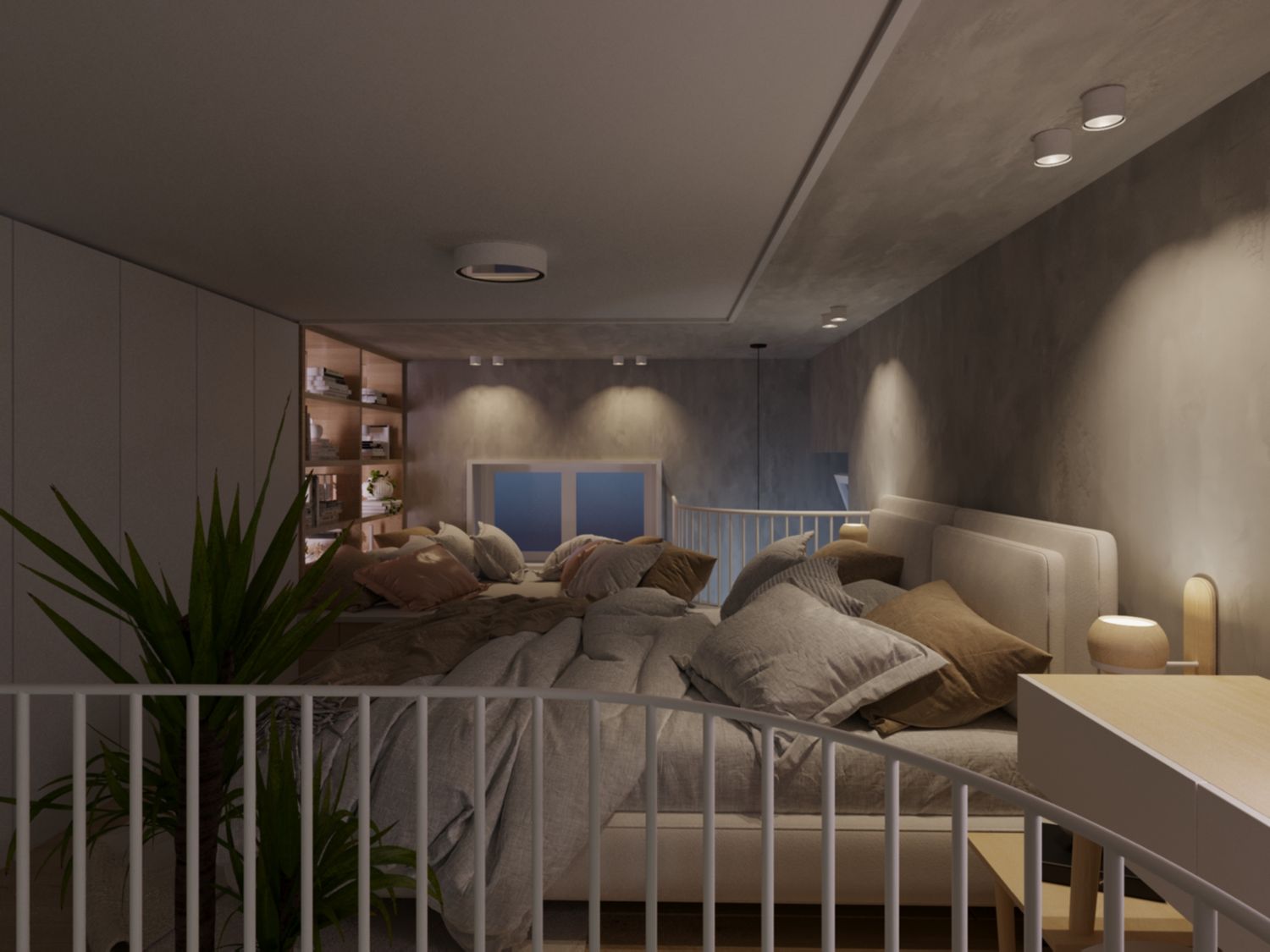
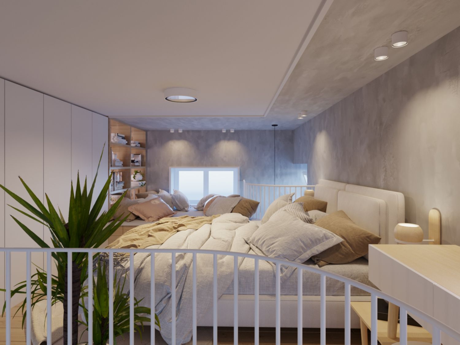
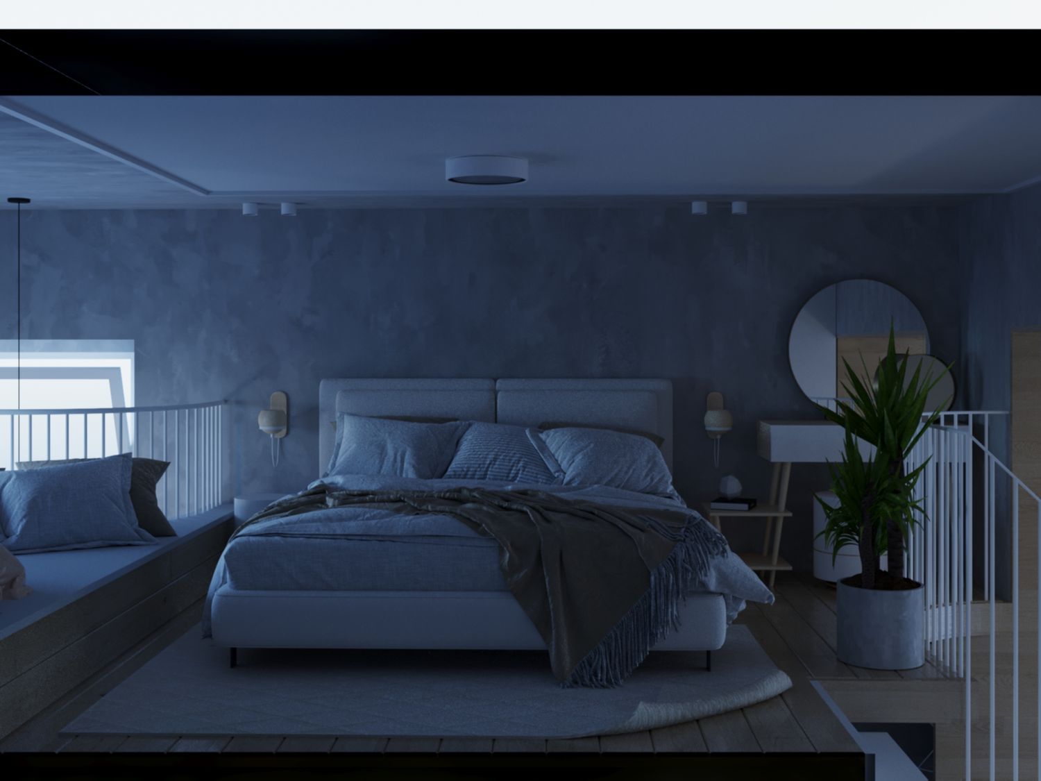
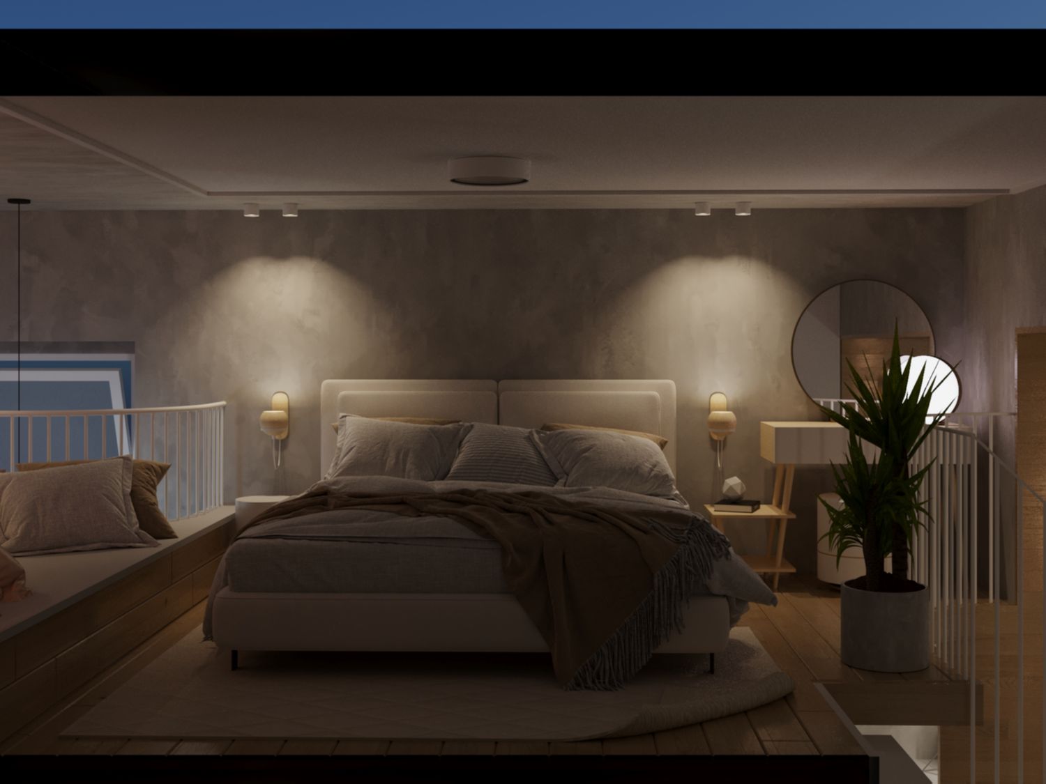
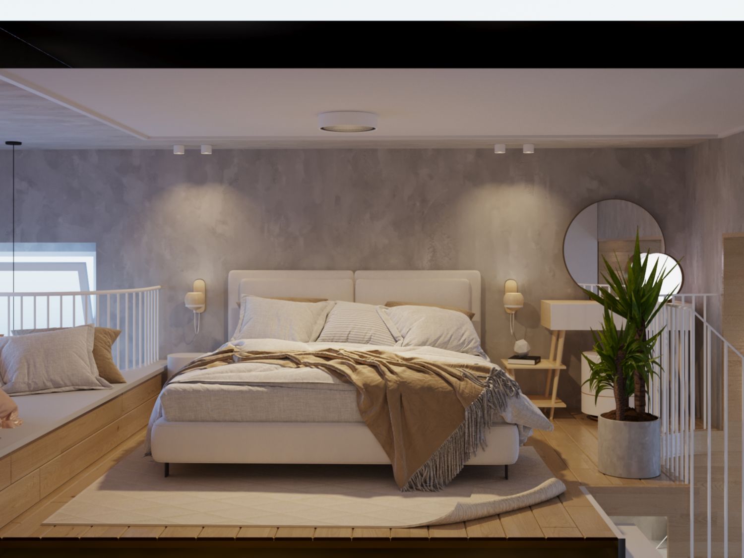
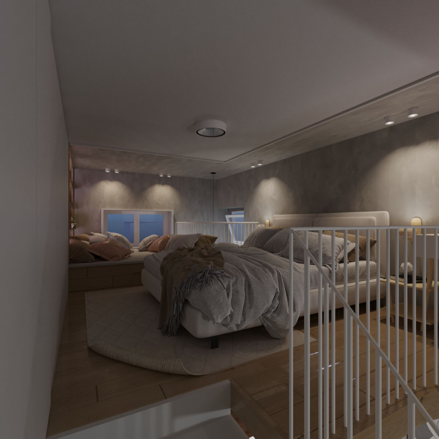
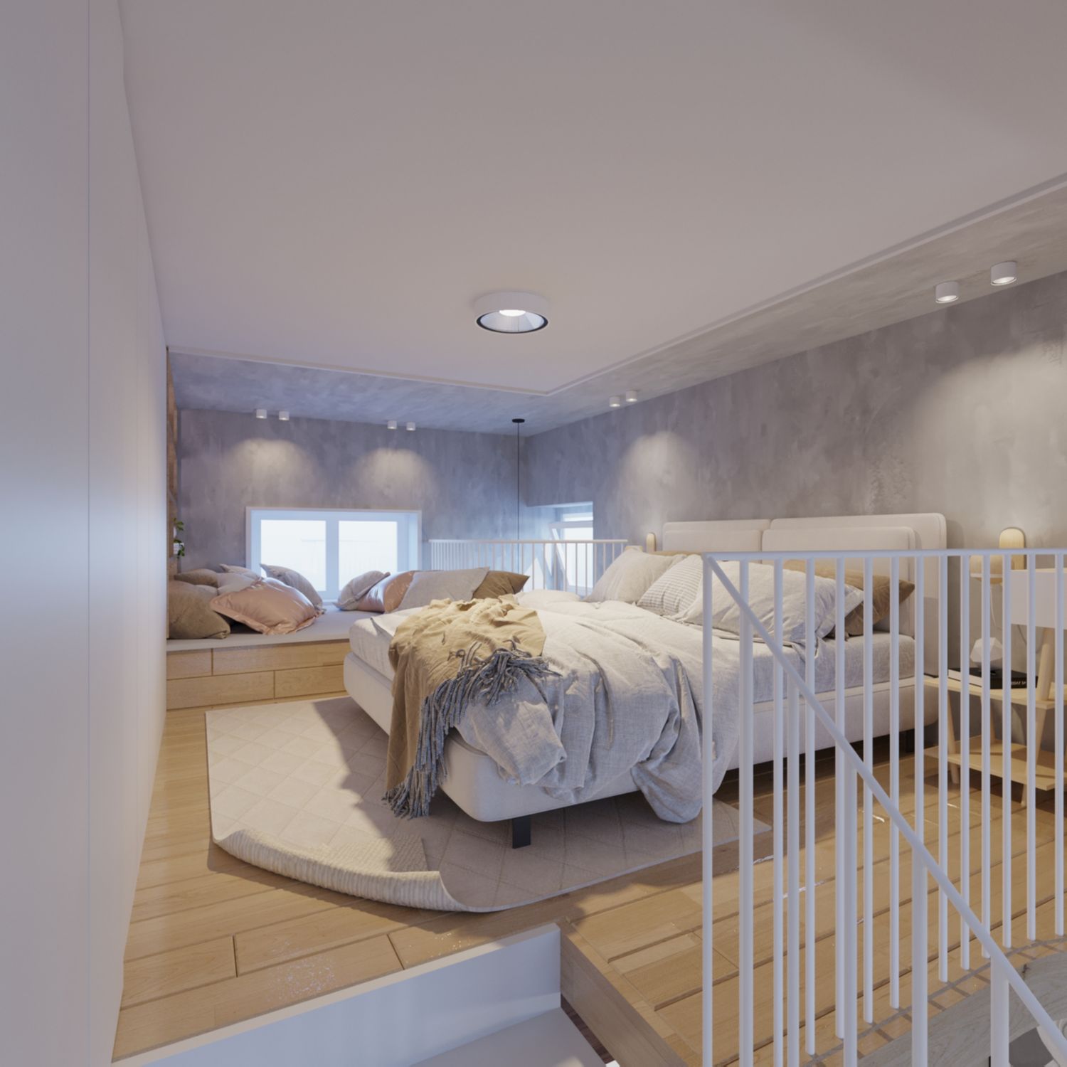
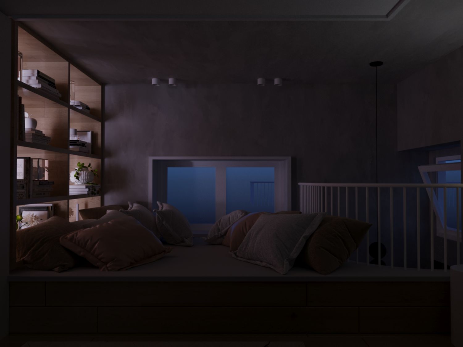
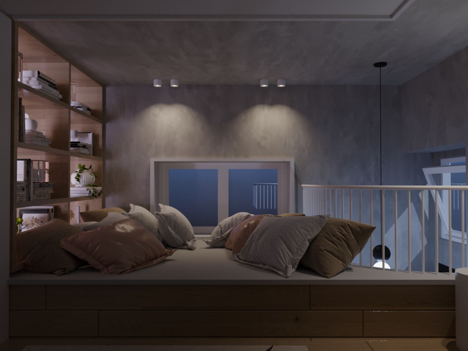
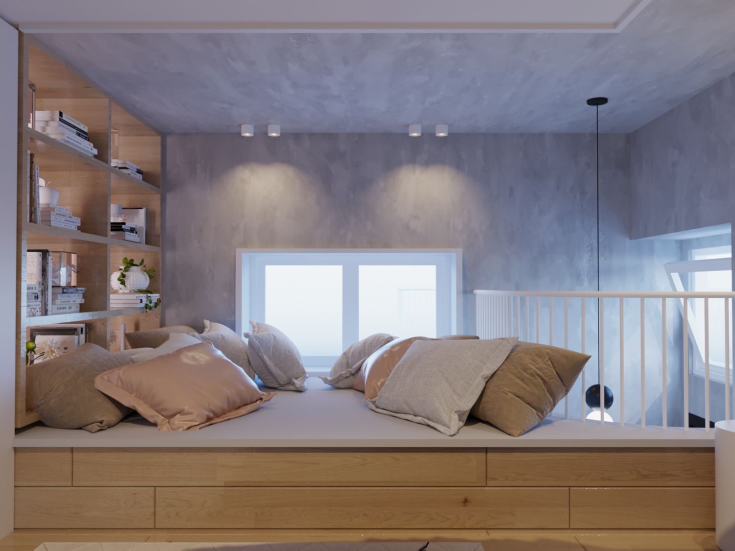
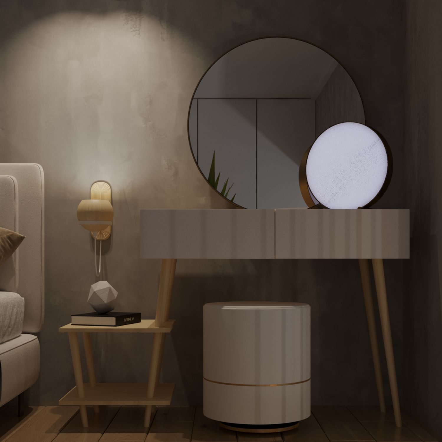
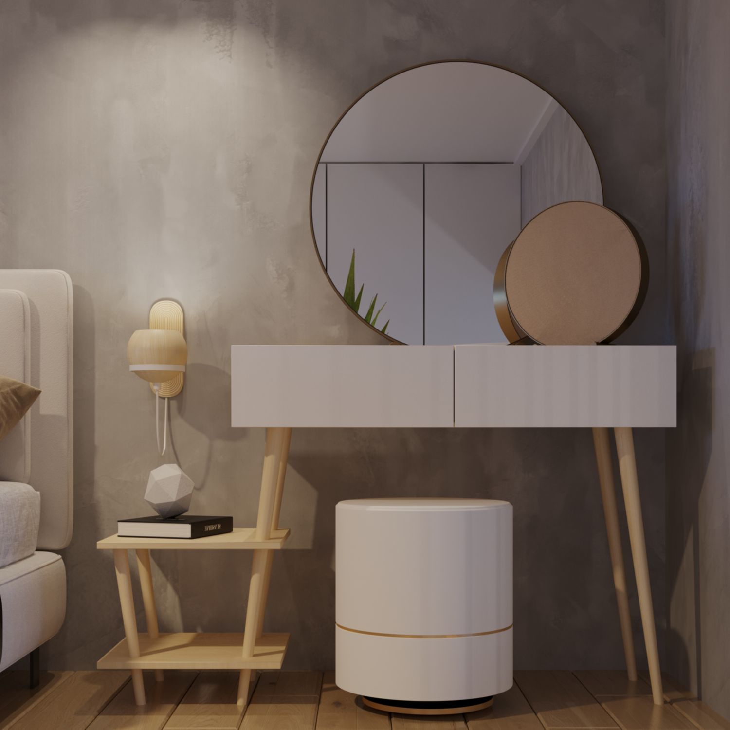
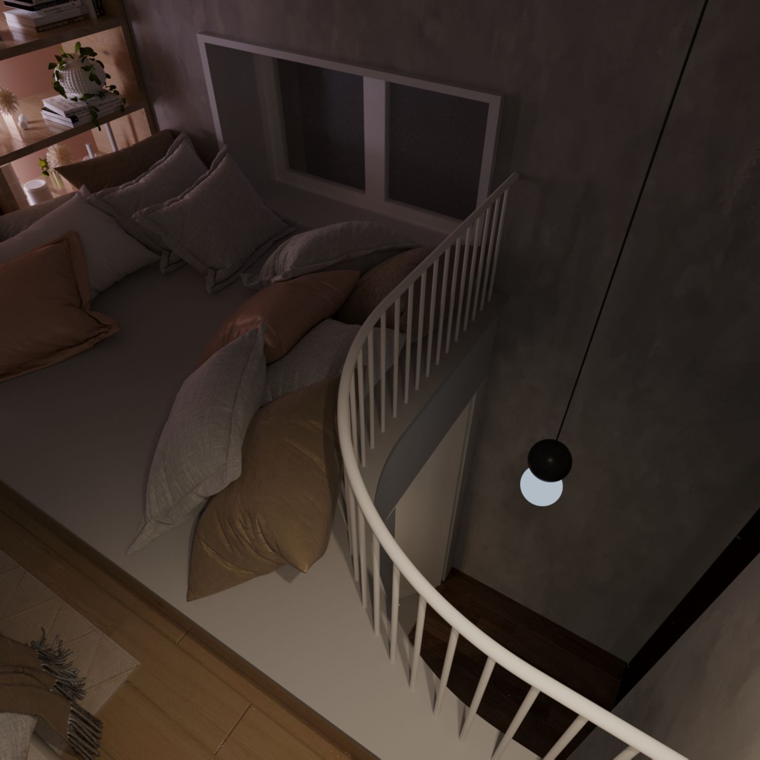
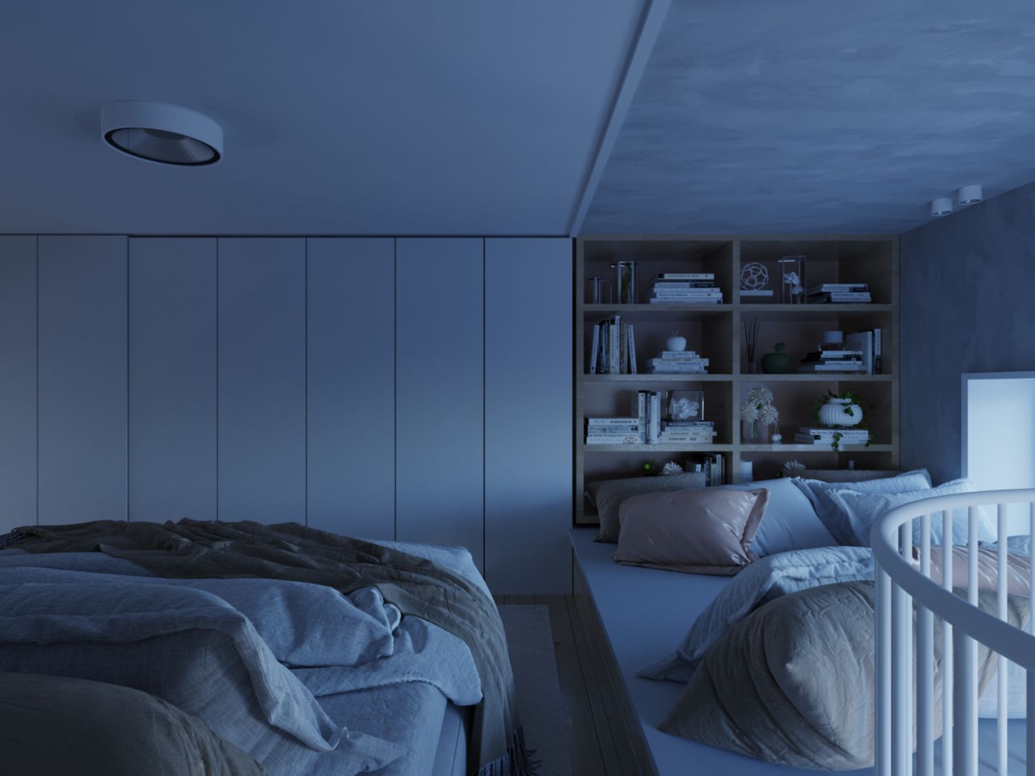
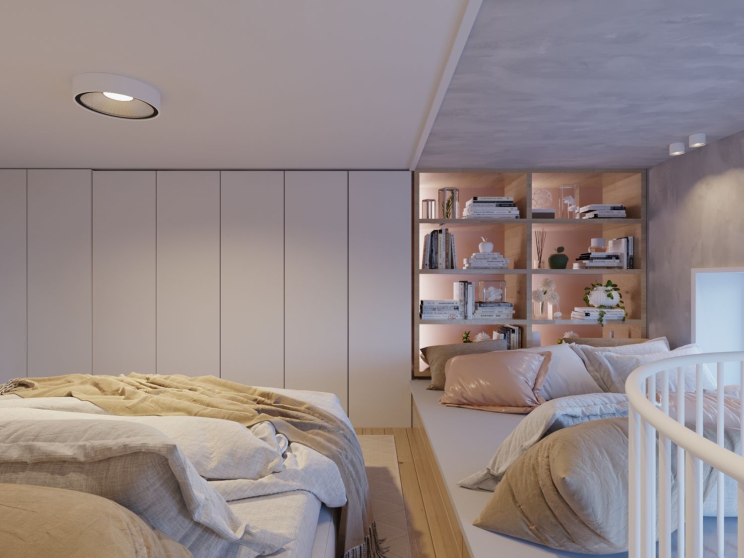
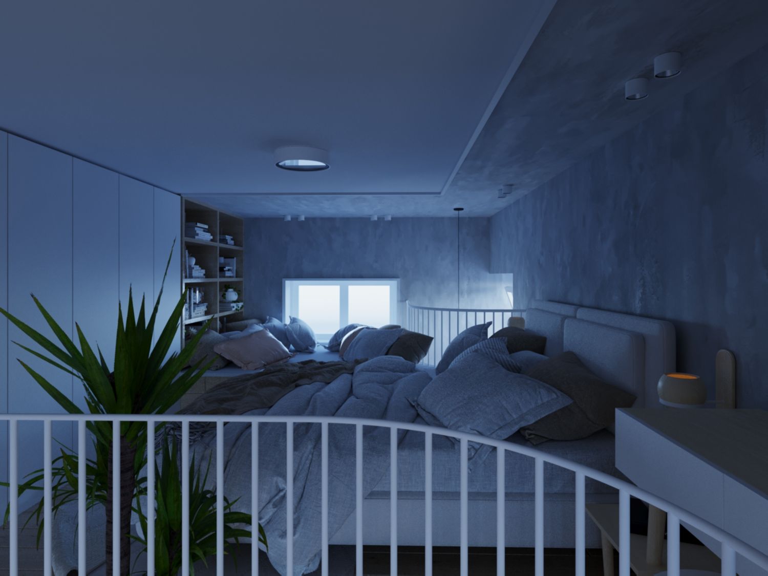
BEDROOM & READING NICH
Upstairs is the bedroom with a reading niche, large clothe cabinets, dressing / working table corner, plants and beautiful views from up to the ground floors from two ways. I have somewhat arced and shortened the slab of the mezzanine next to the stairs so its not the maximum is built, but I judged it would give more air to breath psychologically maintaining a distance from the big existing joist 65x67cm. Also it helps constructively to have a smaller console slab because of the stair.
In this case I preferred to use wall mounted lights for the bed to free as much space on the small nightstands surface, used to put books, personal objects etc. Also ceiling mounted spot lights since we cannot dig in to go with recessed. These lights are put at the perimeter of the space not to interact with circulation given the height. The Cabinets are lightened by a LED strip from the top of the inside.
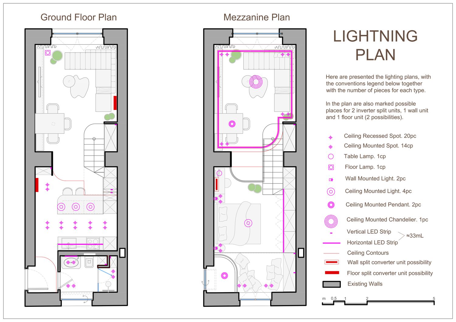
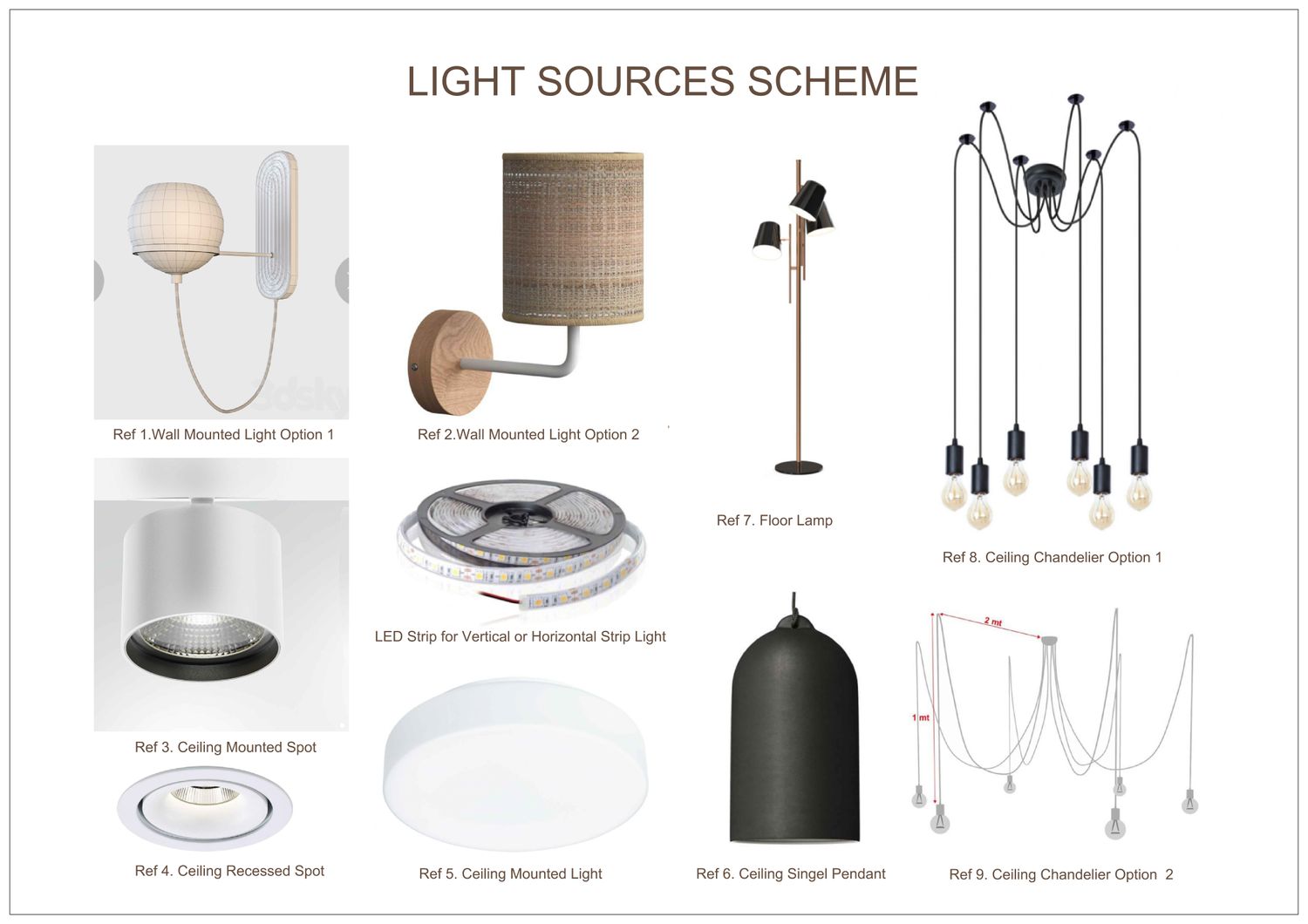
LIGHT SOURCE & REFERENCES
A great part of the artificial light study is presented in the render board. I have imagined 4 to 4.5 layers of lighting for this project. 1) natural light 2) primary light to fill the whole space 3) ambient light to have a sense of ease and relaxation in your indoor environment 4) detailing light that focus on a particular object or element giving it a special emphasize and 4.5) combinations between 1, 3 & 4.
Ref 1. https://woodtailorsclub.com/product/lighting/wall-lamps/fleming-wall-lamp/
Ref 2. https://www.creative-cables.co.uk/with-lampshades/19716-fermaluce-wood-ceramics-wall-light-with-lampshade-and-bent-extension.html
Ref 3. https://www.artemide.com/it/subfamily/4452123/hoy-spot
Ref 4. https://www.artemide.com/it/subfamily/4452123/hoy-spot
Ref 5. https://artelamp.ru/catalog/svetilniki/potolochnyie-svetilniki/a6824pl-1wh
Ref 6. https://www.creative-cables.co.uk/with-lampshade/19547-pendant-lamp-with-textile-cable-and-bell-xl-ceramic-lampshade-made-in-italy.html#/244-light_bulb-with_bulb/343-finish-blackboard_white
Ref 7. https://delightfull.eu/uk/heritage/floor/cole
Ref 8. https://artelamp.ru/catalog/lyustryi/lyustra-podvesnaya/a4322sp-6bk
Ref 9. https://www.creative-cables.co.uk/multiple-pendants-for-exposed-light-bulb/19618-made-in-italy-suspension-with-6-pendants-complete-with-fabric-cable-and-coloured-ceramic-finishes.html
CLOSURE
I found working on this project very pleasurable. I hope you appreciate it too. If the time comes to implement it, as an architect I would be happy to assist.
Best Regards.
ITA
Gentile cliente, è stato un piacere lavorare con questo progetto, spazio compatto ma ricco di possibilità. Ho diviso la descrizione del progetto in sezioni per comprendere meglio il design e i suoi elementi. I riferimenti sono alla fine della descrizione.
DESIGN SPAZIALE
Prima viene lo studio dello spazio. Questa proposta sfrutta lo spazio disponibile in modo molto efficiente senza sprecarene un po. I pilastri strutturali esistenti dividono naturalmente l'area in due porzioni principali. Primo passo è il posizionamento della scala, che si trova tra le due porzioni per quatro motivi, 1) per condividere il peso spaziale, 2) per collegare queste due aree, 3) per fare un uso efficiente dall'alto della parte inferiore della scala da una porzione e dal basso per la parte superiore dall'altra porzione e 4) per unire lo spazio che affetta con le aree adiacenti per creare una sensazione di espansione di ogni sezione. Tenendo sempre presente l'altezza obbligatoria della dimensione sopraelevata della scala superiore a 220 cm. Accanto a destra si crea una lunga unità di stoccaggio che serve entrambi i livelli, il piano terra e il soppalco e si integra con le varie funzioni adiacenti ad esempio diventa ripostiglio cucina e frigorifero vicino alla cucina, ripostiglio lungo le scale e armadi per vestiti al piano rialzato. Soddisfa tutte le esigenze dell'appartamento per lo stoccaggio. Quindi è naturale posizionare il bagno, la cucina, il soggiorno e la sala da pranzo, la camera da letto e una nicchia per la lettura sopra il bagno. L'ingresso insieme al soggiorno sfruttano l'intera altezza dello spazio, per creare la sensazione di spaziosità.
Poiché tutto il piano è a pianta aperta (ad eccezione del bagno), nel piano spaziale sono mostrate con linee tratteggiate l'integrazione e l'area percepita delle funzioni adiacenti l'una nell'altra.
STUDIO DELLA LUCE NATURALE
Ci sono tre fonti di luce naturale nell'appartamento. La finesra anteriore grande e alta (porta ora), il finestrino posteriore e il finestrino superiore all'ingresso. Per massimizzare la quantità di luce diffusa nello spazio cerco di mantenere la area più massimale possibile delle superfici di trasmissione della luce naturale. Gli interventi proposti per ciascuna finestra sono discussi di seguito nella sezione di cui fanno parte. Alcuni dei render si concentrano sullo studio della luce naturale svolto in questo progetto.
COMBINAZIONE DI COLORI
Sono stato molto ispirato dal nome del suo progetto “Tricolore”. Così ho creato un pallet di 3 materiali di base, Grey Italian Stucco / Oak Sweet / Washed White. Intersecandosi con lo Sweet Oak, otteniamo altri due colori appartenenti allo stesso schema, Rose e Darkened Chestnut. Anche un tocco di Neutral Black (un pizzico) per bilanciare il design. Il bianco è dominante, il grigio come sfondo, il rovere per enfatizzare, il rosa per i dettagli e il castagno scurito per il piano terra (dato che tutti gli altri colori saranno brillanti la tavolozza ha bisogno di un equilibrio), mentre il nero per definire.
COSTRUZIONE
Le dimensioni della scala sono: larghezza 90 cm, 12 gradini con altezza 18,5 cm e profondità 25 cm. Si produce un soppalco al livello 222 cm con un'altezza del livello inferiore di 207 cm e il livello superiore del soppalco 196 cm utilizzando una lastra metallica composita di 15 cm. Se si può trarre profitto dal pavimento fino a un altra 10cm, la scala può essere modificata a 19x25cm, in modo da poter trarre automaticamente 6cm sotto e 4cm sopra senca fare nessuna modifica al progetto.
SOGGIORNO E PRANZO
Spaziosa, dallo stile contemporaneo, il gioco del rovere e del grigio, del bianco e di pochi colori selezionati rende l'ambiente insieme lussuoso e allegro. Può funzionare correttamente con una varietà di opzioni come elemento decorativo principale. Ho appena mostrato un esempio di scultura con cornice a bassorilievo.
La scala si integra magnificamente con questa zona e la amplia. Il suo design è minimale in armonia in contrasto con l'altra parte del soggiorno. Ogni pezzo di spazio inutilizzato viene trasformato in spazio di archiviazione, quindi per i cassetti sotto la metà inferiore della scala. Giocoso ma elegante. Non ha scelto di utilizzare il vetro per il corrimano per creare un design più unificato nel complesso, creando una barriera quasi trasparente fatta di barre bianche che mantiene la visibilità ma crea separazione e intimità. È bilanciato dal design sottile della scala di soli 2,5 -3 m di spessore, composta da due fogli di acciaio saldati insieme a una distanza fissa per trasformarsi in una struttura a doppio strato. Questa sezione bassa ci offre ancora più fruibilità sotto la scala.
Propongo la finestra principale vista dalla zona giorno da essere composta da tre parti. La parte inferiore fissa di 55 cm, parte del telaio della finestra dall'esterno e un muro di mattoni dall'interno, per sentirsi solidi e sembrare parte del muro. Questa altezza può essere utilizzata con un paio di cuscini per trasformarlo in una nicchia di seduta. La seconda parte propongo una finestra bassa 65cm con vetro satinato ad apertura verticale. Questo serve per ventilare e far entrare più luce di una normale finestra. La restante parte alta di 223cm, propongo di rimanere fissa e non apribile, principalmente per motivi di sicurezza. Potresti avere ancora la possibilità di aprirlo parzialmente, a seconda delle tue preferenze. Dall'interno si possono posizionare tende motorizzate per aprire facilmente o disporre qualsiasi tipo di trasparenza necessaria.
L'INGRESSO
Dopo aver aperto la porta principale, ti trovi di fronte a un muro bianco e alla porta del bagno, insieme a un'opera d'arte progettata per orientarti lungo il corridoio. Puoi vedere una parte della nicchia di lettura al piano di sopra e l'alto ciondolo appeso sopra. La porta del bagno è pensata per essere filo-muro (dal catalogo GAROFOLI ad esempio) senza bordi per esaltare la cura dei dettagli e mantenere un tocco di classe.
IL CORRIDOIO
Il corridoio è lungo, privo di funzioni ma ben illuminato. Posto perfetto per opere d'arte. Immagino alcuni lunghi fotogrammi astratti verticali. Dal test che ho fatto con gli attuali colori dei mobili, si adattava alle immagini in bianco e nero. Tranne l'opera d'arte dell'ingresso che funzionerebbe meglio con un po' di colori saturi.
CUCINA
La cucina è ampia, completamente attrezzata e con annesso modulo bar. L'ho fatto in modo che le persone possano venire, stare in giro e bere cocktail e bevande. Non è un brutto modo per impressionare i potenziali affittuari. Il posto perfetto per la lavanderia, nella nicchia a vista ricavata in cucina. La lavatrice è al livello inferiore della nicchia con cestelli e detersivi sopra, completamente incassata nel mobile. Larghezza fino a 83 cm e accesso separato alla parte posteriore degli attacchi da sotto la barra senza bisogno di spostare la macchina dal posto. La cassetta porta vino può contenere due file di bottiglie in due colonne da 13 bottiglie in modo da poter contenere fino a 52 bottiglie. Tutto illuminato da luce a LED per sembrare cool. Ogni dettaglio è chiaramente mostrato nei render.
BAGNO
Molto comodo ed elegante. Non un solo pezzo di spazio sprecato e funziona magnificamente. Dato lo spazio limitato del bagno imposto dalle condizioni del soppalco, la necessità di un bidet è sostituita da un WC-Bidet utilizzato nel progetto insieme a un kit di lavaggio mostrato nei render.
CAMERA DA LETTO E LETTURA NICH
Al piano superiore c'è la camera da letto con una nicchia di lettura, ampi armadi per i vestiti, angolo toeletta / tavolo da lavoro, piante e splendide viste fino ai piani terra da due vie. Ho un po' arcuato e accorciato la soletta del soppalco vicino alle scale in modo che non si costruisse il massimo, ma ho giudicato che avrebbe dato più aria per respirare psicologicamente mantenendo una distanza dal grande travetto esistente 65x67cm, cosi profittare piu vista. Inoltre aiuta in modo costruttivo avere una soletta della console più piccola a causa della scala.
In questo caso ho preferito utilizzare delle luci a parete per il letto per liberare più spazio sulla superficie dei piccoli comodini, usate per appoggiare libri, oggetti personali ecc. Anche faretti a soffitto visto che non possiamo scavare per andare ad incasso. Queste luci sono poste al perimetro dello spazio per non interagire con la circolazione data l'altezza. Gli armadi sono illuminati da una striscia LED dalla parte superiore dell'interno.
SORGENTE DI LUCE E RIFERIMENTI
Gran parte dello studio sulla luce artificiale è presentato nella scheda di rendering. Ho immaginato da 4 a 4,5 livelli di illuminazione per questo progetto. 1) luce naturale, 2) luce primaria per riempire l’intero spazio, 3) luce ambientale per avere un senso di agio e relax nel tuo ambiente interno, 4) luce di dettaglio che si concentra su un particolare oggetto o elemento dandogli una speciale enfasi e 4.5) combinazioni tra 1, 3 e 4.
Ref 1. https://woodtailorsclub.com/product/lighting/wall-lamps/fleming-wall-lamp/
Ref 2. https://www.creative-cables.co.uk/with-lampshades/19716-fermaluce-wood-ceramics-wall-light-with-lampshade-and-bent-extension.html
Ref 3. https://www.artemide.com/it/subfamily/4452123/hoy-spot
Ref 4. https://www.artemide.com/it/subfamily/4452123/hoy-spot
Ref 5. https://artelamp.ru/catalog/svetilniki/potolochnyie-svetilniki/a6824pl-1wh
Ref 6. https://www.creative-cables.co.uk/with-lampshade/19547-pendant-lamp-with-textile-cable-and-bell-xl-ceramic-lampshade-made-in-italy.html#/244-light_bulb-with_bulb/343-finish-blackboard_white
Ref 7. https://delightfull.eu/uk/heritage/floor/cole
Ref 8. https://artelamp.ru/catalog/lyustryi/lyustra-podvesnaya/a4322sp-6bk
Ref 9. https://www.creative-cables.co.uk/multiple-pendants-for-exposed-light-bulb/19618-made-in-italy-suspension-with-6-pendants-complete-with-fabric-cable-and-coloured-ceramic-finishes.html
CHIUSURA
Ho trovato molto piacevole lavorare a questo progetto. Spero che lo apprezzi anche Lei. Se arriva il momento di implementarlo, come architetto sarei felice di aiutarla.
Distinti saluti.