🔥 CYBER MONDAY 24H: 60% off all prices on the site! Only until midnight. Use code CYBERMONDAY25 👉🏼

Terni, TR, Italia
Commercial - Retail
Dear Client,
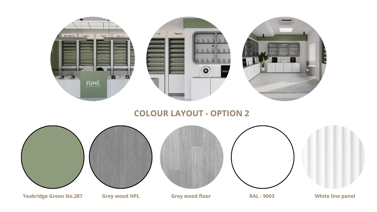
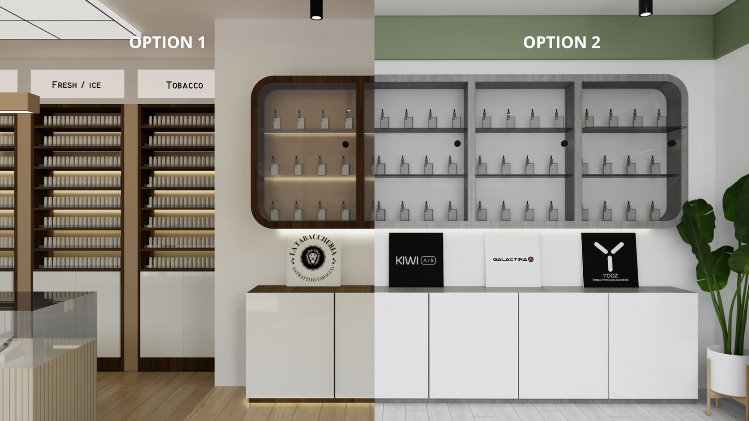
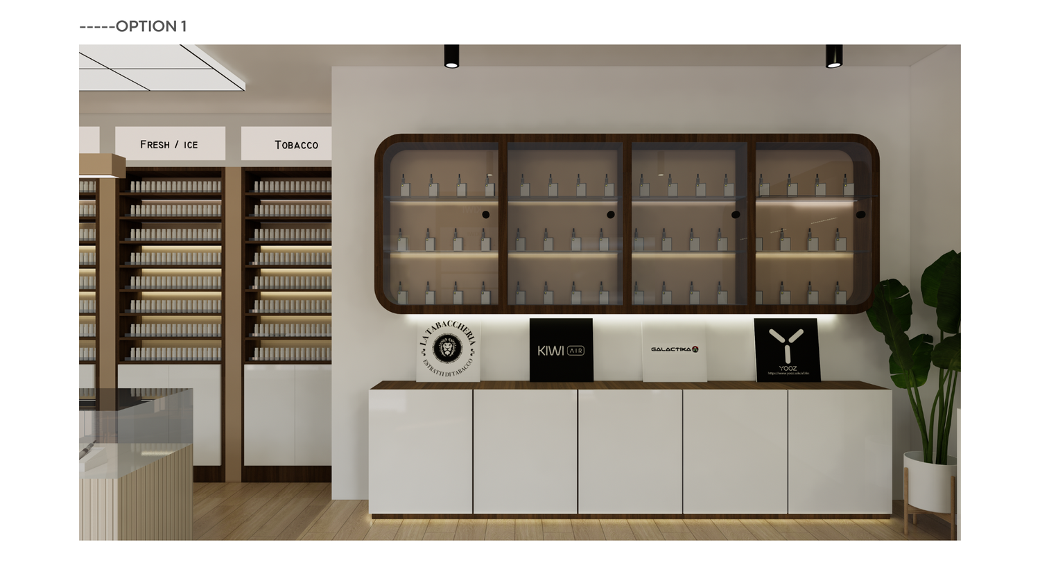
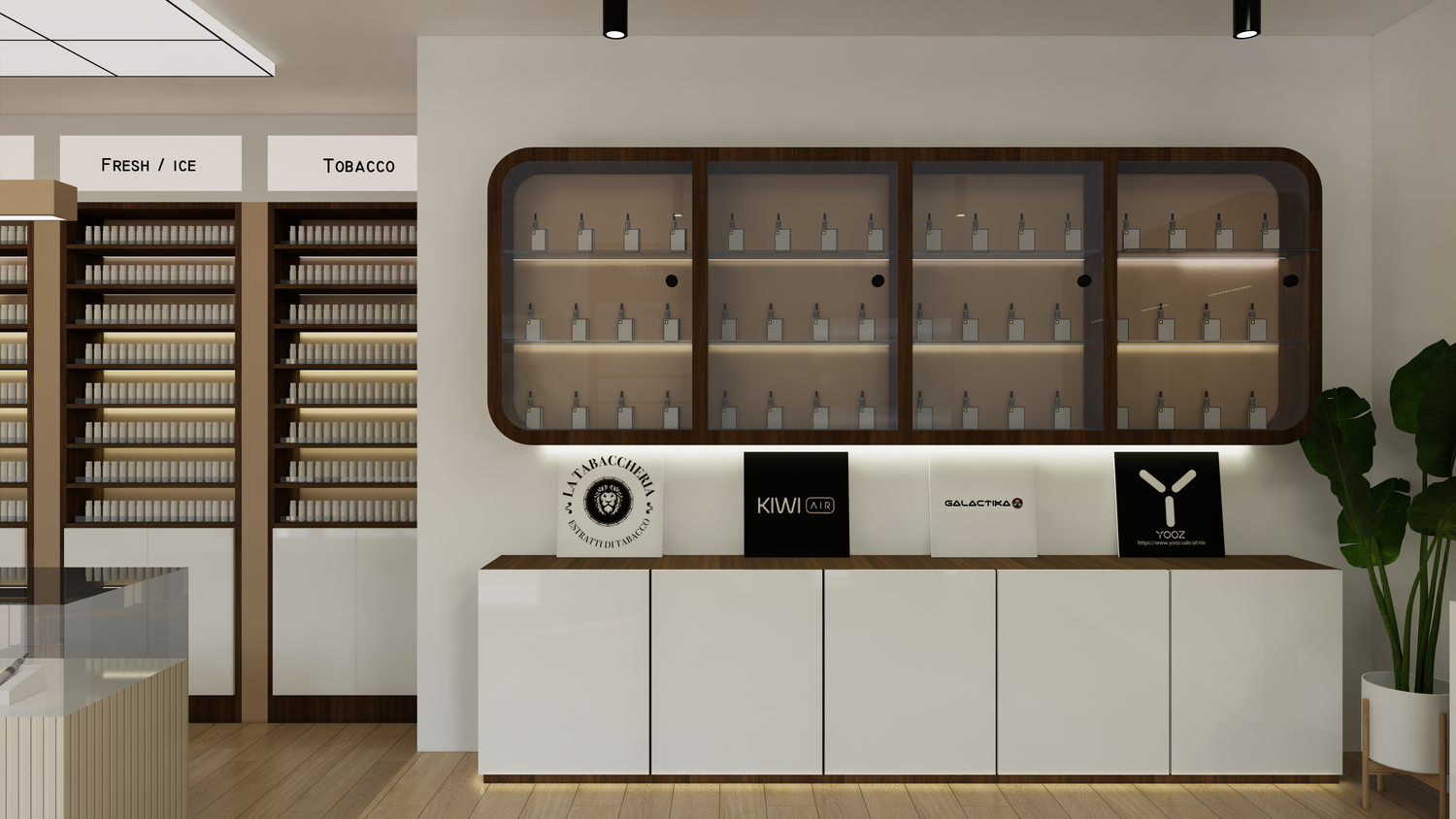
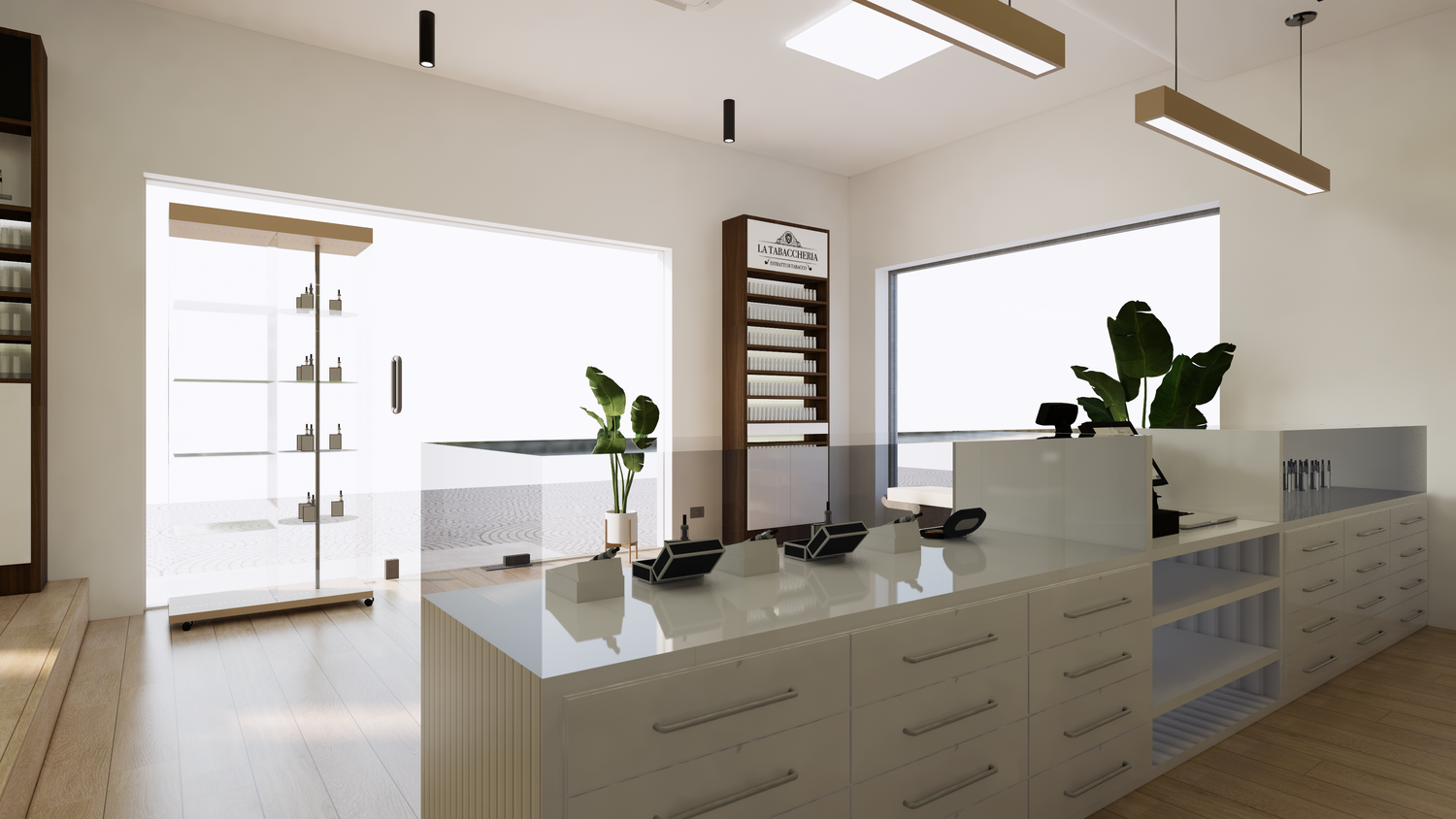
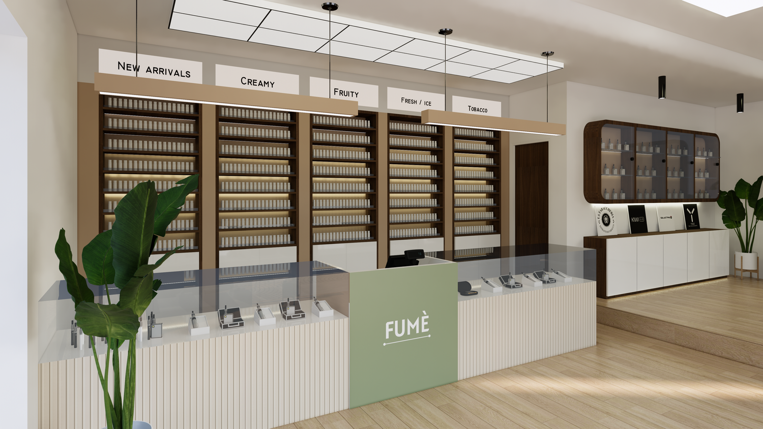
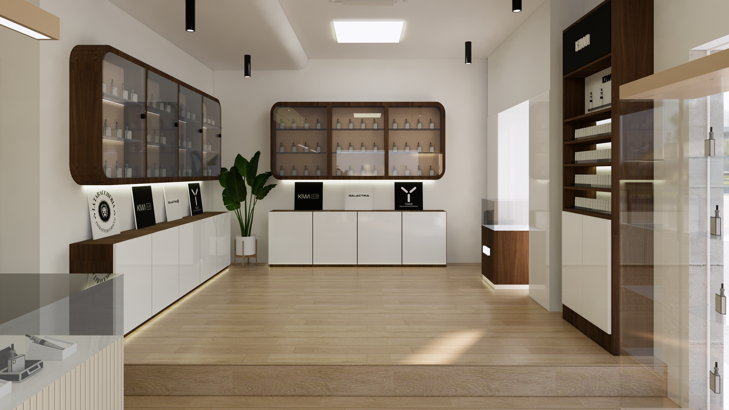
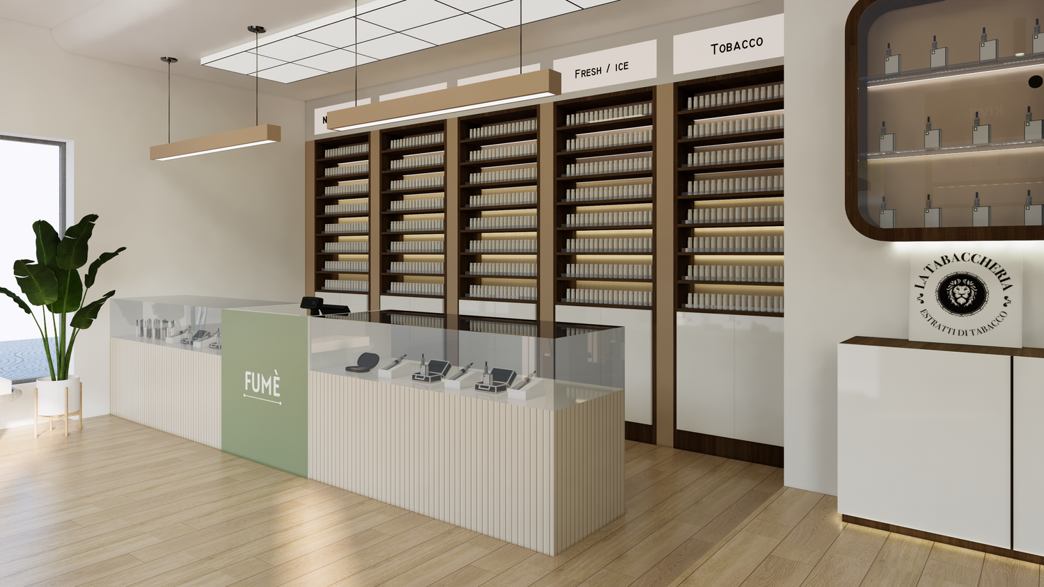
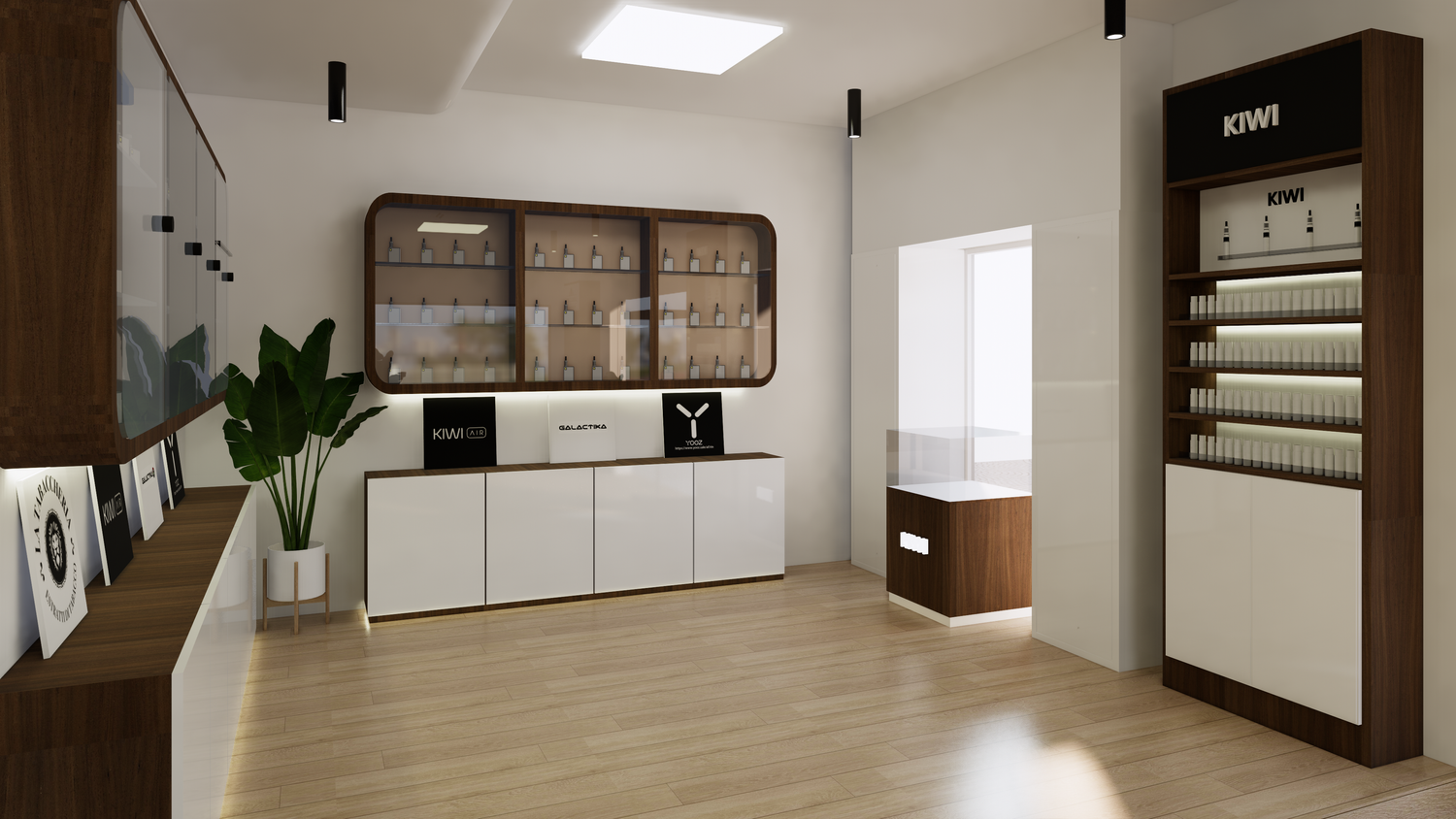
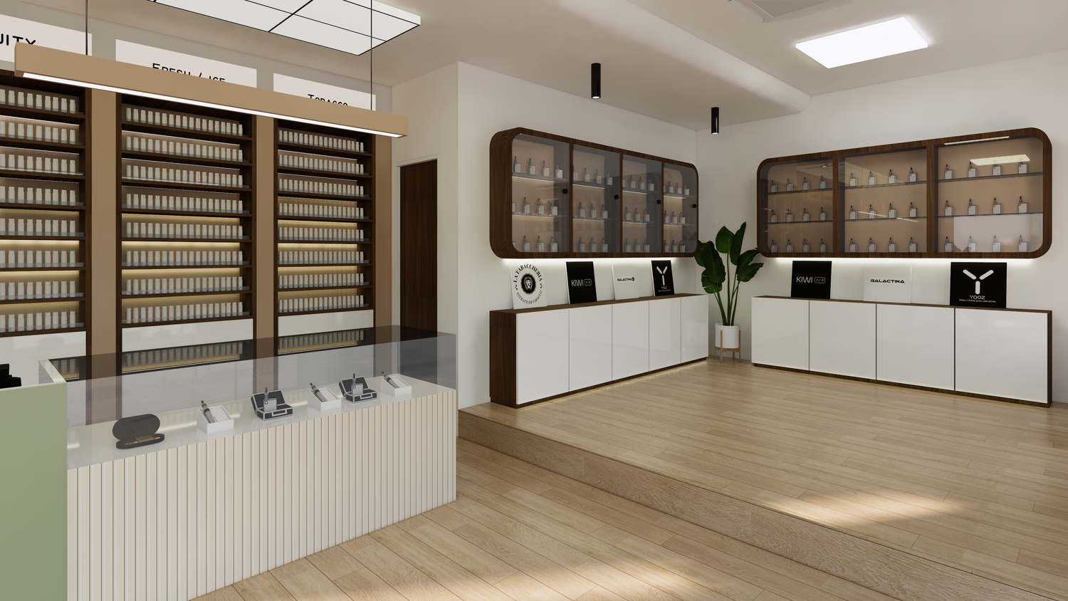
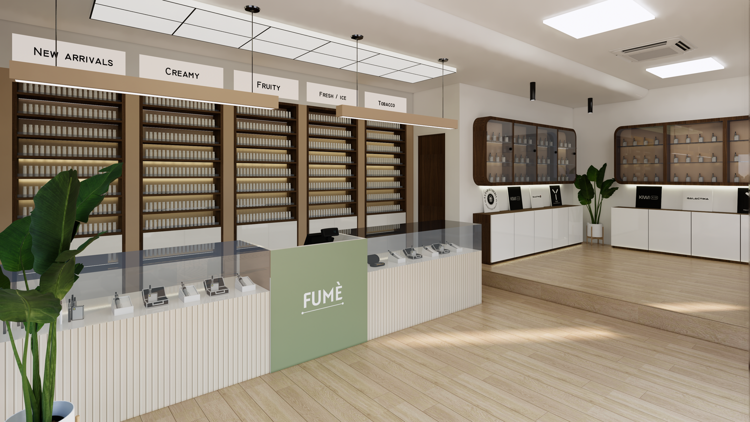
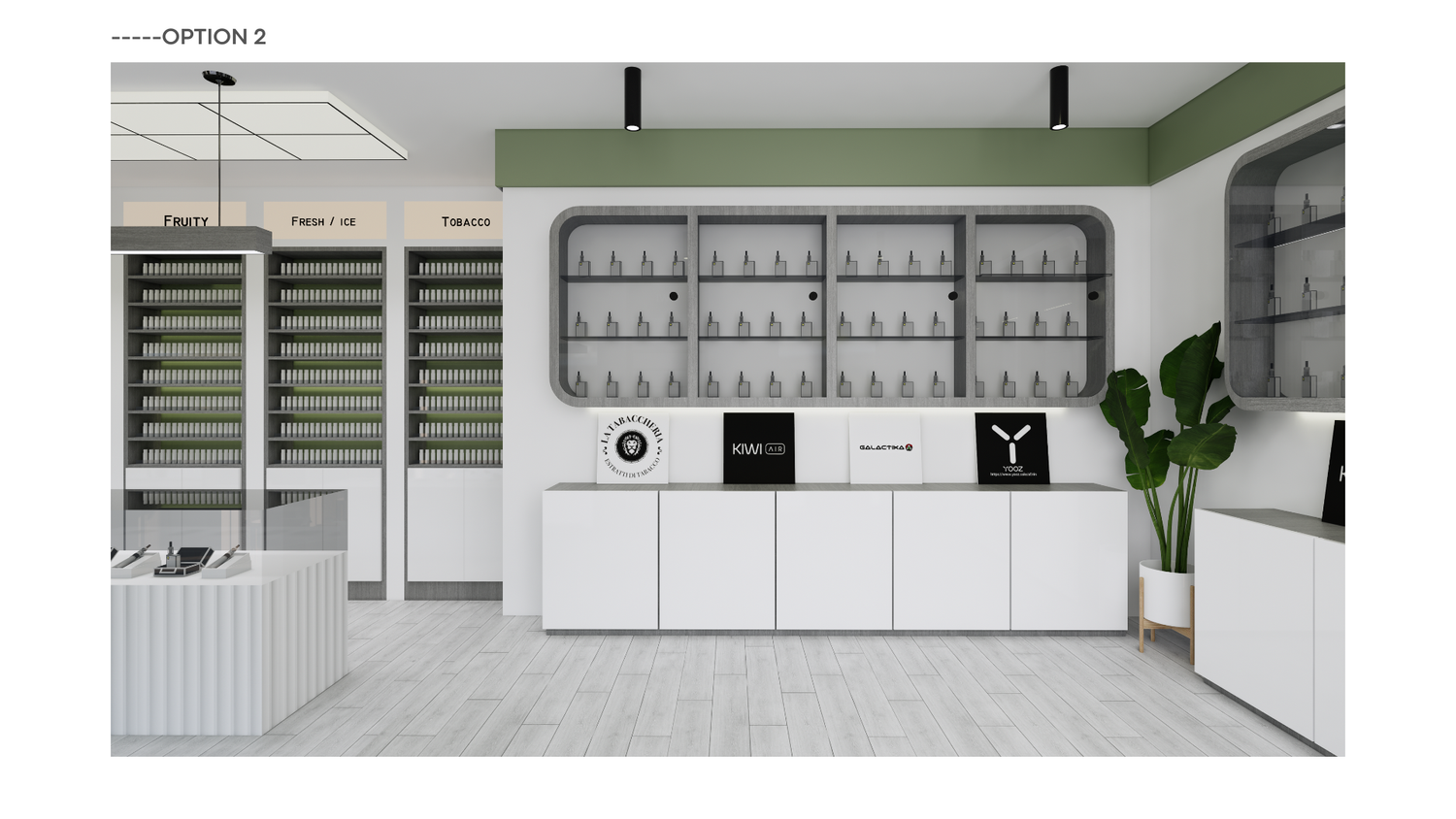
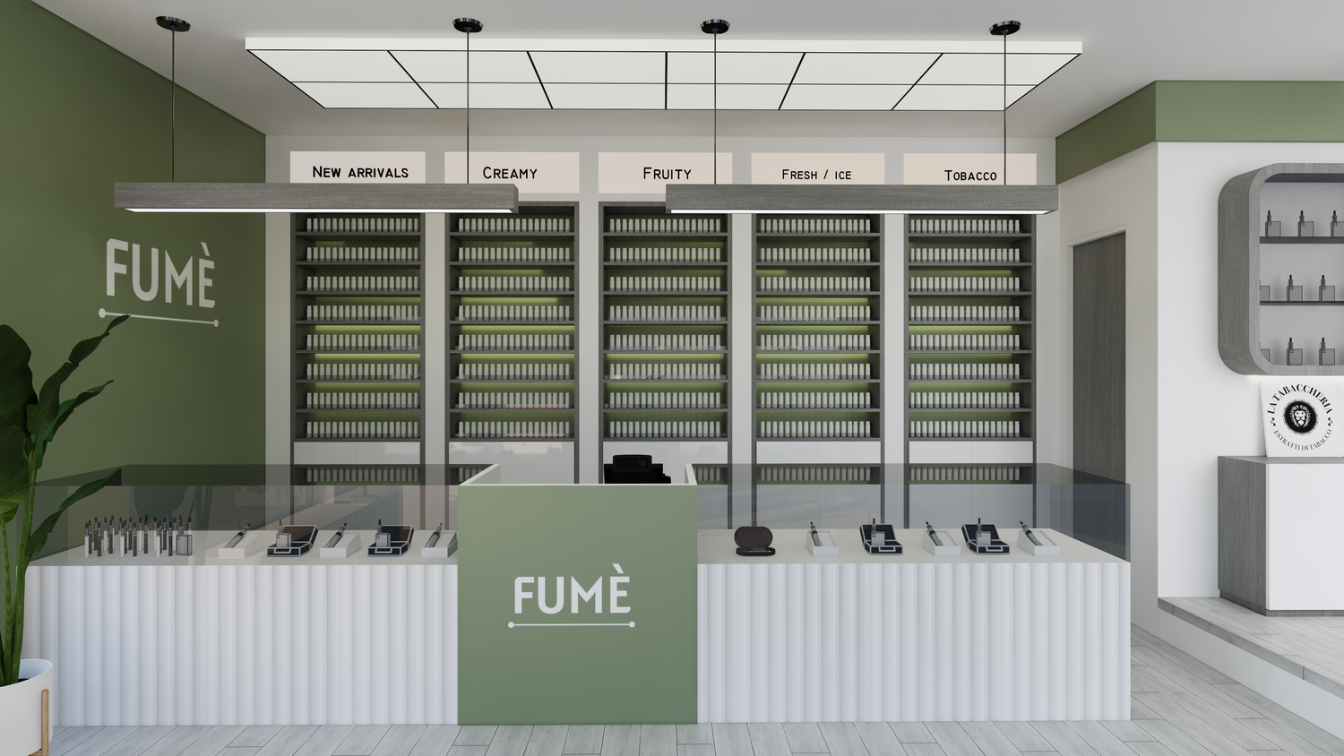
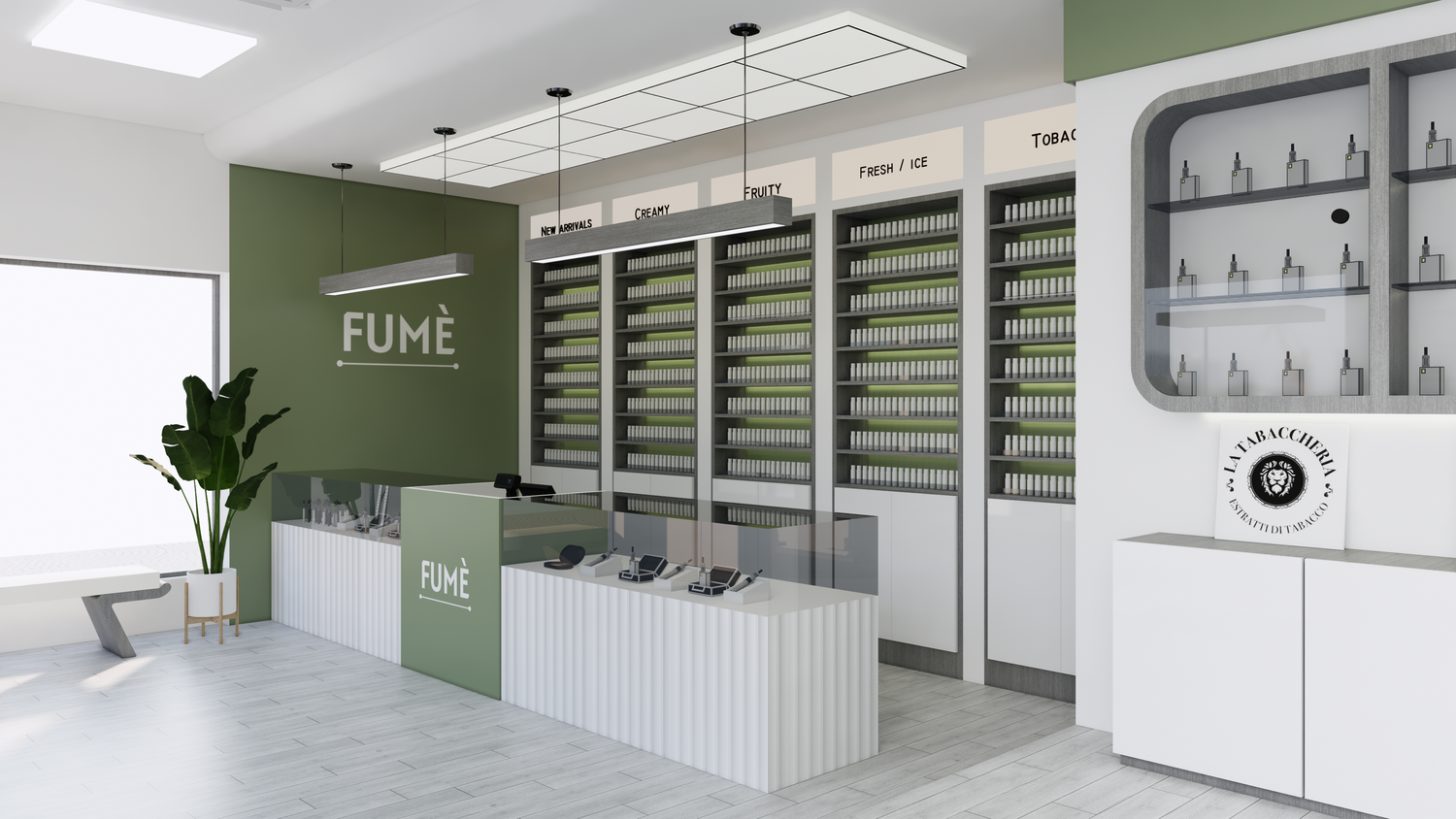
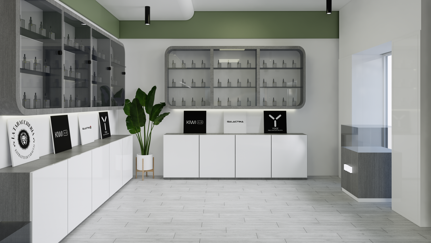
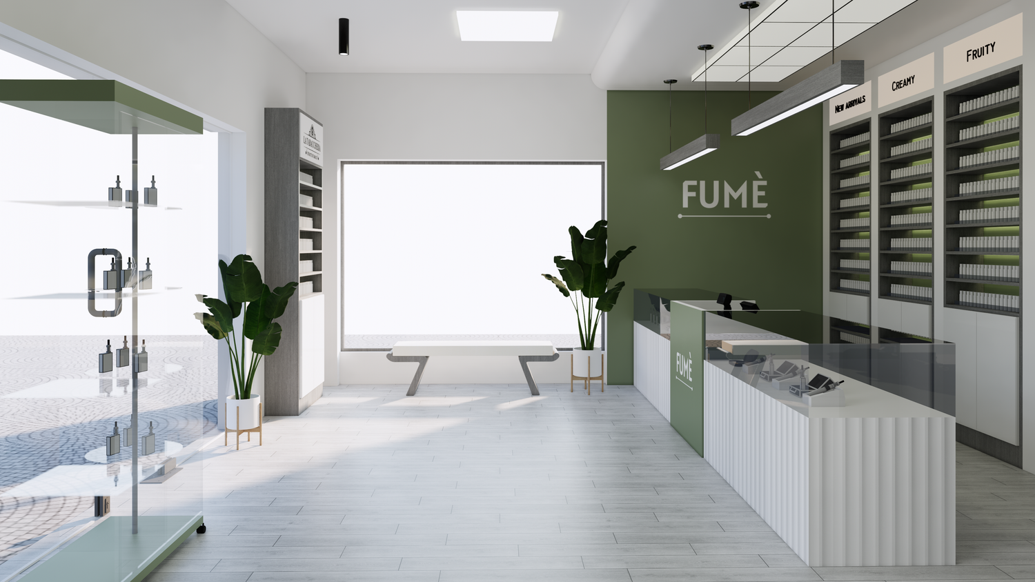
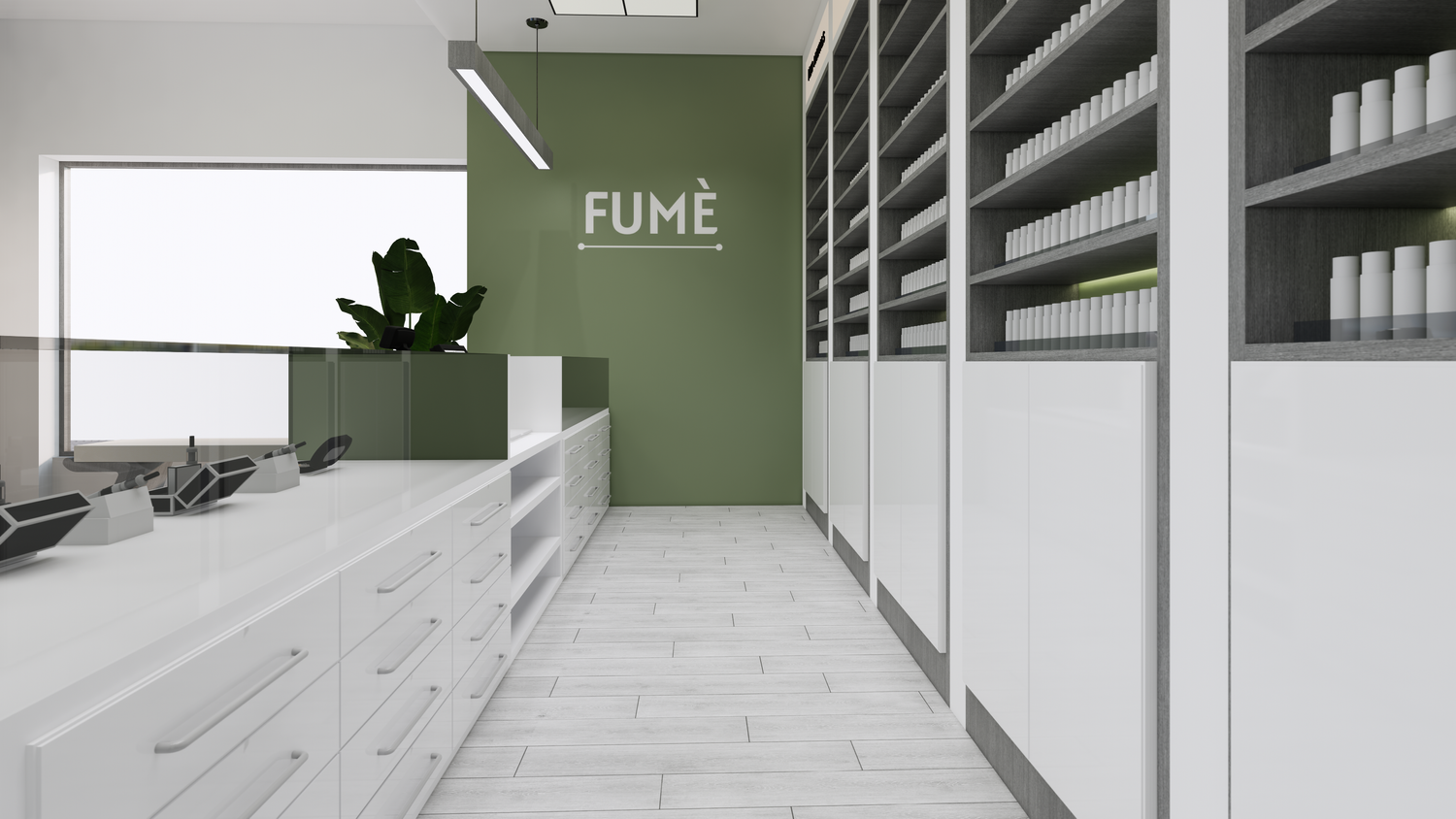
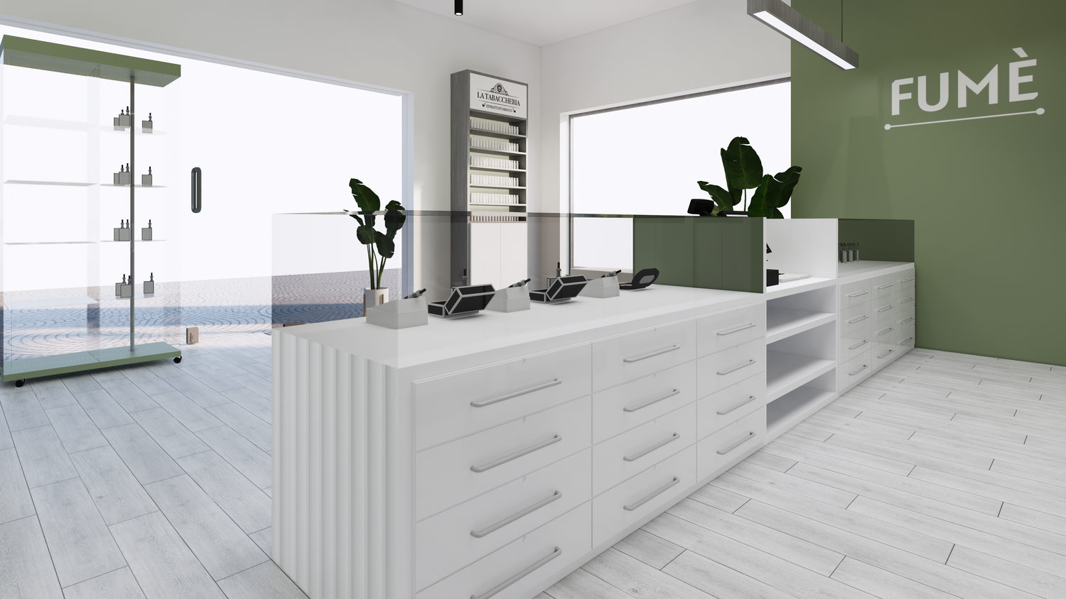
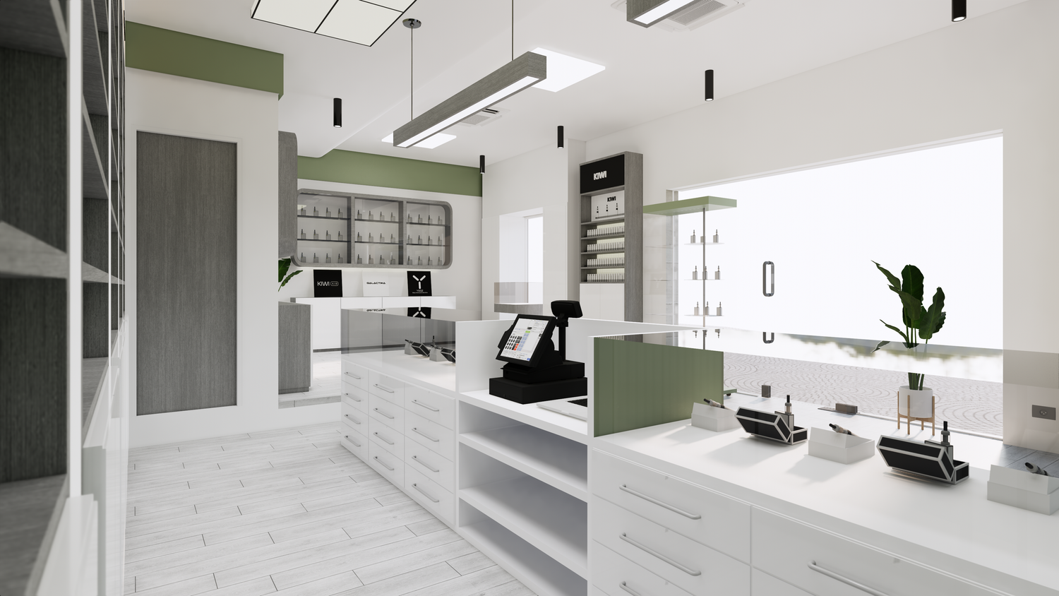
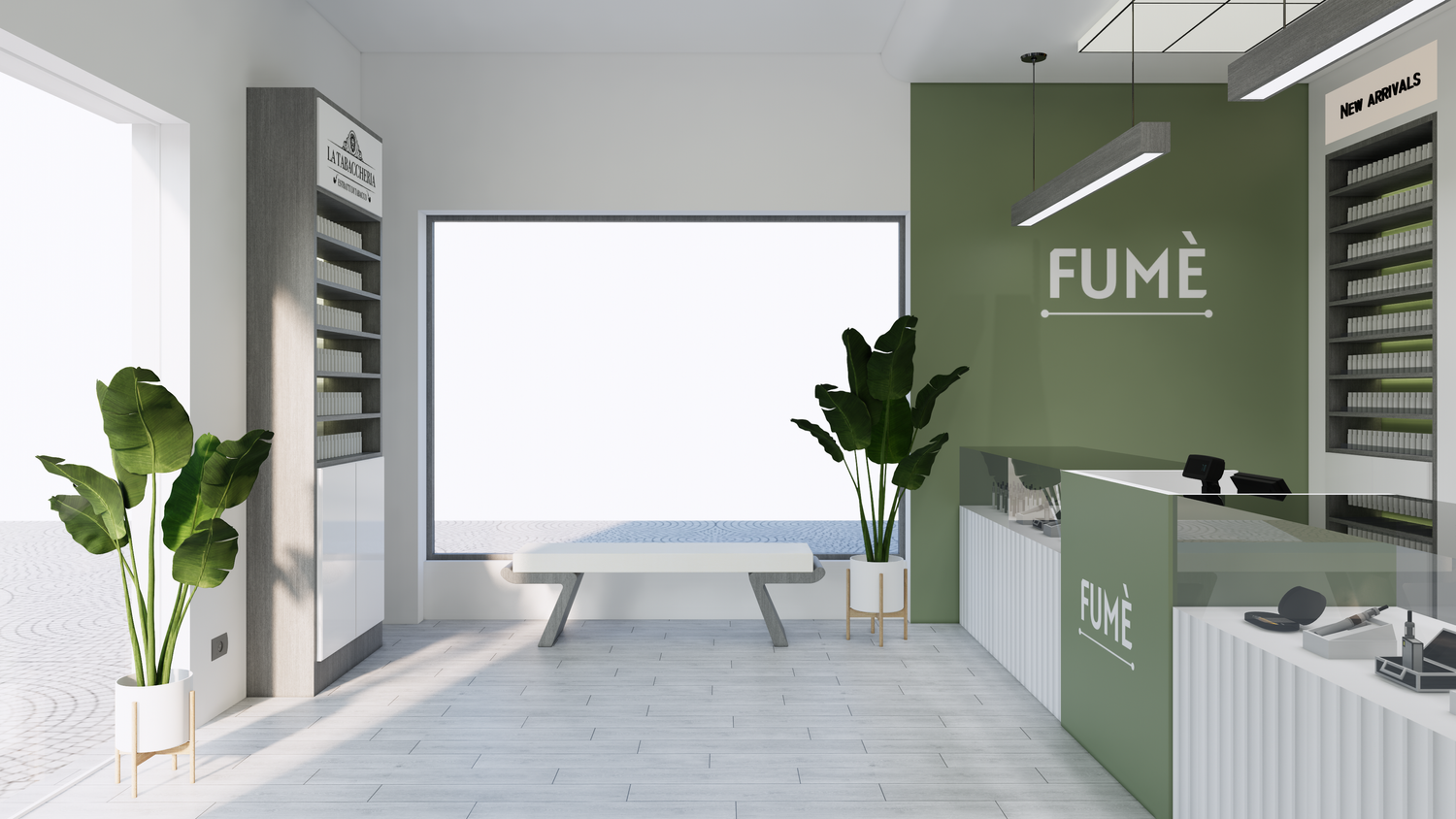
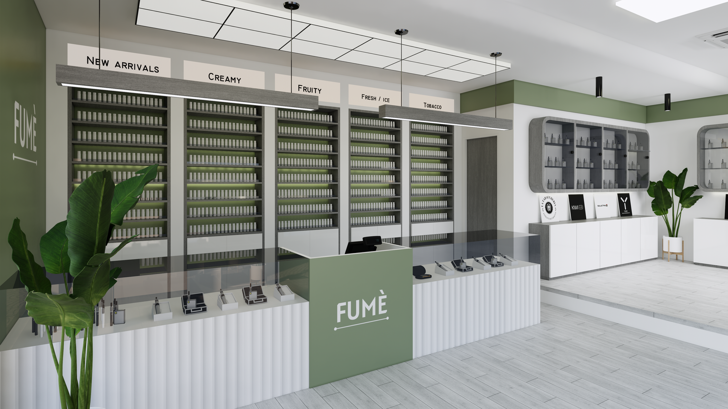
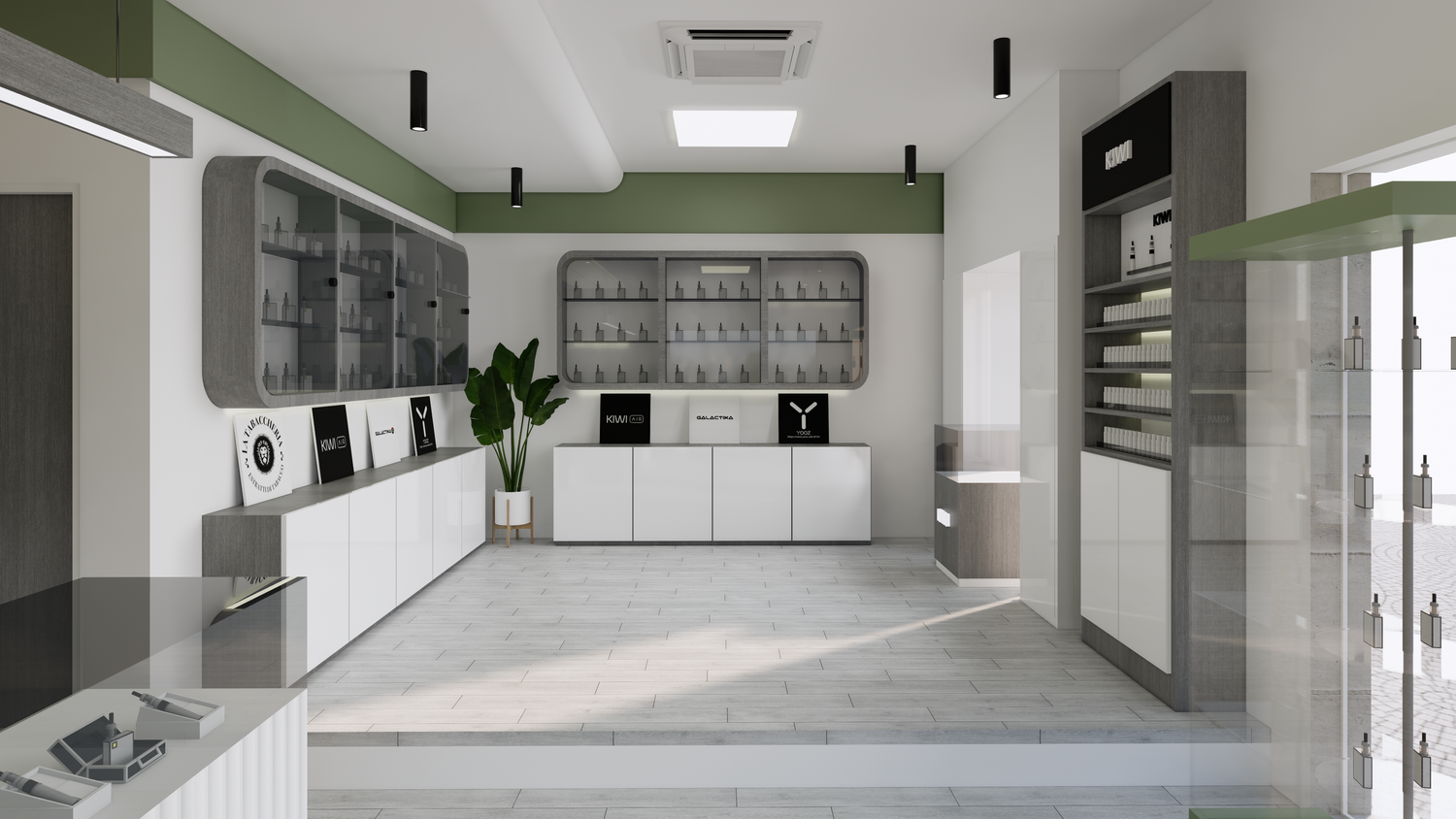
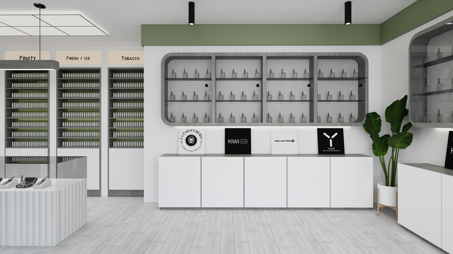
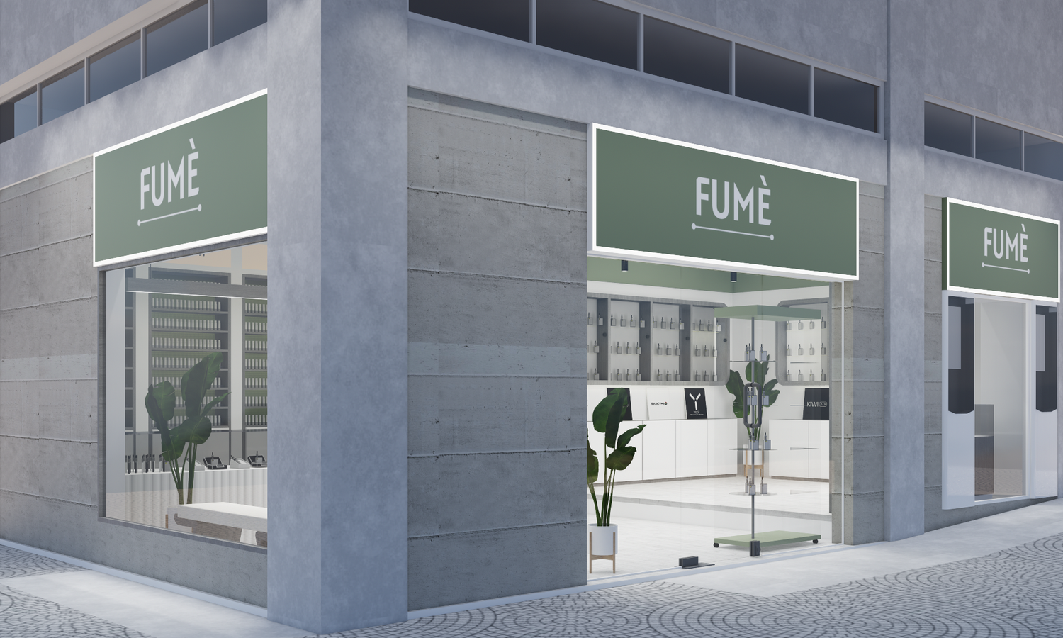
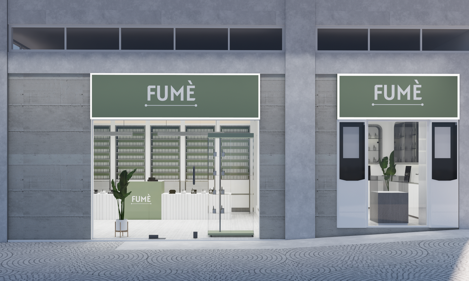
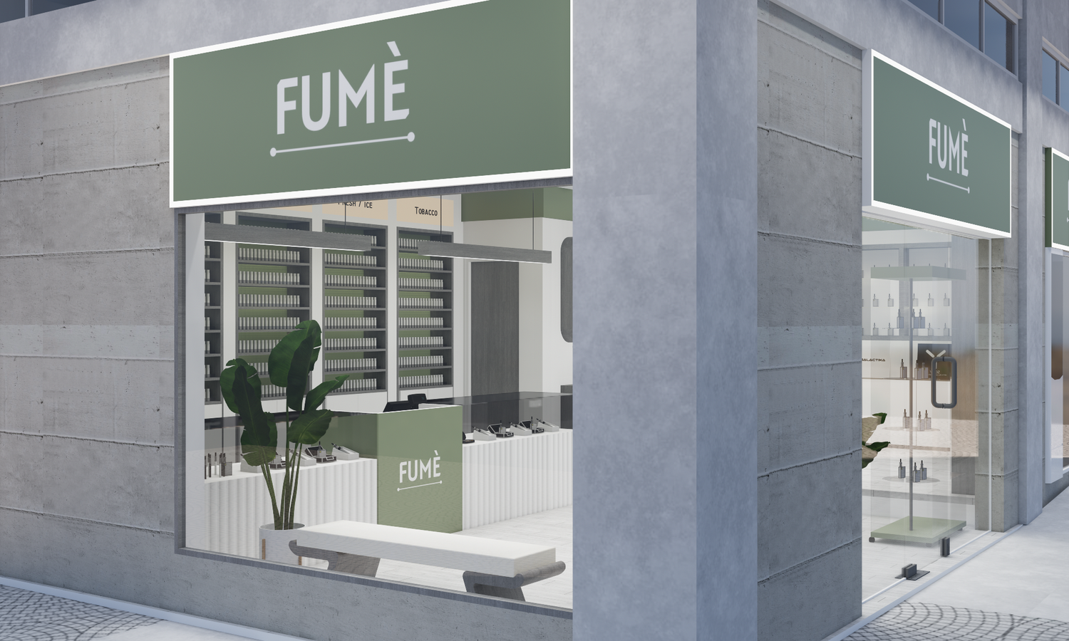
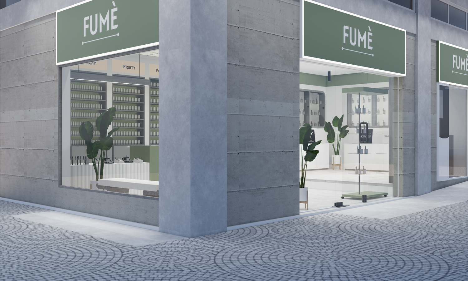
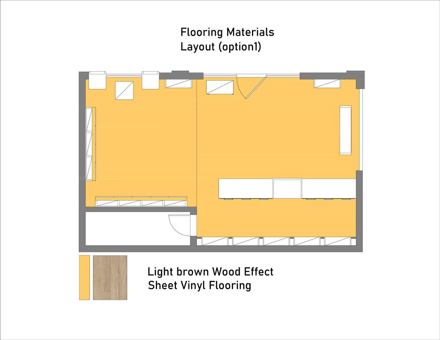
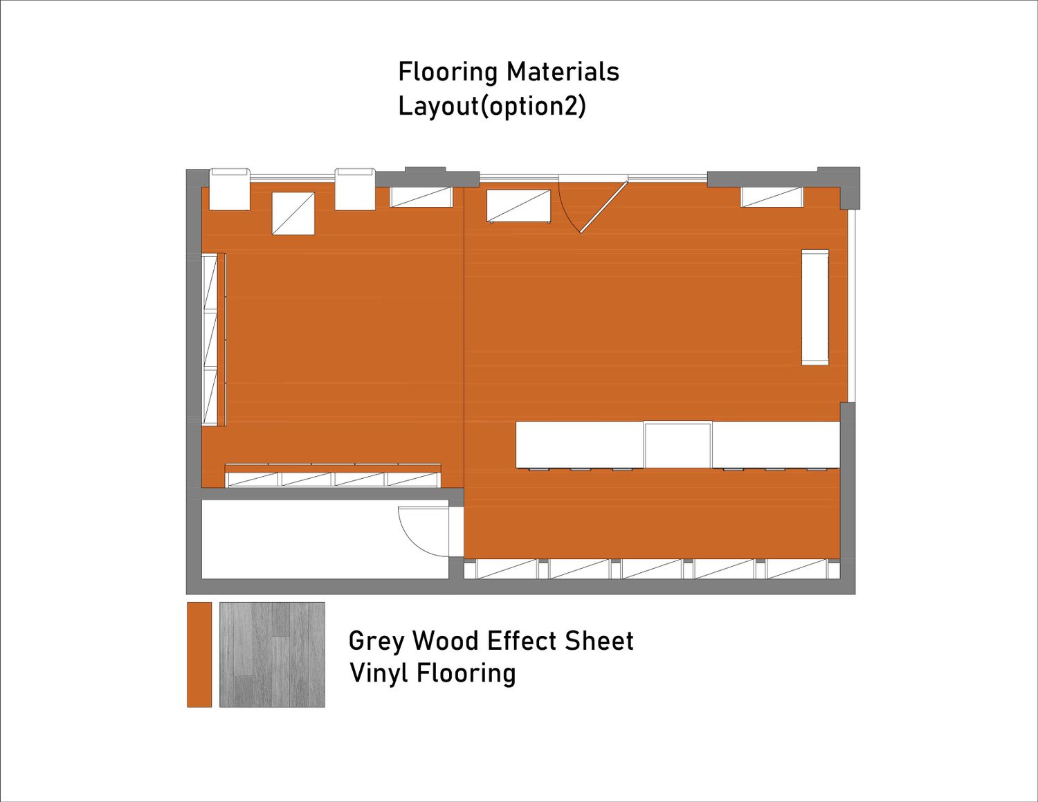
I created two options for you. The furniture placement and size remain the same, with only the color and material choices varying. For the first option, I created an elegant design dominated by cream, brown, and white. This is suitable if you want a store that looks elegant and more modern. For the second option, I created a bolder design with green, gray, and white accents to convey your business identity. This is perfect if you have multiple stores, as it makes your brand easily recognizable, as this second design is very striking and has a strong character and identity.
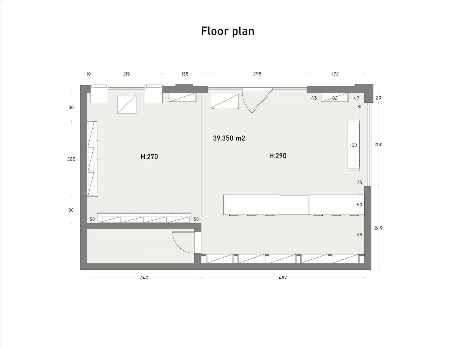
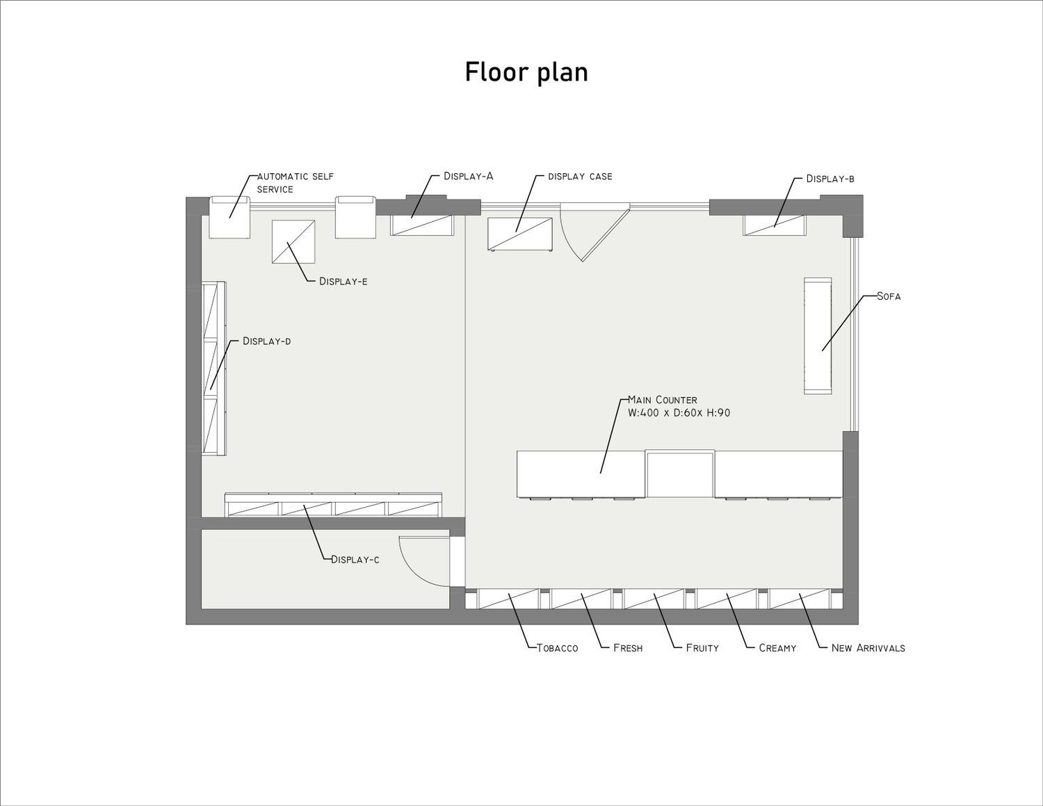
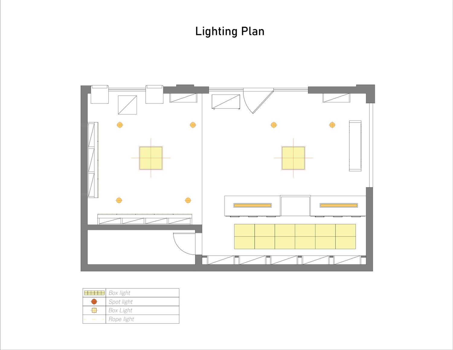
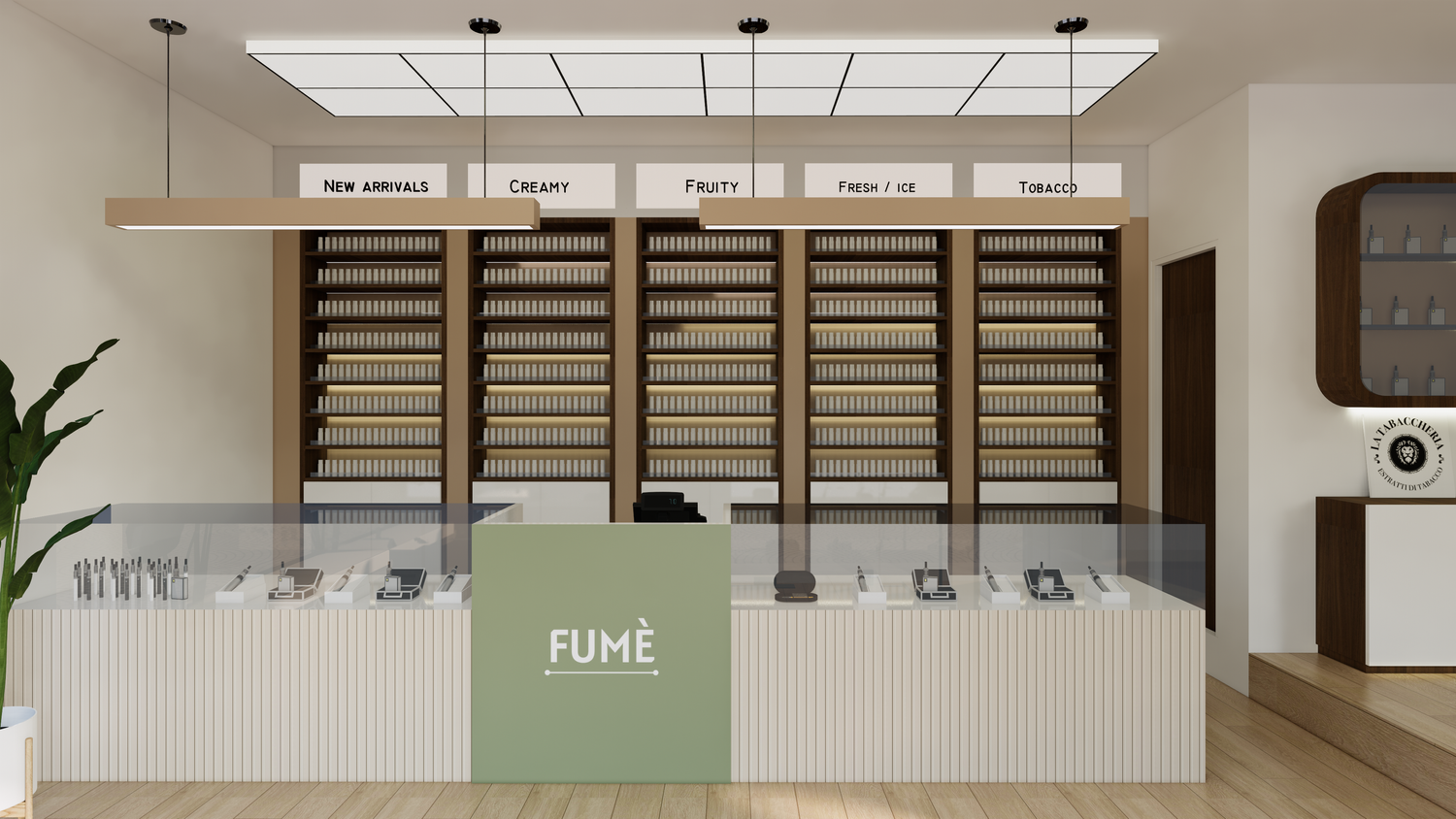
I didn't actually change much in terms of the furniture placement. I only added a sofa to the glass area on the left. As for the lighting, as you can see in the rendering, I chose the lighting that I thought was most appropriate.
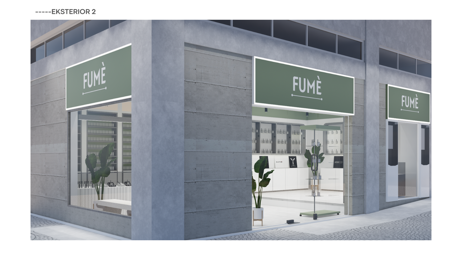
For the exterior of the building, I only replaced the logo sign with a new shade of green and white for a simple and elegant look. I also replaced the entrance door with frameless glass.
I hope the design I submitted meets your expectations. Thank you.
Regards