🔥 CYBER MONDAY 24H: 60% off all prices on the site! Only until midnight. Use code CYBERMONDAY25 👉🏼

Terni, TR, Italia
Commercial - Retail
Dear client,
The proposed restyling of the FUMÈ store is conceived as a clear, efficient, and replicable retail concept, designed to communicate expertise, innovation, and product variety while maintaining a warm, welcoming, and accessible atmosphere.
The design builds upon the existing spatial organization and operational workflow, preserving key functional relationships and enhancing them through precise architectural interventions. This approach allows for a cost-effective and time-efficient transformation, while significantly upgrading the spatial identity and overall customer experience.
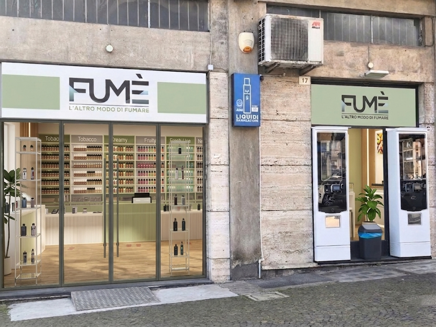
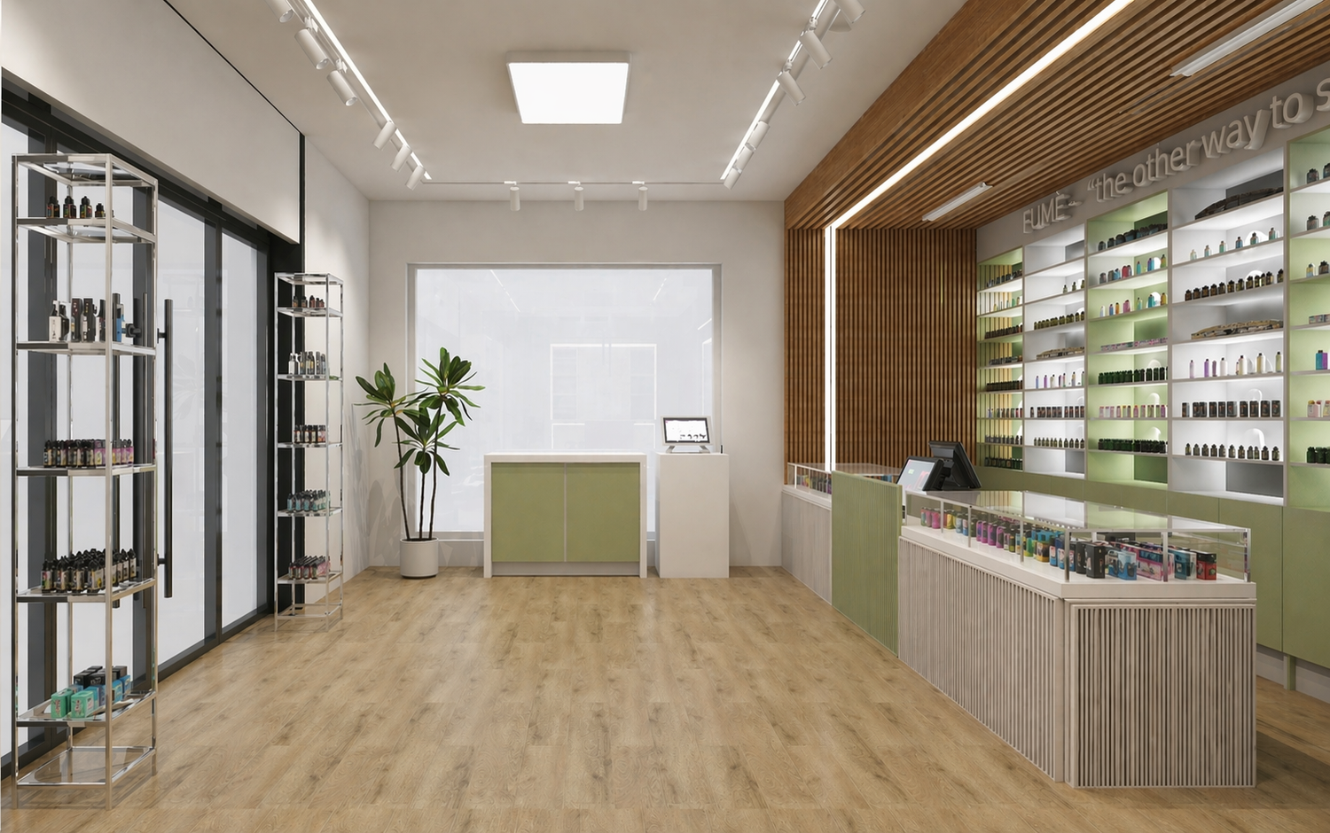
The entrance is redefined through a more transparent and open solution, improving visibility from the street and naturally drawing customers into a bright and accessible retail environment. This intervention strengthens the store’s presence while supporting a more inviting first impression.
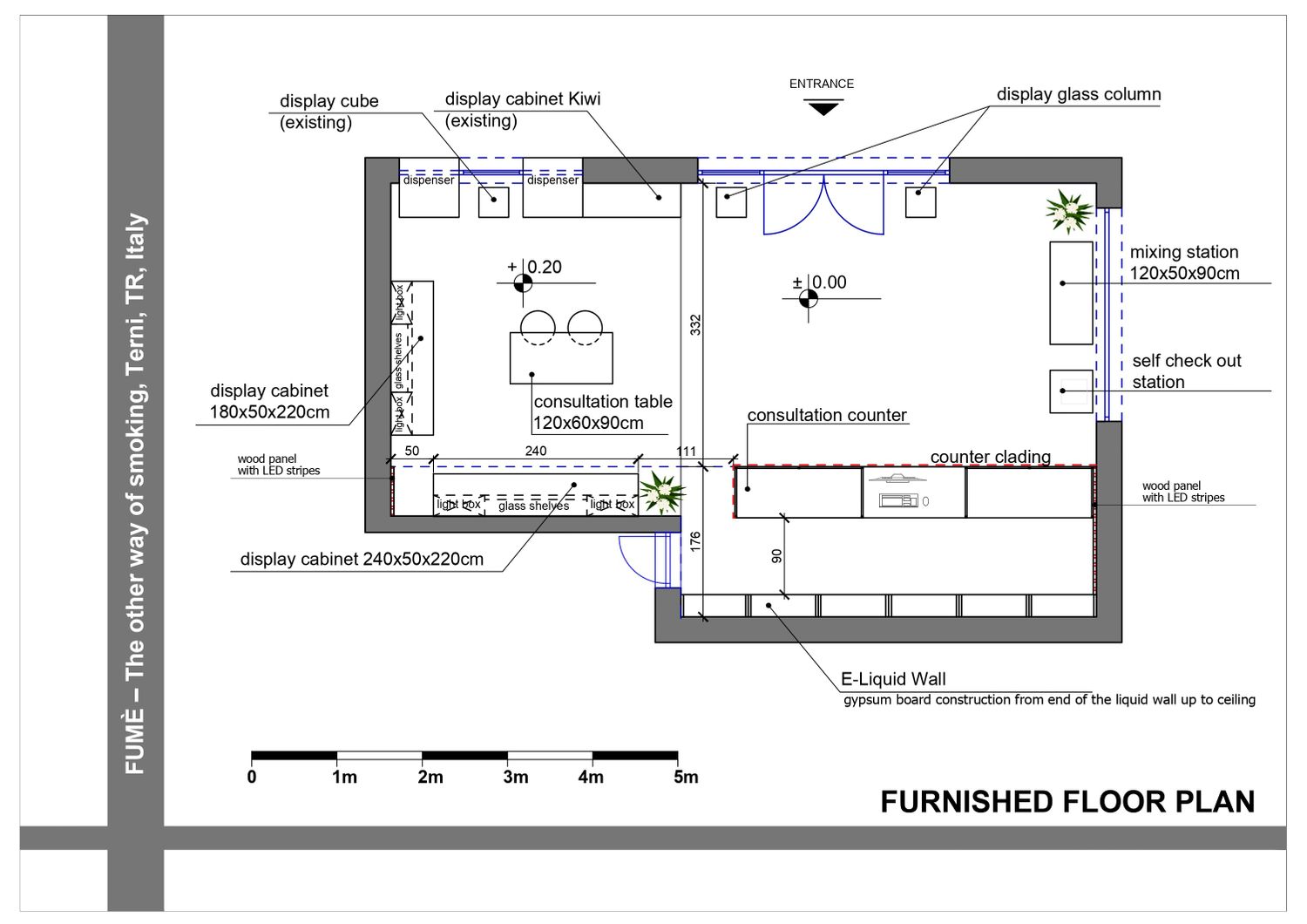
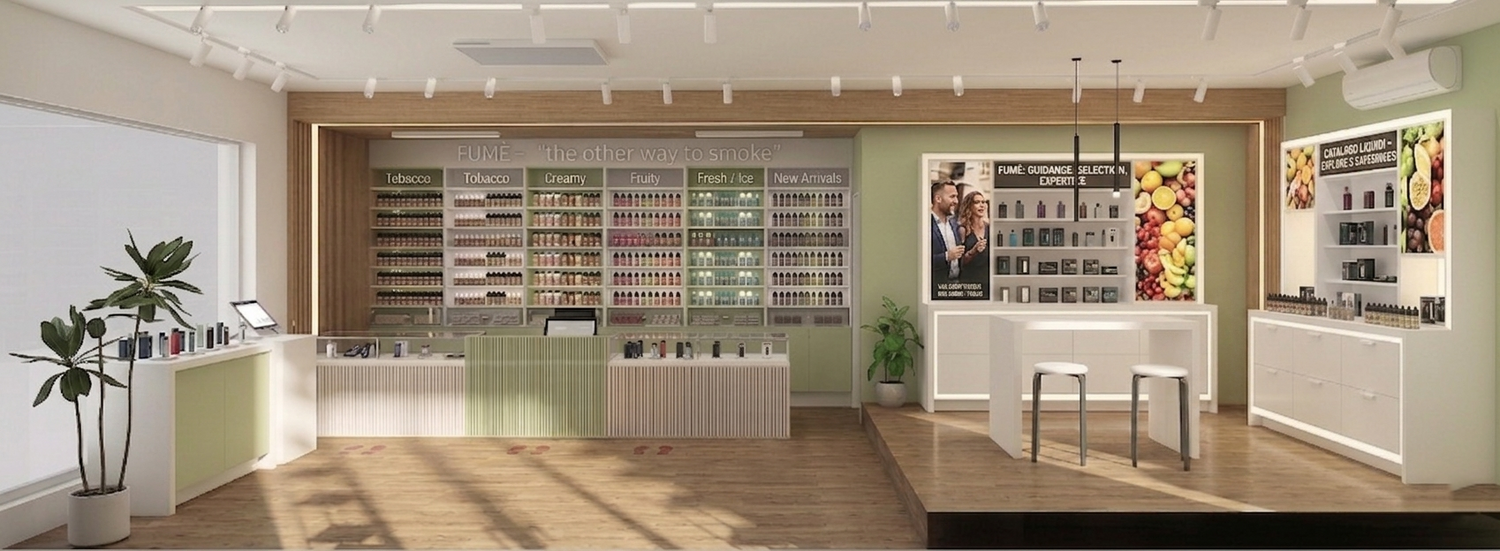
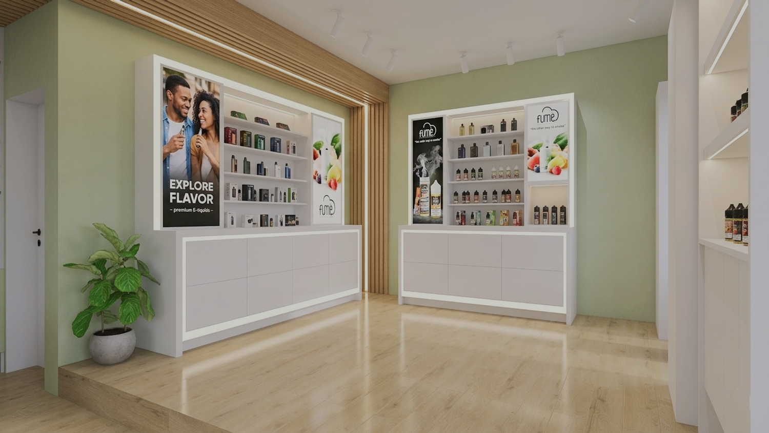
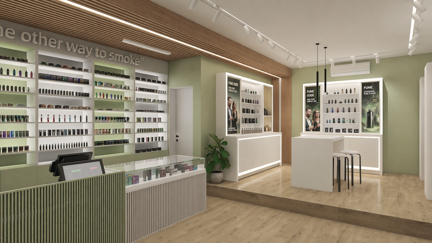
At the core of the project is the e-liquid wall, reinterpreted as a structured “library of liquids.” The current shelf and drawer disposition has been recognized as highly optimized for everyday use, both in terms of accessibility and storage efficiency. For this reason, it is intentionally preserved and enhanced rather than redesigned. The existing plexiglass drawer system is fully retained and integrated into a refined architectural composition defined by a clear modular grid, improved visual hierarchy, and a restrained palette of soft white and green tones. Categorization is reinforced through aligned upper labeling, ensuring intuitive navigation and legibility. The composition is vertically completed with a clean gypsum board closure, creating a continuous backdrop for integrated branding and strengthening the wall’s role as the primary visual anchor of the space.
The consultation counter remains the central interface between staff and customers, maintaining its position within the spatial layout. It is upgraded through the application of vertically articulated fluted 3d soft panel cladding, introducing texture, rhythm, and a more tactile quality to the space. The integration of a glass display zone allows entry-level devices to be presented in a clear and accessible manner, supporting immediate interaction and product understanding.
To the left, near the storefront window, the mixing station and self-checkout area are integrated into a clean and unobtrusive composition. Their placement maintains operational efficiency while contributing to the overall visual order of the space, ensuring that secondary functions remain accessible without disrupting the main customer flow.
To the right of the entrance, the hardware zone is developed as a distinct yet visually connected area dedicated to device display. Custom-designed cabinetry combines glass shelving, integrated LED lighting, and upper lightbox panels for brand communication. Lower storage elements ensure functional efficiency, while the overall composition maintains a clean and balanced elevation. A secondary consultation point is introduced within this zone, defined by more focused lighting and a slightly more intimate scale, allowing for in-depth product presentation and personalized customer engagement.
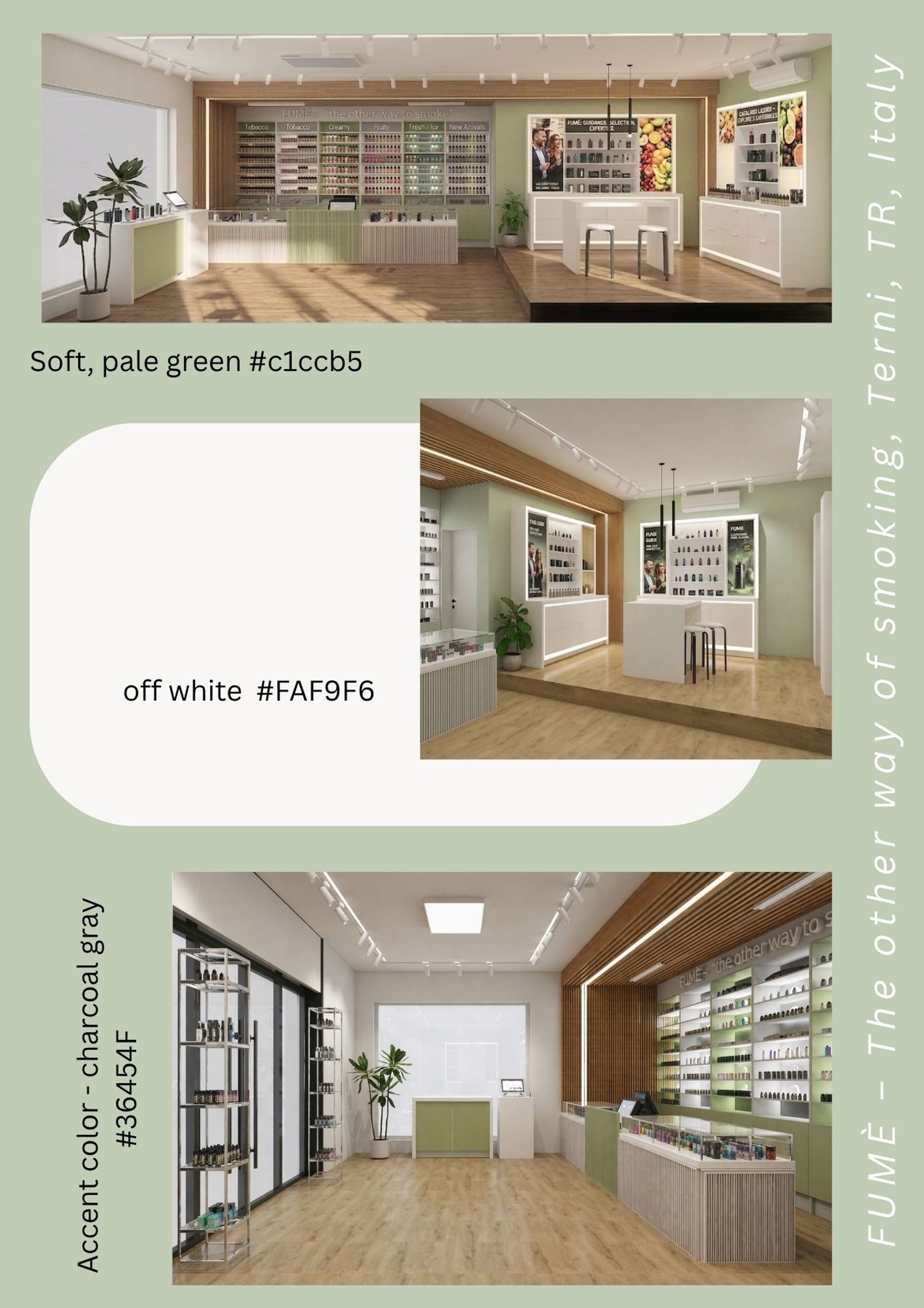
Material articulation is based on a balanced combination of light neutral surfaces, soft green, and controlled use of natural wood. A soft, pale green is also incorporated in logo sign. Wood elements are strategically introduced—particularly in the employee zone and ceiling features—to add warmth and spatial depth, while also serving a functional role in integrating lighting systems and concealing technical components. The overall material language remains consistent, contemporary, and aligned with the brand’s identity.
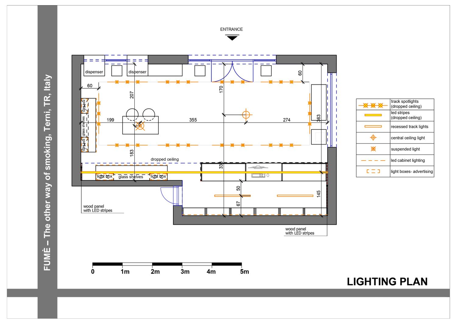
Lighting is conceived as an integrated architectural system, layered to support both functional clarity and spatial atmosphere. Linear LED profiles are incorporated within shelving elements of the liquid wall to ensure uniform product illumination and reinforce the horizontal rhythm of the display. A magnetic track lighting system spans the ceiling, providing flexibility and precise directional lighting across both primary zones. Recessed linear fixtures are integrated within ceiling panels, emphasizing architectural lines and contributing to a cohesive visual framework. Additional accent lighting within display units and localized suspended fixtures further articulate key areas, resulting in a bright, controlled, and highly legible environment.
Please note that renderings are indicative of the design intent; certain elements may vary during detailed development.
The spatial composition is further defined by subtle architectural elements, including the framing of the liquid wall through ceiling and wall transitions, the textural treatment of the counter front, and the integration of display and communication surfaces into cohesive vertical planes. These interventions contribute to a more unified and recognizable interior identity.
Overall, the project delivers a well-organized, visually coherent, and functionally efficient retail environment that enhances product presentation, supports intuitive customer navigation, and strengthens the FUMÈ brand. The result is a flagship store concept that is both distinctive and scalable, providing a solid foundation for future roll-out across multiple locations.
I wish you good luck with your renovation project!
Best regards!