🔥 CYBER MONDAY 24H: 60% off all prices on the site! Only until midnight. Use code CYBERMONDAY25 👉🏼

Salerno, SA, Italia
Residential - Apartment
Hello,
I hope you are doing well.
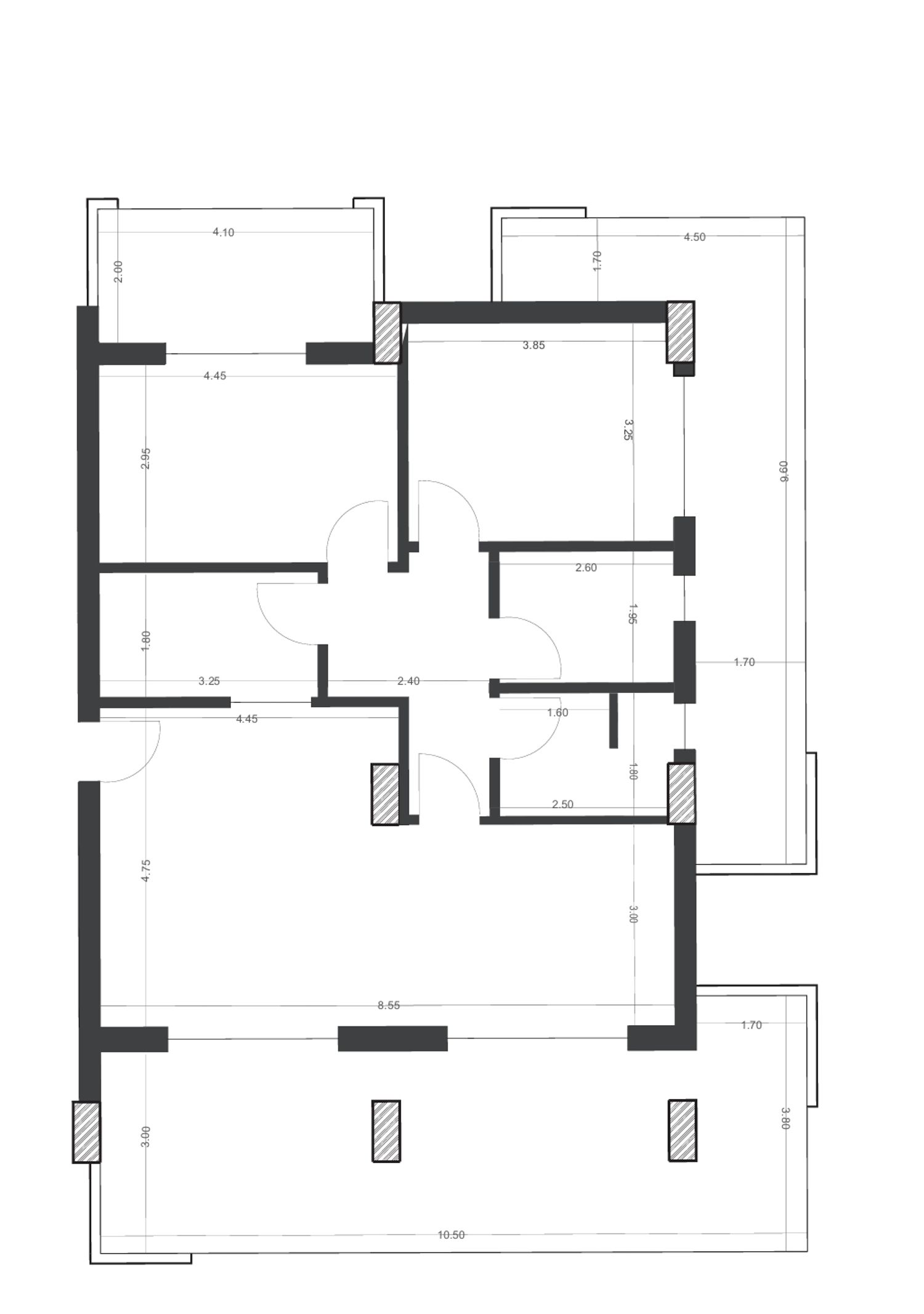
I found your apartment to have strong spatial potential, and with that in mind, I developed a layout that builds on the existing plan rather than completely reshaping it. As discussed, the original organization was already functional and not problematic, so my intention was not to introduce major structural changes, but to refine the space and make it more livable, practical, and better suited to your family’s daily needs.
I am happy to share a solution that responds to your requests, and below I will walk you through the project step by step, as if we were exploring the apartment together.
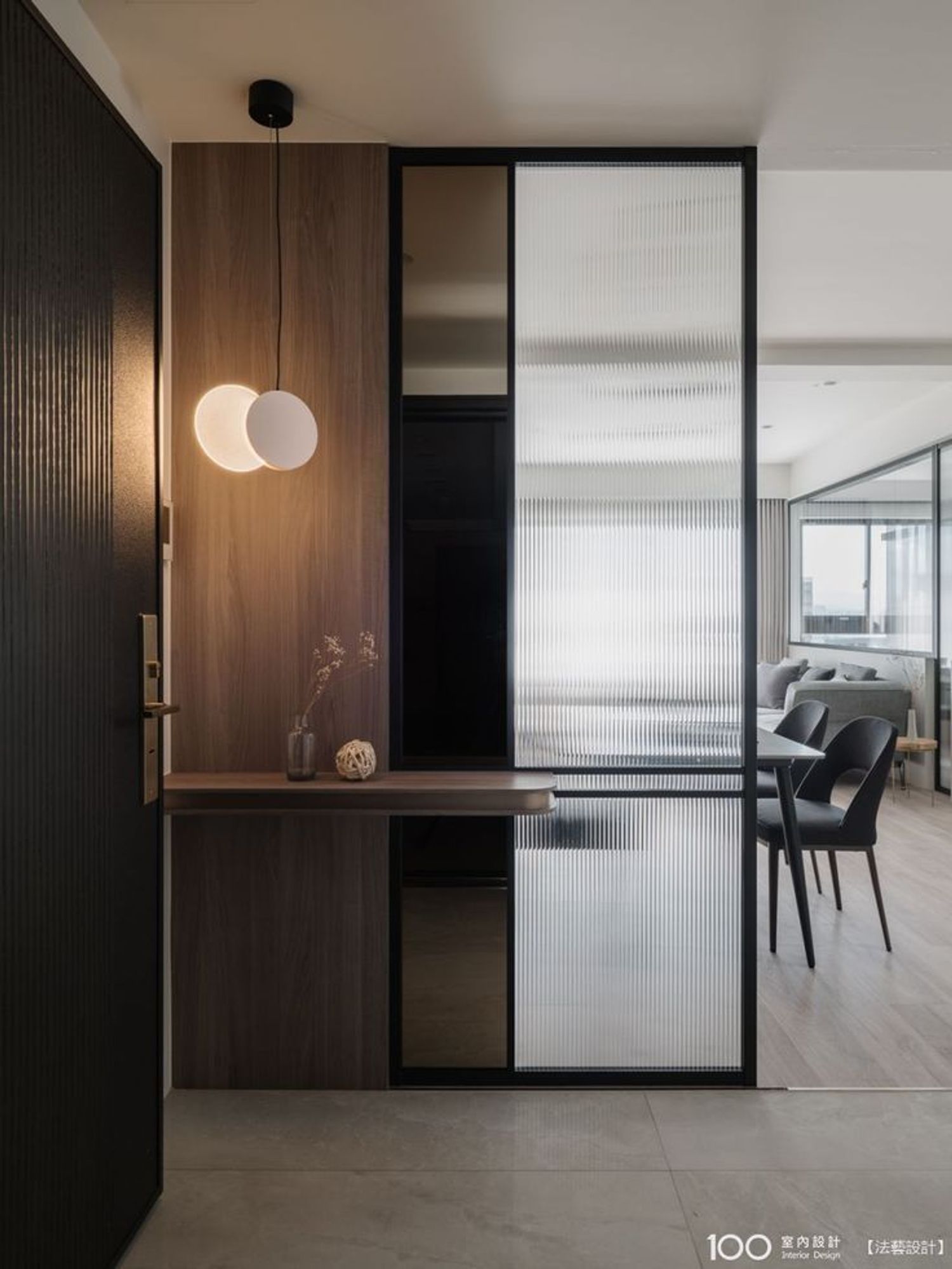
As we enter the apartment, the first design intention was to create a generous and functional entrance area. Instead of opening directly into the living space, the entrance is defined as a separate zone, allowing for a more gradual transition into the home. Here, I designed a spacious entrance with a wardrobe area, integrated storage, and a seating element positioned next to the column. This area can be comfortably used for everyday needs such as storage, changing shoes, and organizing coats and bags—an essential feature for a family home. At the same time, it creates a clear threshold that prevents the living area from being immediately exposed upon entry.
Moving forward, we arrive at the living area. One of your main requests was an open-plan space of approximately 30–32 square meters, and this has been successfully achieved. As requested, the living room and kitchen were kept on the south–east side of the apartment, benefiting from the preferred orientation and natural light. The open-plan living room, dining area, and kitchen are organized as a continuous space, allowing flexibility in furniture arrangement while maintaining a clear sense of order. The living room is designed to accommodate a panelled TV unit and a seating layout that you can personalize over time.
The kitchen is placed at the back of this open area and follows an L-shaped configuration. I recommend using full-height cabinetry here, which allows you to maximize storage capacity without visually overcrowding the space. An island was intentionally avoided, as it would have become the primary dining surface and limited circulation. Instead, a separate dining table was proposed, which suits the geometry of the kitchen and allows for more comfortable movement. Throughout this zone, circulation widths were kept as generous as possible to support everyday family use.
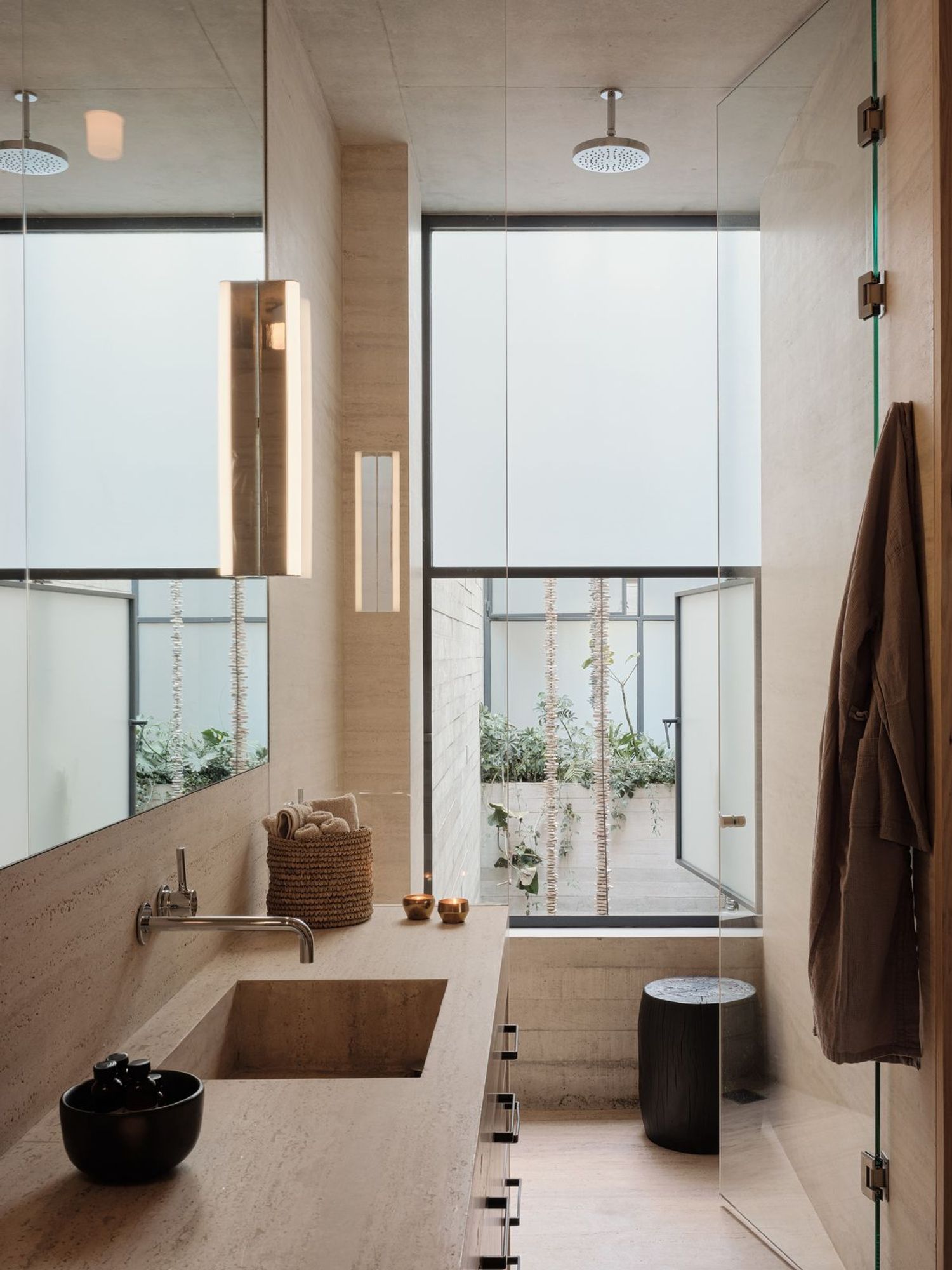
Regarding the bathroom zone, their original location was maintained in line with the existing plan. However, the walls were shifted downward, both here and on the left side of the entrance, allowing the bathrooms to be enlarged without altering the core layout. As a result, one bathroom accommodates a bathtub, while the other includes a shower. Although these are not oversized spaces, both bathrooms include carefully planned storage solutions: one with a concealed laundry cabinet and the other with additional storage for daily use.
As we move along the corridor, you will notice that a new room has been created on the left. By lowering the entrance-side wall, the master bedroom became significantly larger, which made it possible to introduce this additional space. This room is proposed as a studio or working room. Due to the apartment’s orientation and existing structure, this was the only viable location for such a function. However, this also meant that the room would not receive direct natural light or ventilation.
To address this, a frosted glass solution was introduced between the entrance and the study room. This element allows light to filter through while creating a soft and atmospheric presence in the entrance area. At the same time, it includes an operable opening toward the living space to allow ventilation when needed. Several alternative solutions for this wall were explored and are shown in the visual material. A sliding door was intentionally avoided, as it would have reduced the entrance storage capacity and offered limited acoustic insulation. A solid panel door was also excluded for similar reasons. The full-height frosted glass solution was selected as a balanced response, offering privacy, light, and spatial continuity while remaining flexible in use.
Finally, the private zone leads us to the bedrooms. The master bedroom is kept simple and calm, with a clear wall reserved for a potential TV installation if desired. In your daughter’s bedroom, the wardrobe is positioned in a way that separates it from the adjacent room, creating a layout that can comfortably adapt to her needs as she grows. This arrangement is also illustrated in the furnished floor plan.
Overall, the project maintains the original logic of the apartment—including its orientation and spatial relationships—while subtly enhancing comfort, functionality, and everyday usability. I hope the proposed solutions feel thoughtful and aligned with your expectations, and I look forward to hearing your feedback.
Kind regards,
SURA MINA YILMAZ