
Brussels, Belgium
Commerciale - Altro
ITA
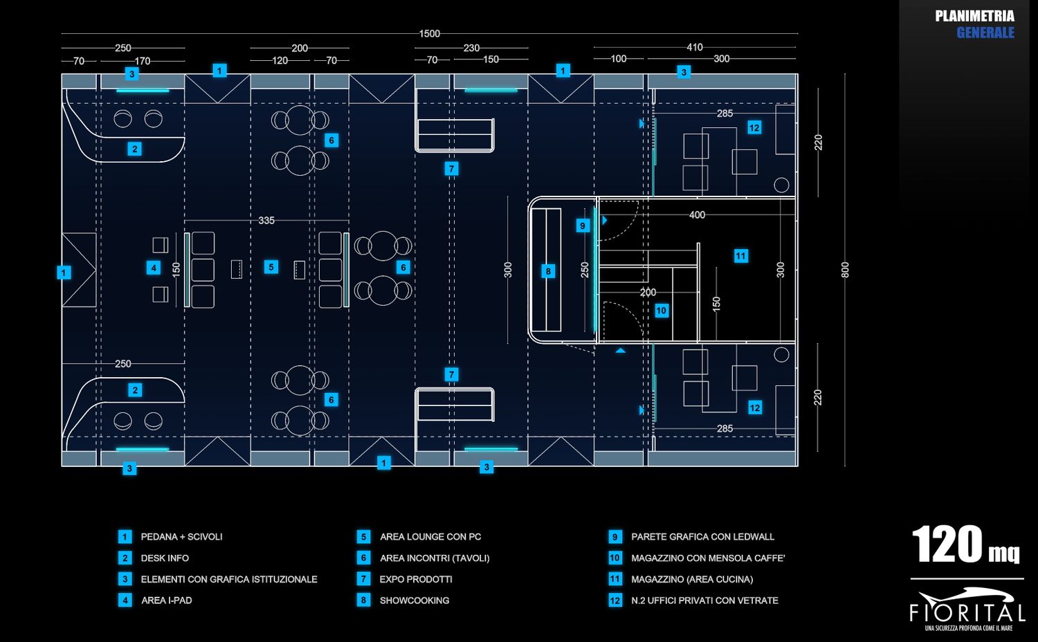
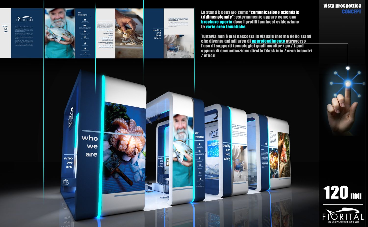
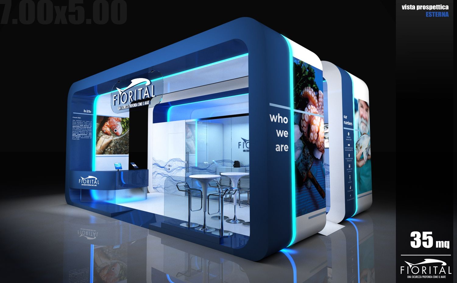
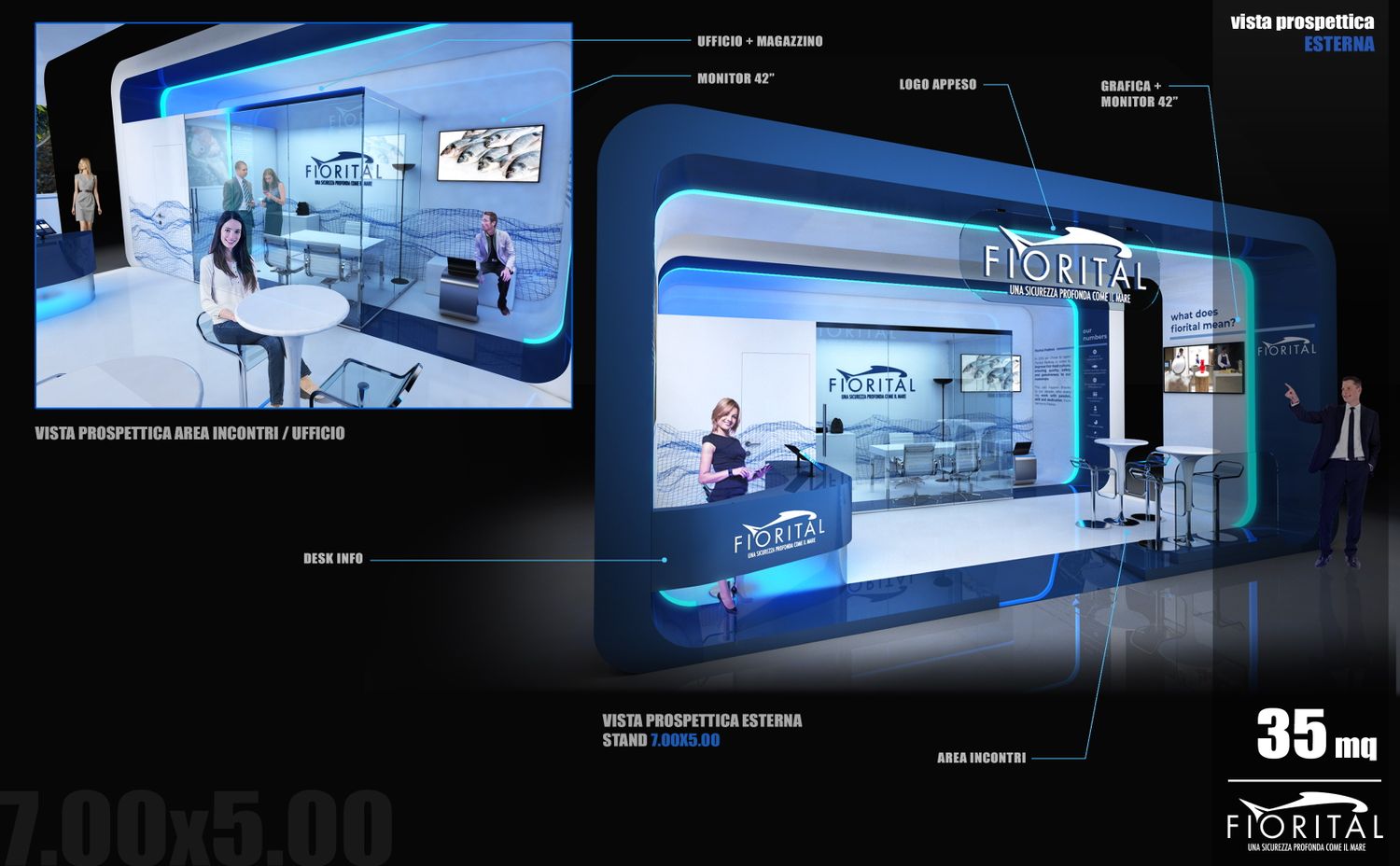
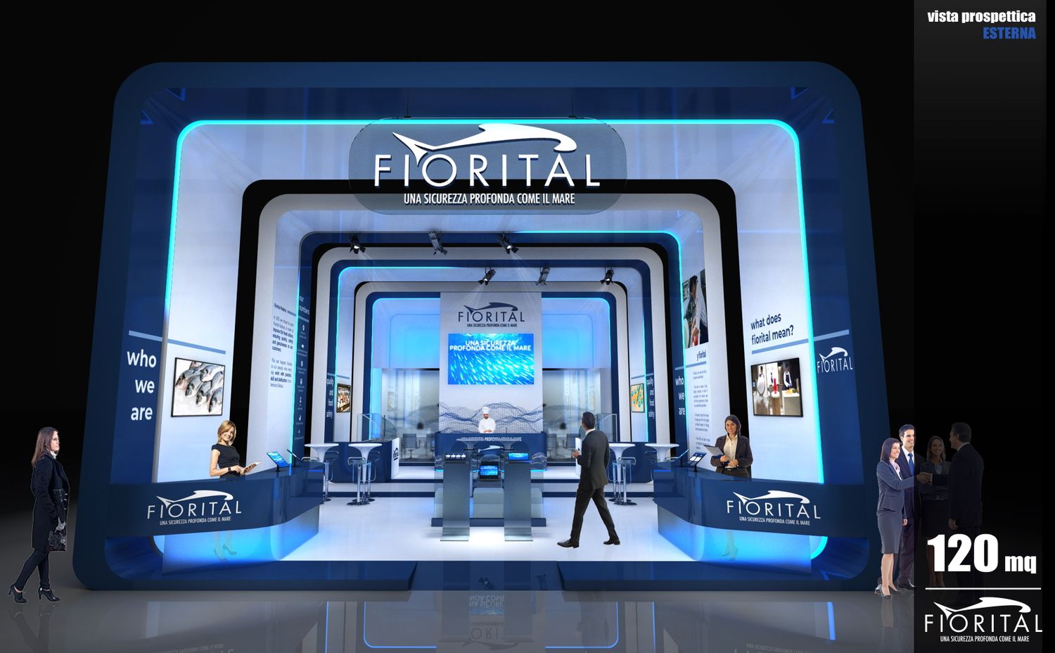
Il progetto dello stand nasce dall’idea di valorizzare il brandbook grafico (a mio avviso molto comunicativo), immaginando le pareti allestitive come un grande contenitore di comunicazione aziendale. In questo modo si viene a creare un duplice involucro (esterno ed interno) che se da una parte è una sorta di biglietto da visita aziendale (l’esterno), dall’altro diventa un luogo dove approfondire i contenuti grafici e testuali esposti esternamente (l’interno dello stand).
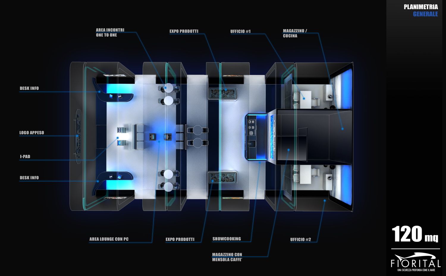
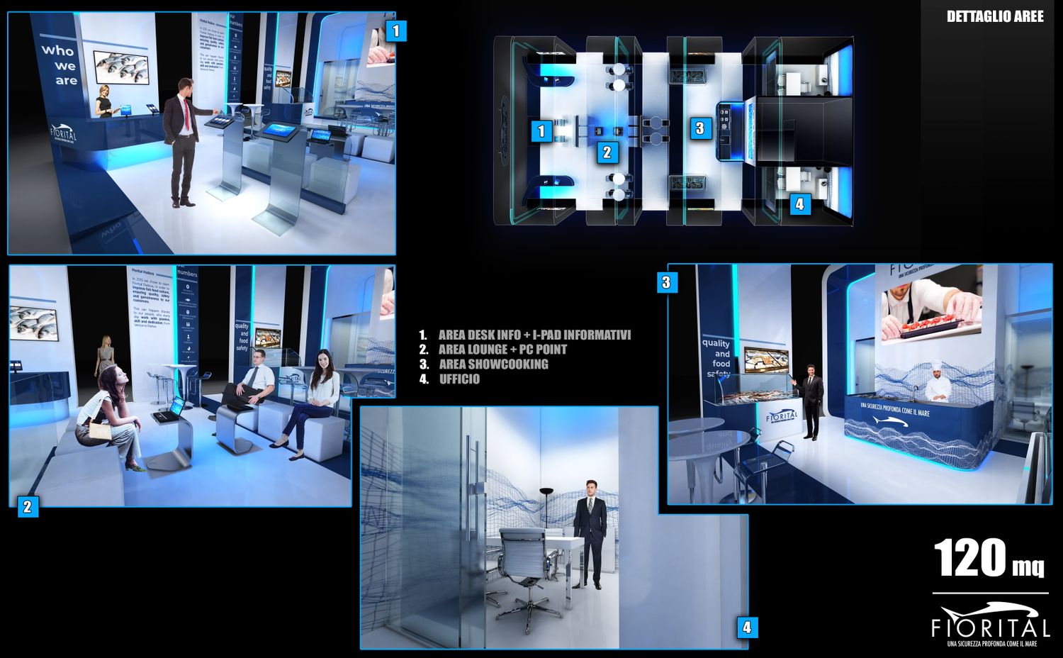
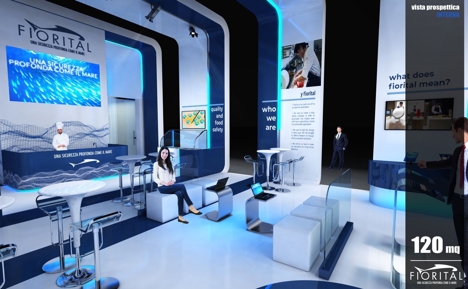
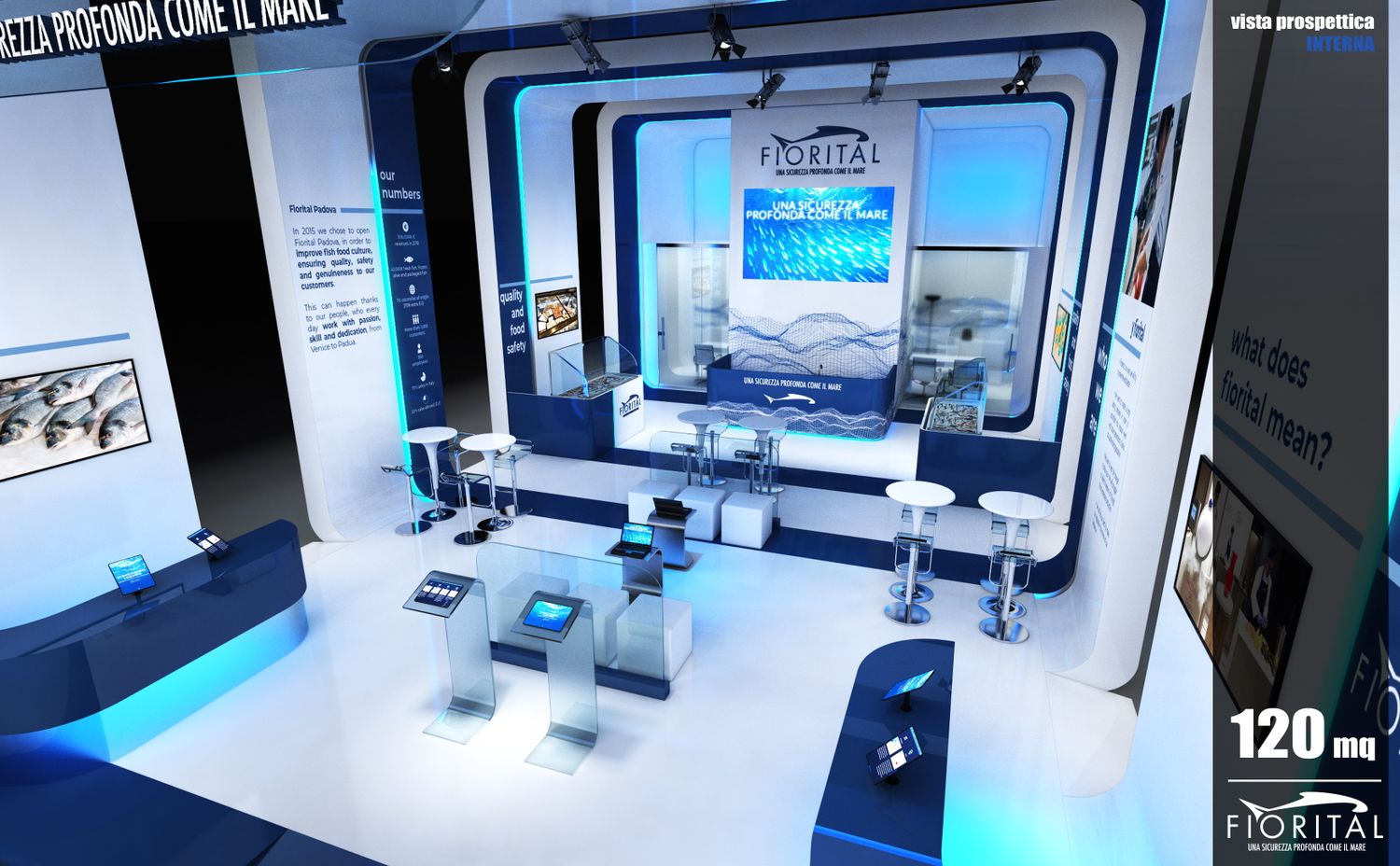
Per questo all’interno trovano spazio (oltre alle funzioni da lei indicate nel brief) supporti multimediali e video (i-pad, notebook, monitor..) che diventano corner di approfondimento a supporto ed introduzione ad un rapporto diretto con l’azienda (tavoli one-to-one, aree espositive, uffici..)
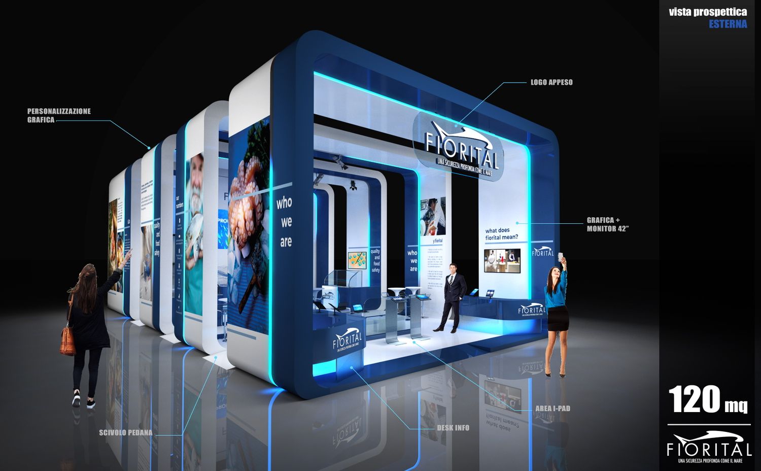
L’impatto generale è a mio avviso molto importante esternamente, soprattutto perché nelle fiere dove ci sono molti altri stand limitrofi è facile rimanere nell’anonimato: per questo anche le stripled esterne permettono di aumentare l’impatto visivo dello stand e sono funzionali allo stesso tempo a sottolineare i vari ambiti di attività aziendali.
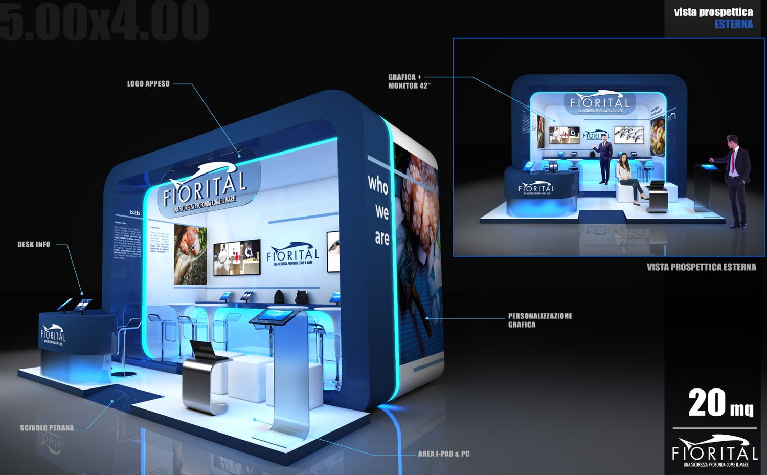
Nelle tavole può trovare anche una declinazione dello stand nelle metrature più piccole. In queste, non essendoci un brief dettagliato, le funzioni possono essere più o meno intercambiabili ma il mood allestitivo rimane il medesimo, essendo le strutture ad arco esterne modulari e ripetibili in varie metrature.
Queste sono pensate con una struttura interna di rinforzo in americana (quindi facilmente modificabili) e un rivestimento in pannelli lignei rivestiti in grafica che hanno due terminali centinati. Tra di essi è possibile inserire stripled o barre led o internamente binari con fari per illuminare puntualmente lo stand.
Sperando sia di suo gradimento, cordiali saluti
ENG
The design of the stand stems from the idea of enhancing the graphic brandbook (in my opinion very communicative), imagining the external walls as a large container of corporate communication. In this way a double envelope is created (external and internal) which on one hand is a sort of corporate business card (on the outside), on the other hand it becomes a place to deepen the graphic and textual contents displayed externally ( the inside of the stand).
For this reason, in addition to the functions you indicated in the brief, there are multimedia and video supports (i-pads, notebooks, monitors) that become support corners and introduction to a direct relationship with the company ( one-to-one tables, exhibition areas, offices ..)
The general impact is, in my opinion, very important externally, above all because in fairs where there are many other neighboring stands it is easy to remain anonymous: for this reason even the external stripled allow to increase the visual impact of the stand and are functional to the same time to highlight the various areas of business activity.
In the graphic layouts you can also find a variation of the stand in the smaller sizes. In these, since there is no detailed brief, the functions can be more or less interchangeable but the set-up mood remains the same, since the external arched structures are modular and repeatable in various sizes.
These are designed with an internal reinforcement structure in americana as laitec (therefore easily modifiable) and a covering in wooden panels covered in graphics that have two ribbed terminals. Between them it is possible to insert stripled or LED bars or internally tracks with headlights to illuminate the stand.
Hoping it's to your liking, best regards